
Update #5: Wednesday, March 31, 11:53 EST
TAKEAWAY: This Sunday, the Times of Oman will start a new chapter in its history with the unveiling of a new design, reorganization of content, and even a new logo. ALSO: Monocle Radio show Sunday: all about newspapers: Mario joins Tyler Brulé and guests PLUS: New Romania Libera pages
What’s new with Times of Oman?
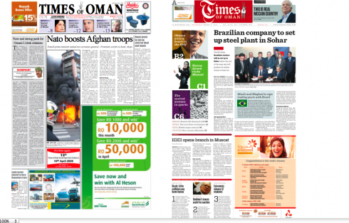
Before and after front pages of Times of Oman: notice change of logo
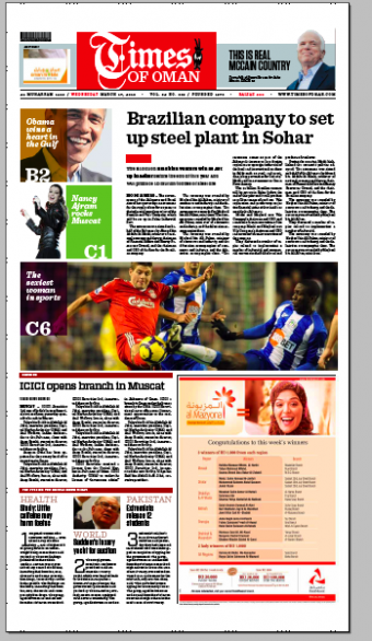
A variation of the new front page of Times of Oman
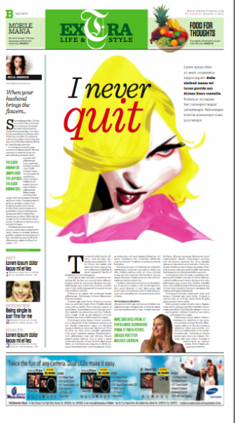
Extra (lifestyle) section front
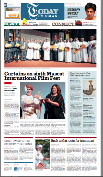
Today in Oman opening page: leads to Extra and Connect (classifieds)
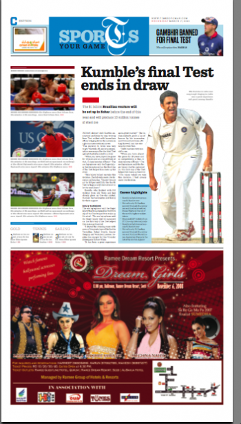
Sports section front
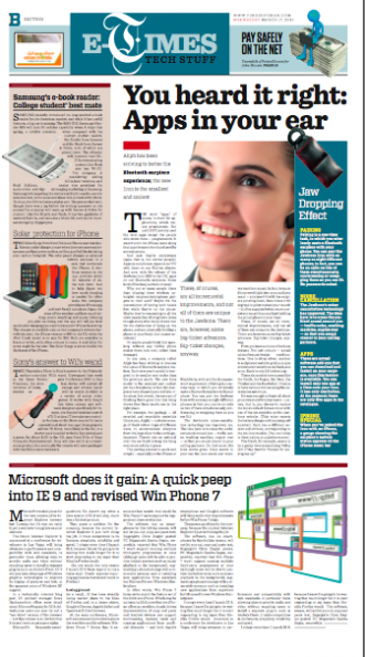
E-times (technology) section front
Several of our readers have been asking why so much attention was given to Al Shabiba and its logo, while the Times of Oman was also undergoing change, including its logo.
Obviously, the Times of Oman logo—-now a pill box, in red—-did not present us with the challenges of the Arabic-language logo of Al Shabiba, which have consumed much of our last four days.
However, it does not mean that T of O is less important or inspiring to all of us involved in the task.
A little history
Jan Kny (Garcia Media Europe) and I started working with a redesign of the Times of Oman exactly two and a half years ago. Three art directors later, we now have Adonis Durado as design director, and, he, in turn has hired an accomplished team of designers, info graphic and illustration artists and the environment was more conducive for us to do our work.
The Times of Oman that will see the light Sunday, April 4, has also rethought its content presentation: there are three sections now, as follows:
First section, international news and opinion.
Second section, Today in Oman, with Extra (lifestyle) and Connect(classifieds)
Third section, Market (business and finance), Sports
Key points of the redesign
Typographic scheme:
Text: Sentinel
Lead headlines on each page: Sentinel
Secondary headlines: Vitesse
Accents: Tungsten
(All fonts from Hoefler & Frere-Jones—www.typography.com)
New page size:
31.5 cm x 57.8 cm
Navigation: Each section front navigates readers to inside content, and always a “Three not to miss” box appears as well.
Color on every page: With a new printing press, the Times of Oman, and Al Shabiba, can now
afford color capability on all pages. The printing machine is City Line Express / Made in India.
Times of Oman and Al Shabiba CEO, Mr. Ahmed sums it up best:
“Our readers will see two very different newspapers this Sunday. Each has its uniqueness, and Times of Oman is not a translation of Al Shabiba or vice versa.
We want to make sure that the design distinction also points out content distinctions, because to us they are very present in how we crteate the paper”
Advertising innovation
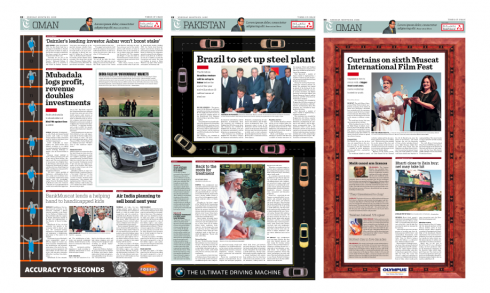
Three of the various ad positions available to advertisers: L, S and Frame structures
Part of the rethinking of both Al Shabiba and Times of Oman includes new approaches to advertising, selling such positions as S, L and U shape ads; island ads; silent ads, as well as belt and frame ads, some of which are shown here.
“Advertisers will find that the new products are thinking of them as well. We want the advertising community to see possibilities with our newspapers beyond the traditional placement of ads,” Mr. Ahmed said.
At a gala dinner to introduce the two redesigned products Monday night, members of the advertising communities declared that they liked what they saw and would be willing to start trying out the new ad positions.
Times of Oman, Al Shabiba: new look starts Sunday, April 4
’
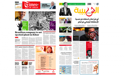
Prototype front pages for Times of Oman and Al Shabiba
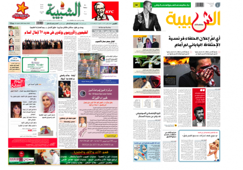
Al Shabiba front page as it is today (left), new design as of Sunday, April 4
Follow up to the Al Shabiba Logo: remarks from designer Lucie Lacava
My colleague Lucie Lacava, whose own portfolio of newspaper design includes the Arab language UAE daily, Al Itijad, sends me her comments about Al Shabiba. I wrote Lucie yesterday seeking her views, as I knew she had probably faced similar challenges in Abu Dhabi:
> It is fascinating to see the evolution of the logo and I can certainly appreciate the attention to detail one must pay to the position and shape of dots in arabic calligraphy which can render a word illegible if absent or misplaced.
I like the combination of the Kufi sans with the calligraphic “sheen”, it is very dynamic. I am in favour of the flame being selected over the more classic dots version, after all it is a logo. A logo must be distinctive. It must reinforce the brand. A logo must be legible but not necessarily read every time we pick up the paper. A logo graces the front page just like a painting graces a room. At first we notice admire and interpret every stroke, and eventually it become part of the whole.Congratulations on your latest relaunches, Al Shabiba looks good!
Monocle Radio this Sunday: newspaper show


Once again, I am honored to be a guest of Tyler Brulé’s Monocle Radio show. The show, which airs Sunday, April 4, includes the following other guests: Simon Kelner, managing director of The Independent (London), who discusses the recent sale of the newspaper and the future of the daily newspaper; Goerge Brock, head of Journalism at City University, London, about whether the importance we’re placing on the medium is overtaking the quality of the message when it comes to how we receive our news. Also, Raul Juste Lores, business and economics editor of Folha de Sao Paulo, who talks about the rise of the printed newspaper in Brazil.
The show airs at 1200 CET, Sunday, April 4.
For more information : www.monocle.com
Two weeks after relaunch: Romania Libera doing well
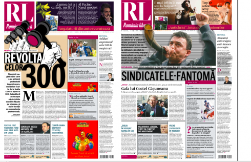
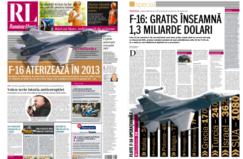
Romania Libera art director, Catalin Dumitri sends us pdfs of several pages of the past few days. As you know, we laucnhed RL”s new look in Bucharest last March 15. The reports are that readers and advertisers like the new look. These pages show that the team is becoming more comfortable with the new concept.
Amalia Badescu, marketing director at Romania Libera, reports that the launch party held earlier this week was a smashing success, with more than 400 in attending. As I could not be there, I prepared a video introducing the new look.
Those interested in seeing a gallery of photos of the event, and my own video, go here:
Mario’s video introducing the new design:
http://www.romanialibera.ro/multimedia-video/mario-garcia-despre-noua-romanie-libera-181577.html)
Gallery of photos of the launch party
http://www.romanialibera.ro/multimedia-foto/petrecerea-de-relansare-a-romaniei-libere-181651.html