The daily e-mail brings us a note from J Ford Huffman, long-time friend,
and, until recently of USA TODAY (and now a consultant at large). J Ford must
be experiencing high frustration levels with the news websites he frequents,
and writes me the following: “Mario, I sent this to a Gannett information-center staffer and I
thought you might be interested in the thoughts also.”
Of course, I am. We have not had much discussion of online news design in
this platform, and it is a topic high on my interest list.. So, J Ford,
with your permission, I sent your comments to my son Mario Garcia Jr., who
is our Garcia Media online design expert. He, in turn has managed to put his
comments directly under yours. A good dialog, I think.
Enjoy:
J FORD HUFFMAN ON MAKING THE HOME PAGE MORE FUNCTIONAL
>J Ford: A suggestion. I’ve been consulting in
San Francisco, Savannah and Maine and being a reader in those and other
cities during my journeys during the last six months. As a traveler and reader, I’ve a suggestion for
any newspaper’s Web site:
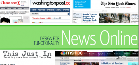
ONE:
Put an image of the print platform’s Page One on the Web site’s home
page.
Why?
– Helps a reader understand what’s top news. Shows a visual hierarchy of what
>the editors think is important. On most news Web sites there’s little clue about
>what’s big news besides one main photo and headline; the other stories often look like every other story in a long, long list.
– Adds a journalistic feel to the Web page. Gives the Web page a sense of
authority and integrity and community. Shows that the information center
is onmnipresent: Online and in print. Acknowledges and promotes the brand.
The major news magazines’ home pages show an image of the current issue. Maybe newspapers can learn from Time, Newsweek, and The Economist?
Which U.S. newspaper sites acknowledge the print platform with an image of Page One?
Today (14 Aug) I did a random check. I chose nine non-Gannett newspapers whose Page One designs stood out among the thumbnails on the Newseum’s front-page site.
Then I checked those papers’ home pages to if the online ‘page one’ matched the impact of the print Page One. The answer? Disappointing. Only two papers of 9 include a print image: Chicago Sun-Times (http://www.suntimes.com/index.html) and the Columbia (S.C.) State (http://www.thestate.com/). The State’s home page is as well-organized as its print front, too.
The other interesting finding?
Most of the nine newspapers’ print Page Ones show more innovation and organization than their online counterparts.
TWO:
JFord: Don’t make me search for a “Contact Us” link, and
make sure that page includes a telephone number and U.S. Postal Service mail address. Not every reader wants to communicate only via the Web.
>MARIO JR. OFFERS SOME EXAMPLES TO MAKE THE POINT
It’s not a bad idea to put an image of the print platform’s front page on
the home page, and I like to do it, but more to draw users to the area of
the page that would tell you what’s in print that day and have quick access
to the print sections. That said, a good news web site should intuitively
tell readers what the editors think is important and interesting, regardless
of whether the print page one is there or not. Good examples of this are…
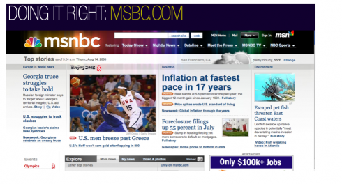
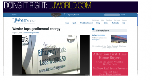
>msnbc.com and www.ljworld.com. These pages have a sense of authority and a
>journalistic feel.
>
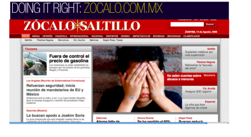
Mario Jr: I totally agree with J Ford about the importance of not burying the Contact Us link. One thing we’ve been doing is not burying the contact info in the footer and, in fact, creating a UTILITY box within the body of the site to show readers all the services the newspaper offers. Check out zocalo.com.mx near the bottom of the page.

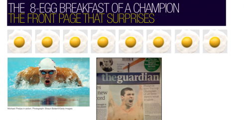
Leave it to London’s The Guardian to offer the Page One surprise of the day. True, US swimmer Michael Phelps has been on almost every front page I have looked at while in Europe this week, and deservedly so. After all, Phelps made history Aug. 13 in Beijing at the 2008 Olympics when he scooped a record-breaking 11th gold medal.
While every other newspaper carried a story on Phelps’ historic feat, The Guardian’s headline read: Phelps is now the top Olympian of all time. Here’s what it takes….
It proceeded to list what Phelps eats for breakfast, lunch and dinner: an extraordinary 12000-calorie daily diet, and, get ready for this, an 8-egg breakfast.
Yes, The Guardian also told you the rest of the “swimming” story on page 10. But, on Page One, nobody could resist the Phelps Diet story.
Good job, and a Page One for editors everywhere to study, to analyze and to imitate.
As for the 12000-calorie a day diet? Don’t try it unless you swim five hours a day, as Phelps says he does.
READ ABOUT THE MICHAEL PHELPS DAILY DIET:
http://www.guardian.co.uk/sport/2008/aug/14/michaelphelps.swimming1