Looking at recent redesigns
In an effort to make some sense of the current state of front page architecture in the United States, I have chosen to look at the front pages of the following dailies, all of which have been recently redesigned: The Hartford Courant, The Tampa Tribune, The Chicago Tribune, the Orlando Sentinel and the (Fort Lauderdale) Sun Sentinel.
Let me begin by saying that I like a lot of what all of these pages do, and how they do it. I admire the spirit of experimentation that is obvious here. Indeed, times of crisis open new windows in the creative laboratory of the newspaper. As someone who has clocked more than 35 years visiting newsrooms, I know that if anyone had suggested some of these concepts even ten years ago, he would have been shown one of the windows—-the one on the 11th floor and without a parachute (try the nameplate of the newspaper on the side, as in the Hartford Courant).
Indeed, interesting times and these pages show it:
What to do with the logo
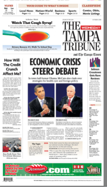
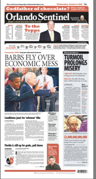
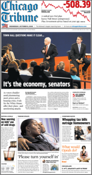
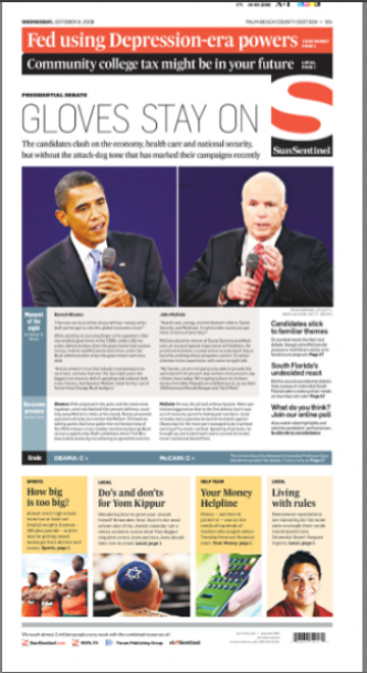
Once the most sacred of page one artifacts, now those newspaper nameplates are on wheels, or like stickies that you can put on your refrigerator door. Push them to the right (The Tampa Tribune), push them to the left (Chicago Tribune), eliminate all the letters and just use ONE initial (everyone knows S is for Sun or for Sentinel), or, follow the fashionistas and dress in classic black (Orlando Sentinel).
Yet, in each case, the strategy works, allowing for more navigational items at the top of the page.
Does anyone out there think that nameplates belong at the top of the page, reading left to right? I certainly don’t, but I have lived for decades suffocated by the plights of publishers and editors that, upon my arrival, would say: Mario, do whatever you want, but leave the nameplate at the top.
Yes, sir. Yes, ma’am.
These publishers must all be in a retirement community. A good thing.
Page One as Navigator
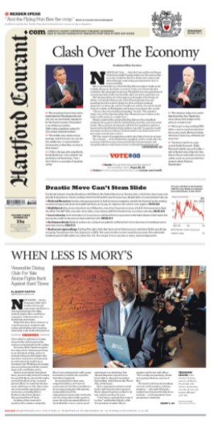
With the exception of the Hartford Courant, which is more texty on Page one, all the other newspapers analyzed here use their front page as a map to the inside. Finally, American newspapers are learning from their European and South American counterparts. Wonderful. It was about time.
Who does it best? In today’s front pages, The Tampa Tribune handled this best. One basically reads one story, and the rest are summaries.
Who handled it worst? The Orlando Sentinel which needs a map to understand the map. Too many mixtures of type and font styles, caps, and lowercase, and too much text in most of those copy blocks. However, their top of the page navigator is the best of them all. Concise, easy to follow.
Is there a tabloid in their DNA?
With the exception of the Hartford Courant, which, that vertical nameplate aside, remains a true classic, all the other front pages analyzed here borrowed a page or two (maybe a chapter) from the tabloid textbook. They are showing more than just a little leg, and, of course, why not? Bigger photos, bigger headlines, the surprise visual (see that spoonful of medicine at the top of The Tampa Tribune?), all of those elements attract eyeballs.
Ironically, all of these front pages do make one of my old time favorites, USA Today, look a little traditional, classic and…..tired? Indeed, USA Today still adheres to most of Arnold’s Axioms, the lead on the right, the axis of orientation around the center of the page, the hot corners. Well, time for a little botox, USA Today, although I like it the way it is.
But, you, USA Today, you should open the big window and go for a compact, a Berliner format, and show them how it can be done in America. Be the trailblazer again, why not?
This is the beginning
I am happy to see these front pages. Content and design working together here, work in progress, and perhaps, when they complete their time in the laboratory, all of these pages will come to terms with what the front page should be: content that surprises daily, headlines we have not heard before, visuals that stop us on the way to the coffee machine, and a sense of what surprises lurk inside of today’s newspaper. Simple formula. These folks are on their way there, indeed.
![]()
In Paris, France: busy with La Tribune, and doing a review of Paris Match as the staff prepares the second issue with the new design.
TheMarioBlog posting # 114