TAKEAWAY: It is, by all standards, an iconic newspaper: USA TODAY has inspired a generation of journalists and designers globally with its color, use of graphics and short stories. Now, 30 years later, it unveils its major redesign of consequence Sept. 14. Part 3 today: Master illustrator George Rorick walks us through the creation of “the” weather map that changed visual weather coverage for all. Also hear from Richard Curtis and Roy Peter Clark.
USA TODAY is planning a major relaunch of its newspaper, website and mobile platforms, complete with a new logo this Friday, September 14, the day before the newspaper turns 30.
In anticipation, I have decided to devote TheMarioBlog this week to highlight the impact that USA TODAY has had on the way we look at newspaper design and visual storytelling. To that effect, I am talking to those who were directly involved with its creation, as well as people in our industry, veterans and newcomers, for their assessment of how this iconic and game changing publication carved a line in the timeline of newspaper design history: before and after USA TODAY.
George Rorick, former illustrator/artist USA TODAY
George: the weather feature was the daily challenge
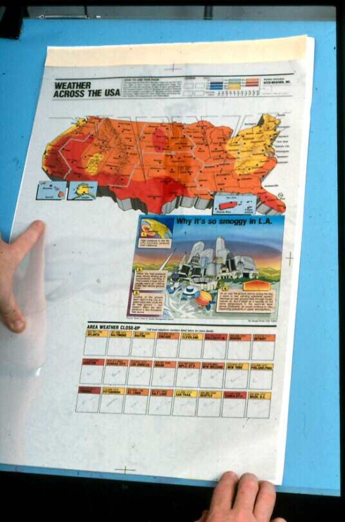
The making of the famous weather map
FROST_thumb.jpg)
(All photos in this sequence from the personal collection of George Rorick)

Here is how original weather map looked (Page is from J Ford Huffman’s personal collection)
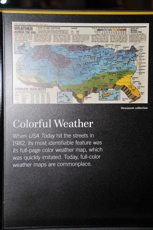
The famous USA TODAY weather page is already at the Newseum in Washington, DC
The weather page had 10 colors + white, 16 city data boxes, a color key and the full color weather feature. This all had to be sent to production by 6 PM, five days a week.
I created a process for preparing all 11 colors for the weather map having to repeat redundant tasks. Since we never changed any of the elements on the set-up it was easy to prepare most of the page in advance. We spent about 30 minutes a day on all the repetitive color elements. Again, the weather feature was the challenge. We needed to save all the time we could for production of the feature.
I created 3 U.S. map projections of the weather map over time. One had a easterly perspective one a slightly less easterly perspective and the last map was centered. The centered map was my favor.
I used a perspective grid which I created by referring to a USGS base map. The 3 maps were slightly stylized but accurate. Again, they had to be drawn by hand, there wasn’t a computer I could have used. Thanks again for today’s technology.
Funny relocation’s:
—We had many requests from cities who wanted their city name on the weather map.
—Alaska wanted the State of Alaska to be presented in the correct proportion to the U.S.
—We had a wall in the newsroom that was full of U.S.A. TODAY weather page copies.
—A local TV station and more than one newspaper literally coped, a;most line for line, weather graphics.
—There were weather maps from all over the world on that wall.
In the beginning many would joke about U.S.A. TODAY color, graphics and short stories and then turn around and copy us.
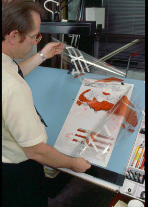
Rorick shows us the various steps for this “Smoggy LA” story
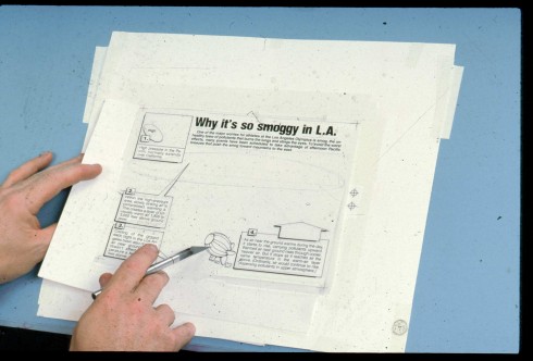
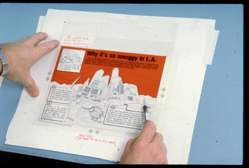
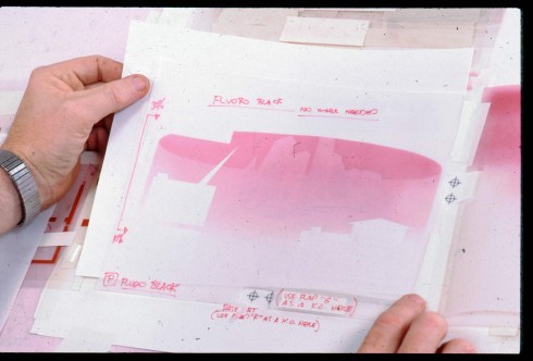
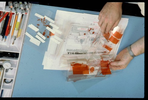
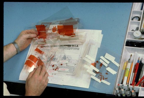
This a typical example of a daily assignment. Assignment in at 11 AM and to production at 6 PM. There was no leniency for a late graphic.
The process was cut / paste and then cut flaps for the color separations. In those days, before the computer, we had to cut flaps to add color to to the drawings. I didn’t
especially like the effect so I added more flaps. The purpose was to softing the hard flat color and create graduated color effects. In other words I wanted to create the effect of reflective color.Some of the flaps were intended to serve as color separations, some were knock-outs, some were masks. In other words there was a lot of flaps on a graphic. The other reason for doing this was to save production time. Yes, it saved time because I could do all the flaps in red, including the airbrushed flaps. I presented all colors in red with instructions to the color strippers as to what the color should be stripped in at. I wanted to create the the effect of reflective color in my graphics. This process enabled the camera crew to shoot everything in black and white. each flap. They loved the challenge and I got the color effect I wanted.
Then the Mac came along and changed things making it much easier to do professional graphics. Thank you Steve Jobs!
Rorick on his wild ride
Being a part of the start-up of USA TODAY was the best experience of my life. If I could do it all again I would jump at the opportunity. It was exciting, scary, frustrating, exhausting but most of all it was challenging and rewarding. I remember heading for the elevator after finishing our initial prototypes when I realized that Al Neuharth had followed me to say thanks and hope you come back if we decide to move ahead. For me that was about as inspiring as it could get and I mean that in the most sincere way. Mr. Neuharth took the weather page very seriously. Sometimes I would arrive at the office early to find him setting at my desk studding the mock up. I think I made 5 to 6 camera ready presentations. When I thought I finally created one that he was pleased with, he wanted another idea. It was like that till the week before we printed the first edition. I also remember once when he saw one of my nulti-flap pages he said “Is that going to work?” I said yes and I thought it had better work, and it did.
The challenges were great and exciting but most of all I remember the people that I was so lucky to work with. All professionals. People like Al Neuharth Ron Martin, John Quinn, J Ford, Richard Curtis and many, many more.
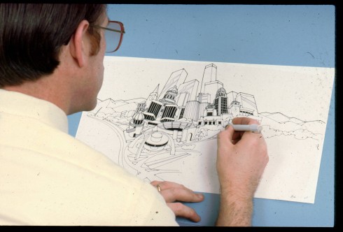
That master artist, George Rorick, at work on one of his many illustrations for USA TODAY
Richard Curtis: former managing editor for design, USA TODAY
Richard: USA TODAY was perceived as an enjoyable reading experience
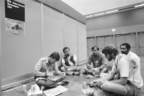
Richard: Attached is a photo from the 1984 Olympics in Los Angeles that shows some of our limited staff there (we had only two photo credentials, for example) having dinner in the Press Center in downtown L.A. From left: sports photo editor Porter Binks, contract photographer Memet Bieber, me, assistant director of photography Jackie Greene, and photographer H. Darr Beiser. Both Greene and Beiser are still with USAT. Photo taken by Acey Harper, one of the two photographers at USAT then, now a successful freelancer living in California.
Richard Curtis was probably the most envied newspaper design director of the 1980s, and with reasons: how many of us get to design a newspaper that has never existed before, with license to create, to innovate, and with no legacies to handicap the creative process?
Richard , who was the first USA TODAY managing editor for graphics and photography (his title eventually changed to managing editor for design) ,rose to the occasion, surrounded himself with a most capable and enormously talented team, and the rest is a rich and very colorful history that we are retelling here this week.
Here is how Richard reminisces about that busy but fulfilling part of his incredibly successful career:
The earliest years of USA TODAY, indeed the earliest days, weeks and months, were some of the most professionally exciting of my life. No matter in which direction you turned or looked, there were opportunities to be creative. The design methods I’d learned in college and had applied in my early career, were of great use in arriving at solutions for USA TODAY.
Those days were exciting for several reasons:
(1) We were attempting to design a newspaper quite unlike any that existed then or before. What a challenge!
(2) We had the resources to do that.
(3) No one ever said “We can’t do that because we’ve never done it before.” In fact, we usually did the opposite simply because it hadn’t been done before.
(4) Everyone at USA TODAY– and I mean EVERYONE – was fully engaged in the project, unlike other places I had worked. Most had given up safe jobs elsewhere to pursue this dream, which came with no guarantees. There were lots of self motivation and unbridled enthusiasm in that early staff. Fourteen-to-18 hour days were common and for six and seven days also.
(5) We had, not only the blessing and commitment of Gannett CEO Al Neuharth, but his actual daily involvement. His presence tended to speed things along, hasten decision-making and open a lot of doors.
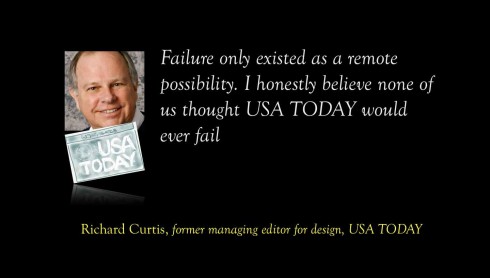
(6) Failure only existed as a remote possibility; I honestly believe none of us thought USA TODAY would ever fail. One thing that led me to believe that was the overwhelmingly positive response by readers and the almost universal rejection of USA TODAY by editors. The most impressively positive response was how readers perceived USAT as an “enjoyable reading experience.” I had never heard that sort of response by readers toward any newspaper, ever. It bode well for our future.That was evident to me that a newspaper designed FOR readers could become a big success. And here, 30 years later, a lot of those newspapers whose editors didn’t see the advantages of that are out of business or facing dangerous readership and revenue declines, not that other factors aren’t at play also. Newspapers are painfully aware of that now, and hopefully media companies will take smart steps to change that dynamic before it’s too late.
Curtis’ most memorable graphic
There are too many to single out one graphic or illustration, and by doing so, I would do a disservice to many talented and wonderful artists who have worked here over the past 25 years. Some that stand out in my admittedly feeble memory: Web Bryant’s double-truck illustration-graphic commemorating the career of Dale Earnhardt that we published five days after Earnhardt’s death. That paper sold over 3 million copies
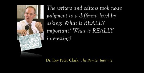
Roy Peter Clark, The Poynter Institute for Media Studies
Roy: Journalism world was unfair to USA TODAY
I remember being underwhelmed by the original USA Today design. Remember, we were in St. Petersburg, where the Times had already been experimenting with color, info graphics, modular design and other hot innovations. If anything, the design of USA Today seemed too rigidly formatted. I tend to hate it when the news has to fit the format rather than the format bending to present the news.
I did some early writing workshops at USA Today and encouraged them to experiment over time with the form and content of their centerpieces—the way the WSJ did with their A-Head features.
In retrospect, I think the journalism world at-large was unfair to USA Today in its McNews criticism. The writers and editors took news judgment to a different level, by asking “what is REALLY important?” and “what is REALLY interesting?” This proved to be an alternative to inverted pyramid writing because the editors were more discriminating.
The people who invented USA Today really wanted to make it work—and to make it good. I remember being approached by a very young man who was writing those fifty state by state news summaries. “We’re trying to figure out how to write these better,” he told me. “You got any ideas.” I wanted to hug him and smuggle him back to Poynter as a role model for newsroom learning.
That first prototype: some contemplations from me
The very early prototypes: with “armpits”, no grids and not so modular
The first day of USA TODAY: sanitized, modular, no armpits to be found, skinny columns and a crisper look
Here are two sample prototypes that were not meant to be the final version, although we can see here that many of the elements stayed.
To me, what is interesting here, from a newspaper design historical perspective is that these models may have been a little antagonistic to designers in 1982. Notice that these are not as perfectly modular as was the trend in the 1980s.
Both front page models show what used to be called “an armpit” for the lead story: meaning that the headline covers a certain territory, about five columns on the page on the left, all the way across on the right, but under it were elements NOT pertaining to that particular story.
This is a practice that was popular in the newspapers of the 1950s and early 60s, but which was abandoned for the more organized and decaffeinated modular style: a place for everything and everything in its place. Headline covers the territory and picture, NOT beyond that.
Notice also a total disregard for grid configurations here. I count about three or four different column widths here, and all columns tend to be fat and wide, no skinny colummns.
Now take a look at the first day edition of USA TODAY: it’s perfectly modular, there are no armpits, a sense of grid prevails. It is crisper, more organized, and, of course, with the new and final (until Friday, Sept. 14 that is) logo in place.
Although I do not know what caused the radical change from prototype to final execution, I imagine that those early prototypes could have been made by “advertising agency” types, who might not read the latest list of newspaper layout rules.
Our previous blog posts about USA TODAY:
USA TODAY turns 30: Part 1—Looking into the attic for those early sketches
https://www.garciamedia.com/blog/articles/usa_today_turns_30-part_1-looking_into_the_attic_for_those_early_sketches
USA TODAY turns 30: Part 2—USA TODAY turns 30-Part 2—-A newspaper that influenced all of us
https://www.garciamedia.com/blog/articles/usa_today_turns_30-part_2—-a_newspaper_that_influenced_all_of_us
Of special interest today:
– Australia: Free smartphones, tablets the new business model
http://afr.com/p/technology/free_smartphones_tablets_the_new_QebYynMPiZqT59m7u8UXZP
Young people consider news to be gargage and lies
http://jimromenesko.com/2012/09/10/young-people-regard-news-as-garbage-and-lies/
Cincy Enquirer pushing redesign to ‘13
http://www.newsandtech.com/news/article_3afbfb20-fb65-11e1-a1d8-0019bb2963f4.html
Chatting with Tyler Brulé on Monocle Radio’s new show, The Stack
Listen to my chat with Tyler Brulé about future of print in Monocle Radio’s The Stack here:
http://www.monocle.com/24/shows/stack/
Sign up to get information on my new digital book
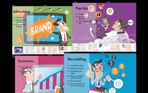
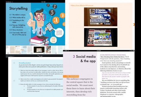
Assorted screens from the book: top, chapter openers all of which are color coded and carry illustrations by Luis Vazquez, of the Gulf News of Dubai; second image, opener of Storytelling chapter, and two inside screens.
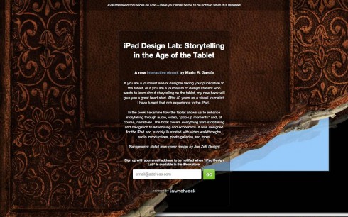
As we get closer to publication date for The iPad Lab: Storytelling in the Age of the Tablet, we are now set up so that you can give us your email address and you will automatically be informed when the book is ready for download.
Now you can leave your email address so that you will be updated and informed the moment the book is read for download.
Simply go here:
http://ipaddesignlab.com
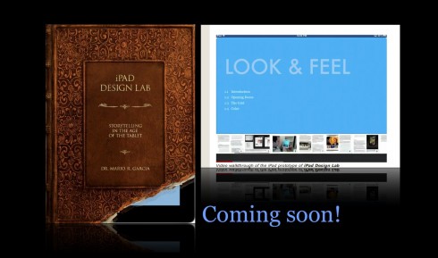
Video walkthrough of the iPad prototype of iPad Design Lab
SND Scandinavia Space 2012 conference
Still time to get a spot to attend the SNDS conference in Copenhagen, Sept. 27-29;
For more information:
SNDS workshop ever. Read all about SPACE 2012 here:
http://snds.org/get-your-own-space-guide/#more-1852
Mario Garcia’s upcoming speaking engagements:
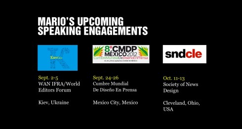
Cumbre Mundial de Diseño en Prensa 2012: Mexico City; September 24-26
http://www.cmdprensa.com/mx2012/
SND (Society of News Design) Cleveland; Oct. 11-13
http://cle.snd.org/
1st Middle East News Design Conference
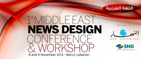
It promises to be a great program, and a historic one, too: the first SND Middle East gathering. Put it on your calendars: November 8 & 9, in Beirut, Lebanon. Sponsored by An-Nahar and SND.
For more information:
http://www.snd20events.com/conference/