TAKEAWAY: Not all tabloids are alike, but the best develop a personality and stick to it. We take a look at some of the most popular tabloid categories. PLUS: Pop ups of the day
It’s a palette with variety for compacts
The world of the tabloids never stops fascinating us.
As readers of this blog already know, I am a fan of Germany’s Bild. It is bold. It is irreverent. It has the goods (and the bads!). It makes fun of everyone and everything. It is fun to read and to look at.
It’s also NOT a tabloid in the format sense of the word.
Its design does not follow any rules, except Bild’s own, whichever they are, but, rest assured that there are some rules that are inherent in its DNA. Indeed, if we wish to be technical about it: Bild is NOT a tabloid format. It is a fabulously grand old broadsheet. In spirit, however, it is the king of the tabloids, in my view.
Although I have not yet seen the Bild stylebook, I am sure it is mandatory reading for anyone crossing the main doors of the imposing Axel Springer Haus in Berlin to go to work on the Bild staff.
What is tremendously good about Bild, and a reason for every student of journalism and journalistic design to take a look and to study it, is that it knows what it is, what it wants to be, and it has no pretenses.
There many “tabloid” styles out there.
The reason I mention this is because I got another one of those frequent emails from someone in the business who asks me why I like Bild, and tabloids generally, so much.
I like it for the reasons expressed above, and particularly because Bild knows what it is, nothing less, and, yes, a lot more!
With compact formats becoming so popular with newspapers globally, the usual discussion in a newsroom is that of look and feel.
Usually, a publisher/editor in the process of switching to a tabloid format will face the inevitable question: are we going to be more downmarket now that we have become a compact or tabloid newspaper?
For many in the newsroom, the change of format implies a less serious approach to the news.
It does not have to be.
Reviewing some popular tabloid styles
In my view, format has little or nothing to do with the look & feel that a newspaper wishes to project. In fact, as you see here, one of the large broadsheets, Bild, is the most tabloid-like in spirit. However, it is important for editors and designers to understand what the content philosophy and target audience are. Once this is clear, then it is easier to design the type of newspaper that would be most appropriate for the given target.
The classic tabs
There are the authoritative, serious tabloids (think El Pais of Madrid, for example). These are newspapers whose editors definitely insist that there be text on the front page. Photos rarely appear big here, but not necessarily so. Headlines tend to be smaller. Navigation is elegantly presented. The adjectives relaxed and elegant come to mind.
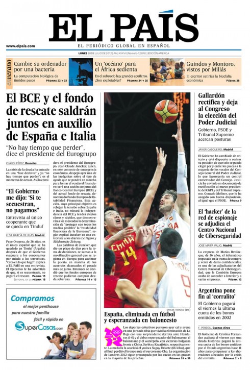
El Pais, Spain
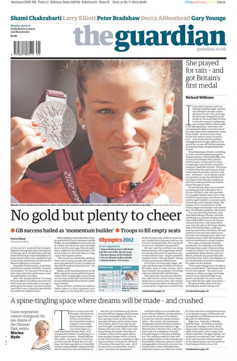
The Guardian, UK
The contemporary tabloid
There are the contemporary tabloids (think Goteborgs Posten, of Sweden, among many), These newspapers appeal to an educated audience that will also want its newspaper to be lively, colorful and very visual. Some, like the GP here, do not include any text to be read on the front page, although a template exists for when the editors feel that text is necessary. The front page becomes a giant, visually attractive navigator. The adjectives colorful and trendy fit here.
I believe that this is one of the ideal styles for a tabloid that wants to appeal to a general audience, present serious but entertaining journalism, and to offer a visually appealing package.
With more newspapers presenting content across platforms, this contemporary look also allows for a more seamless and consistent look from print to digital.
If I were starting a newspaper today, I would probably go for a contemporary look in an A4 format.
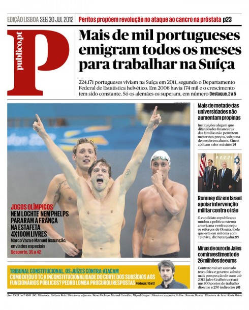
Publico, Portugal
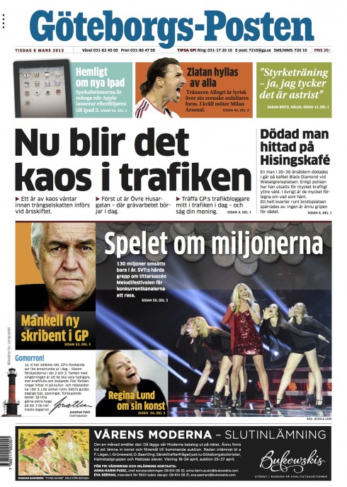
Goteborgs Posten, Sweden
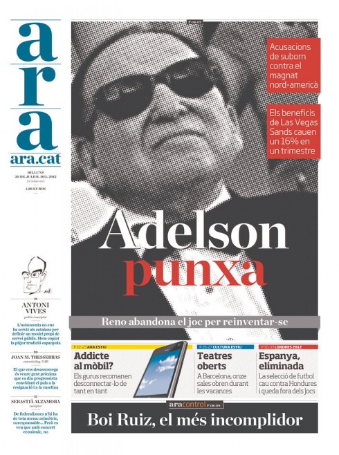
Ara, Spain
The down market tabs
There are the heavy downmarket tabloids (think New York Post). They are the ones who give the term tabloid a run for its money, and its reputation: loud, bold, over the top, with content that is like a five-alarm fire everyday. Headlines are written to engage in an informal way; no topic is taboo; no photo is taboo (well, almost); sex, crime, sports, and gossip rule the day. However, some of these tabloids have a following beyond the downmarket audience, a tribute to the editors’ efforts to attract not just with the sensational, but also with exposes, and investigative journalism. Titillating is a word that comes to mind with these tabs.
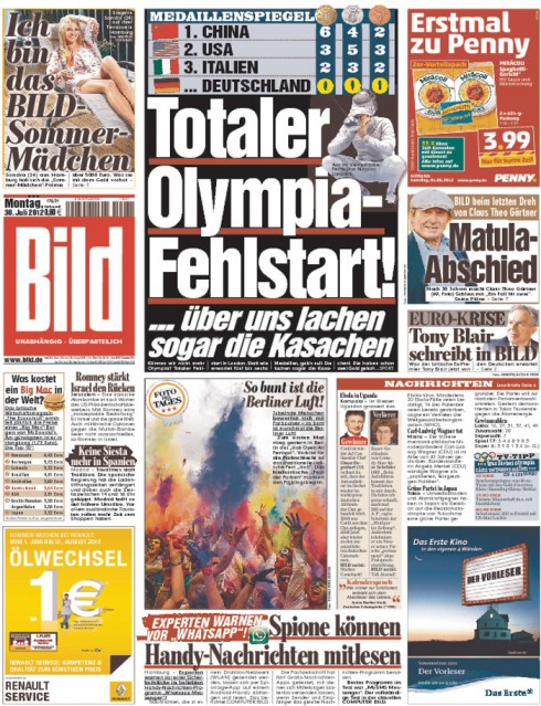
Bild, Germany (we know it is not REALLY a tabloid, except on Sunday, but it is the most tabloidy of all!)
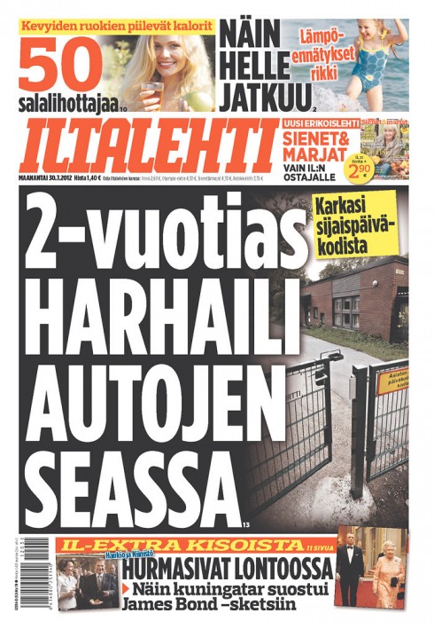
Iltalehti, Finland
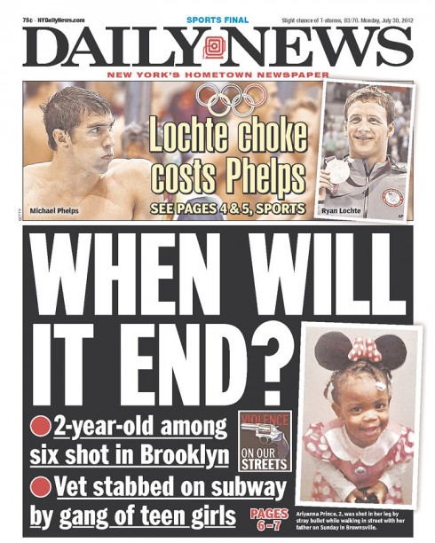
New York Daily News, USA
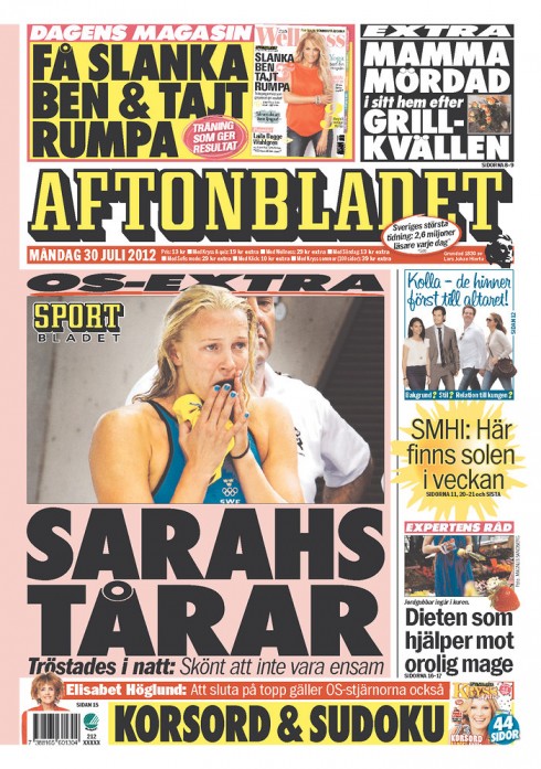
Aftenblodet, Sweden
The poster look tab
We have many tabloids that go for the poster look on a daily basis. This is a more difficult to sustain look from day to day, but when the right photo and story come together, it is a winning format. Front pages are inviting and newsy, even if the story count is not high. It takes a great story and a wonderful photo, and some good art directing to pull these off.
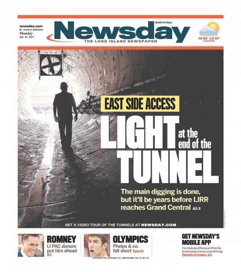
Newsday, USA
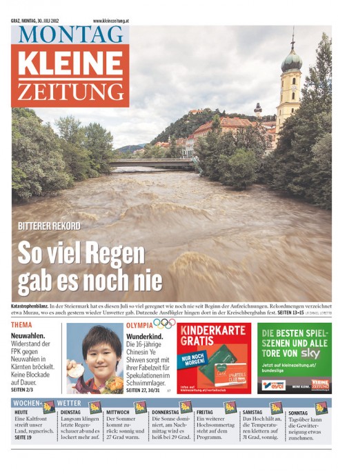
Kleine Zeitung, Austria
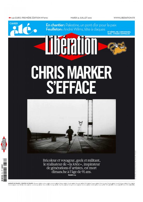
Liberation, France
The sports tabloid
There are the sports tabloids which emphasize large photos and big headlines, and their audience is guaranteed to like them. Every designer should have to design the front page of one of these sports tabs at least twice a year: just for the fun of it, call it a mini design holiday.
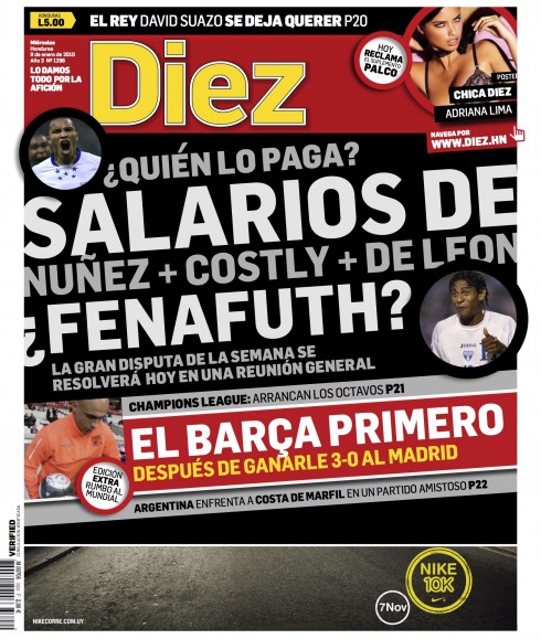
Diez, Honduras

Marca, Spain
Size does not matter here
Size does not at all imply the philosophy that the newspaper embodies for its content and how it presents it.
Design comes to the rescue and adapts the ideas of the publisher/editor to create the impression that the reader will have in those first 10 seconds when he/she takes a look at the front page of the newspaper.
Bild dresses daily to go out as the Joker, or Lady Gaga, or that bad girl with the over the top make up we all remember from high school. It does it proudly, without fear or remorse.
That’s what it is all about: whether a tabloid , a broadsheet or in between, recognize who you are, emphasize your DNA and then go out into those streets ready to flaunt it.
Those in the audience who like you, will love you more, and, who knows, you may seduce new readers in the process. Just know who you are and wear it proudly.
A philosophy that works for people too, by the way.
Of special interest today
Interview with Robert Newman: Creative Director of Reader’s Digest
http://blog.pinterest.com/post/28339728907/interview-with-robert-newman-creative-director-of
This is a very informative, but personal, interview with the great Robert Newman.
Here is one of the questions/answers from that interview:
We love your collections of different illustrations. What do you think makes a good book cover, poster, or advertisement?
A good poster or cover should engage on both an emotional and intellectual level. It should delight, amaze, and inspire; be original and distinctive. I always think of things in terms of how will they tear it out and stick it on their walls? Now of course, will they pin it on Pinterest?
Sources: next iPhone likely to be unveiled on Wednesday, September 12th
http://www.theverge.com/2012/7/30/3204810/next-apple-iphone-5-event-date-rumor-september-12
The Daily lays off a third of its staff
http://allthingsd.com/20120731/the-daily-lays-off-a-third-of-its-staff/
Note also: “The Daily will move to a portrait-only orientation – the mode in which the vast majority of its readers view content – though video will still be viewable in landscape mode.”
Pop up of the day
And, speaking of the iPhone 5, how about one that looks like a spider and wraps around the top of your hand?
Spider-Like iPhone 5 Design is Creepy Yet Cool
http://mashable.com/2012/07/06/iphone-5-spider/#74289The-iPhone-5-as-a-Spider
Bild’s pop up is also about the new iPhone 5.
Also another pop up from Bild’s tablet edition, celebrating 682 years of beauty, with some of the world’s best designers (among them CALVIN KLEIN, ANDY WARHOL,
HELMUT NEWTON) and the supermodels who inspired them. Timothy Greenfield-Sanders reunited the models for his documentary, Supermodels Then and Now.
To see more of Timothy Greenfield-Sanders, go here:
http://www.greenfield-sanders.com/galleries-2
The iPad Design Lab: Storytelling in the Age of the Tablet
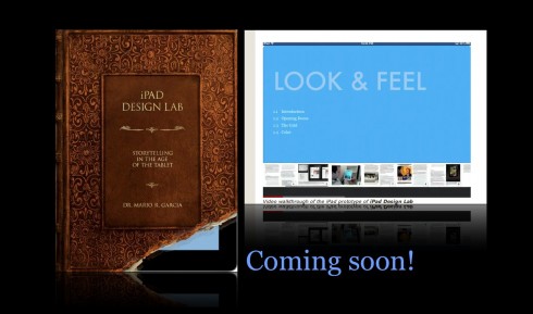
Video walkthrough of the iPad prototype of iPad Design Lab
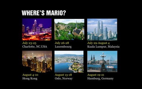
Mario Garcia’s upcoming speaking engagements:
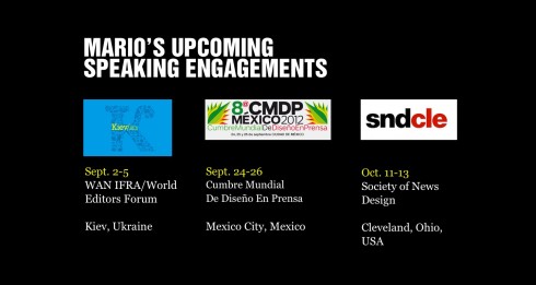
WAN-IFRA World Editors Forum, Kiev, Ukraine, Sept. 2-5
http://www.wan-ifra.org/events/64th-world-newspaper-congress-19th-world-editors-forum
Cumbre Mundial de Diseño en Prensa 2012: Mexico City; September 24-26
http://www.cmdprensa.com/mx2012/
SND (Society of News Design) Cleveland; Oct. 11-13
http://cle.snd.org/