It happened last week. My Garcia Media Europe senior art director, Constantin Eberle, and I , were doing initial sketches for our Blick project in Zurich.
Blick, as you may know, is one of those lively, colorful and loud tabloids that pull more punch than three cans of Red Bull.
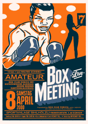
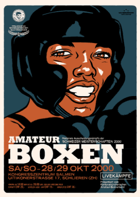
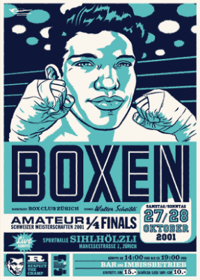
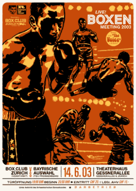
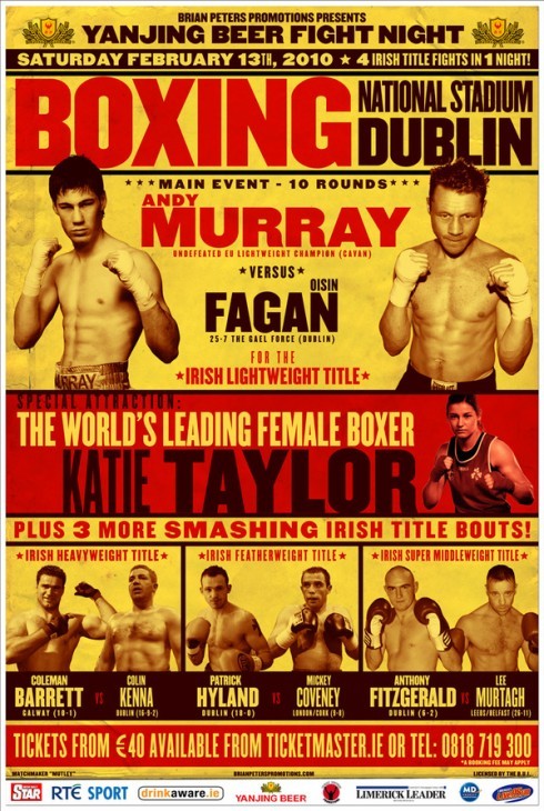
It’s like a pre-run warm up: turn to boxing posters and let your senses get involved with the color (usually yellow and red), and with what I refer to as a sense of visual irreverence. The best boxing posters look like they were hit right smack on the nose, not enough to cause a bleed, but sufficient to show that you just don’t mess around with the characters there.
When designing down market tabloids, this is exactly what one needs, a sense of visual irreverence, the loud and the not so neat.
Here are some that always get me thinking in the right direction for these difficult to rethink newspapers where a legacy of a 100 years of white on black headlines, tilted images, circles, squares and triangles, have created the type of attic or basement that nobody wants to clean up.
The boxing posters have that sense of systematic chaos that is just perfect for these projects.
On we move with inspiration. And now the front pages are emerging (can’t show them to you yet, be patient), and behind each model there is a glorious boxing poster with several rounds of inspiration.
Try it sometime!