Helvetica’s simple lines fly high with the German airlines Lufthansa.
![]()
Swiss is set in Univers 65 Bold. “It says Swissness,” a designer once told me.
There are many lessons we media designers can obtain from what those brand designers come up with. First, they translate the essence of a company into a visual representation that must say it all in a few seconds. Isn’t that what we try to do with how we present our own newspaper and magazine brands thru the rapid scrutiny of a cover, front page or home page?
Specifically, I always derive much inspiration from how brand designers utilize color. For them, this is perhaps one of the most useful design tools to guarantee that a brand becomes memorable and easily identifiable in a sea of brands that clamor for attention. Think the yellow arches of the M in McDonald’s.
If color is important, so is typography in a major way. When we look at the logos of such airlines as Lufthansa and Swiss what we see is an elegant, simple sans serif that inspires authority and no nonsense (traits we look for before we set foot on that plane to take us from point A to point B).
Let’s take a look at Bang
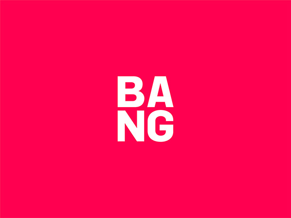
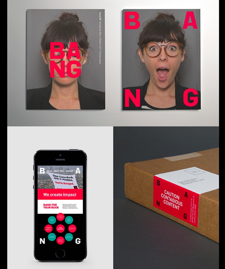
Here is one brand design that catches my attention fully for its simplicity and vibrancy. Hope you feel the same way.
Bang, a company I had never heard of, is a PR agency and I like the extensions of this brand from coffee mugs to photos and more.
It is catchy. It is memorable. Hope you agree.
For more:
https://www.behance.net/gallery/19624819/BANG-Pr
Greetings we like
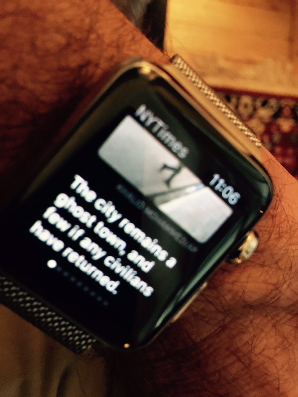
It's personal. It's positive. It's from The New York Times. Who'd say?
As part of its morning headline service, the NYT now adds a headline about the weather and a friendly message:
Headline: Fair and Fall LIke
Greeting: Good morning on this resplendant Wednesday.
Feels good to get that before a summary of the headlines of the day.
The Times' folks are learning that, in the digital age, it must get closer and more personal. It works.