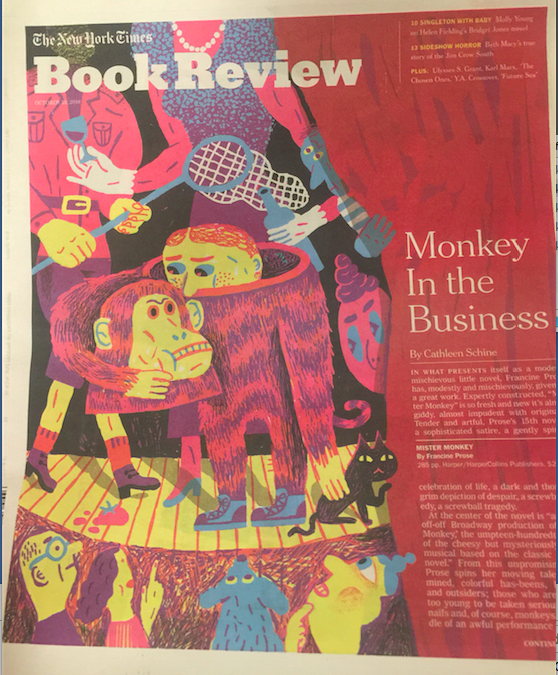
It’s very hard to read white body type over a reddish background.
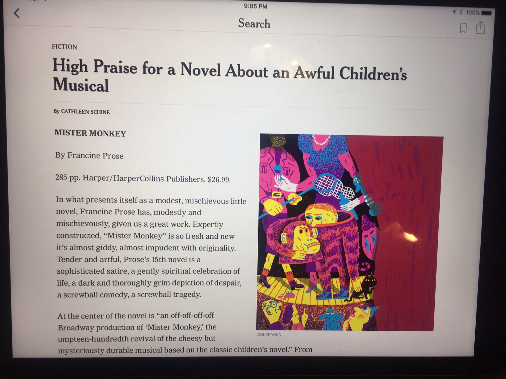
Today we have the advantage of reaching for our tablets to continue reading what was impossible to read in the printed edition: but it shouldn’t be that way.
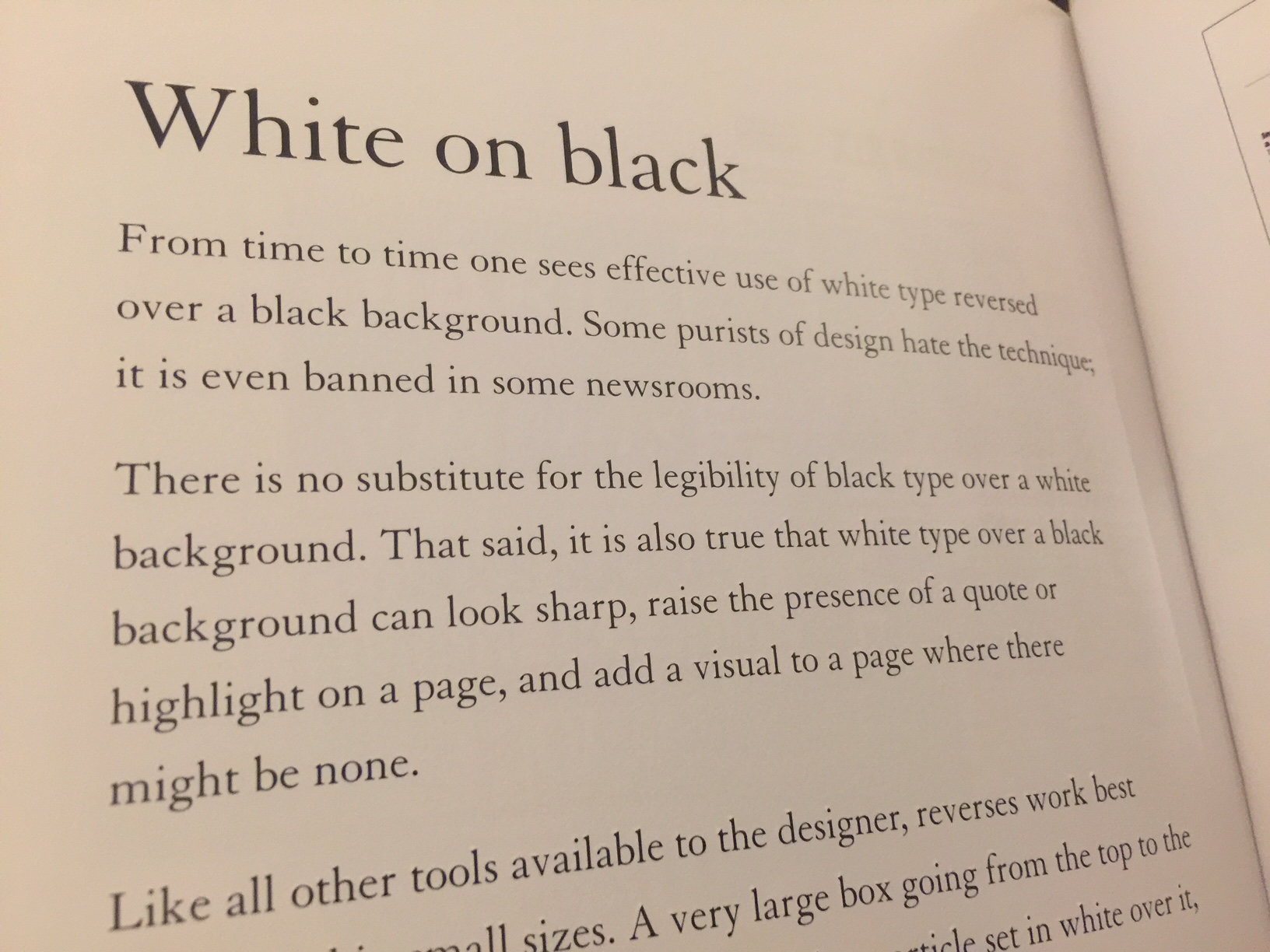
I maintain what I wrote in my book Pure Design
I admit that the older I get the less patience I have for use of color backgrounds with text type over it. Of course, it has to do with aging, I admit that. But I felt the same way 35 years ago.
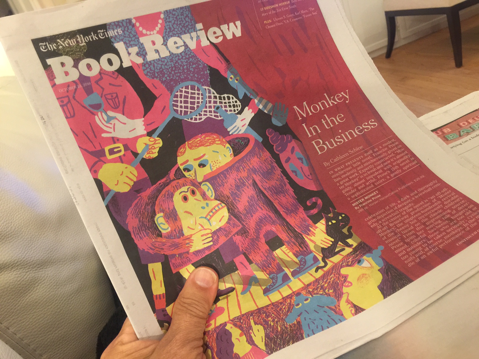
I was getting ready to read the Book Review in the Sunday New York Times, then hit upon the worst obstacle right on the cover. This leads to frustration and to abandon the printed copy in my hands and reach for the iPad Pro where I was able to continue reading the article.
As I wrote in Pure Design (2002), “There is no substitute for the legibility of black type over a white background.”
I still maintain that.
When the headline misses the point?


When the headline misses it: such is the case with this headline today from the Financial Times. It reads: Tequila and sympathy: Clinton courts the Hispanic vote in Florida.
This headline would have worked well for areas of the United States where the majority of Hispanic voters are of Mexican heritage, but not Florida where Hispanics tend to have more Cuban and Puerto Rican roots.
While I understand this is a take on Tea and Sympathy, a 1956 film, the headline writer should have done a little homework and realize that perhaps Mojitos and Sympathy, or Cuba Libres and Sympathy, would have been more appropriate for Florida. Better yet, maybe a Tequila Mojito and Sympathy (a real concoction) would have been more appropriate.