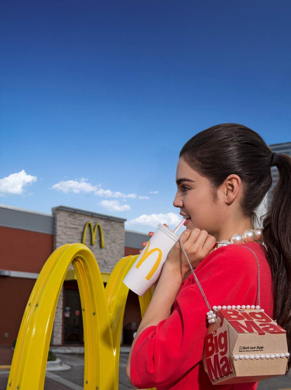
Perhaps that McDonalds restaurant near you has already adopted the new branding palette that the folks from Boxer have created for the place with the golden arches. I admit I had not seen any of it, as I only set foot at a McDonald if a grandchild makes it a point of me taking him/her there. Fortunately, for whatever reason, they have not made such request lately.
Although I would probably have liked to come in to admire these new styles, which are referred to as “dynamic and fresh, playful and mobile billboards.”
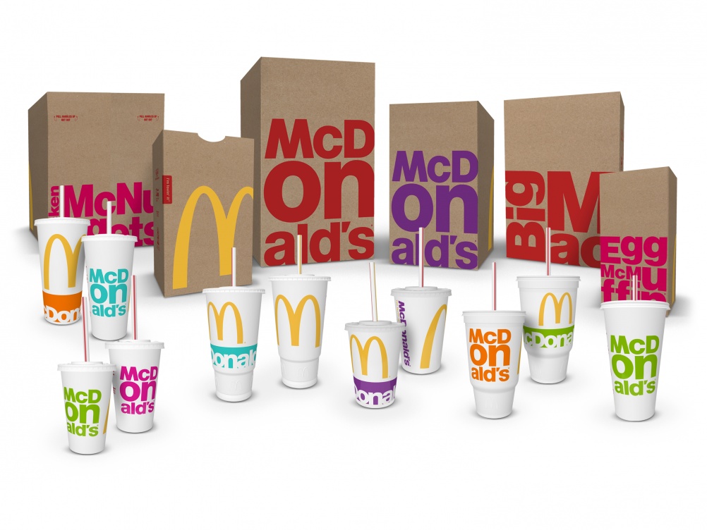
If the use of large type accomplishes all of the above, then McDonald's has accomplished its goals. I find the new look of bags, mini burger boxes and cups to be appealing.
McDonalds commissioned the guys from Boxer Brand Design to come up with new concepts. The familiar pictograms and illustrations have been replaced by bold oversize graphics and a color palette which includes purple, cyan, magenta, orange and lime green along with the traditional red and yellow.
So, not only has McDonalds gone for a healthier menu (such as favorites under 400 calories and a variety of salads), it has also gone for look & feel that a more progressive and youthful appeal.