Postmedia of Canada today launches the first in a series of transformational changes for eight of its newspaper titles. Today's relaunch of the Ottawa Citizen is not only a new look and visual identity. It is also a total rethinking of how news is edited, designed and distributed in the digital age.
As more titles launch the new concept, I am sure that the industry will be watching with interest, since this is a case study of how to give each platform—smartphone, website, tablet and print edition—its own place in the “media quartet,” letting the content and design adapt to each.
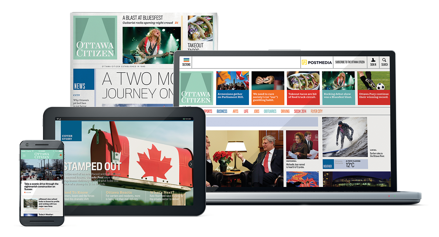
Below is a case study of our collaboration with the talented teams at Postmedia and the Citizen over the past months. But first, visit the new ottawacitizen.com on your phone, tablet or computer, then download the smartphone app for iOS or Android and the tablet app for iPad.
And for more about the tablet app in particular, please visit our post, “Ottawa Citizen for iPad: Precisely what a tablet edition should be.”
We love this video campaign for the new Ottawa Citizen by Sid Lee: “Trending since 1845, reimagined for today.”
In the beginning
The project began with an early 2013 meeting in sunny Miami Beach, when Postmedia's Wayne Parrish and Lou Clancy came to meet with me while I was on a New Year's vacation.
Wayne is COO and Lou is Senior Vice President for Content. Together, they have been mapping out the strategy for a total rethinking and revitalization of Postmedia Network, the largest publisher by circulation of paid English-language daily newspapers in Canada, representing some of the country’s oldest and best known media brands, including the National Post, Ottawa Citizen, The Gazette of Montreal and The Vancouver Sun.
Our meeting was about how to take Postmedia's metro dailies, which circulate in eight cities, to a more unified philosophy for presenting the news, while allowing them to preserve elements of their DNA and locale.
From the start, we knew that the first discussion had to be about the media quartet—how the dailies could take advantage of all the platforms now available to them.
At the first workshop, our art director and project manager Reed Reibstein and I introduced concepts demonstrating the importance of the media quartet and setting the stage for what was to come over the following months.
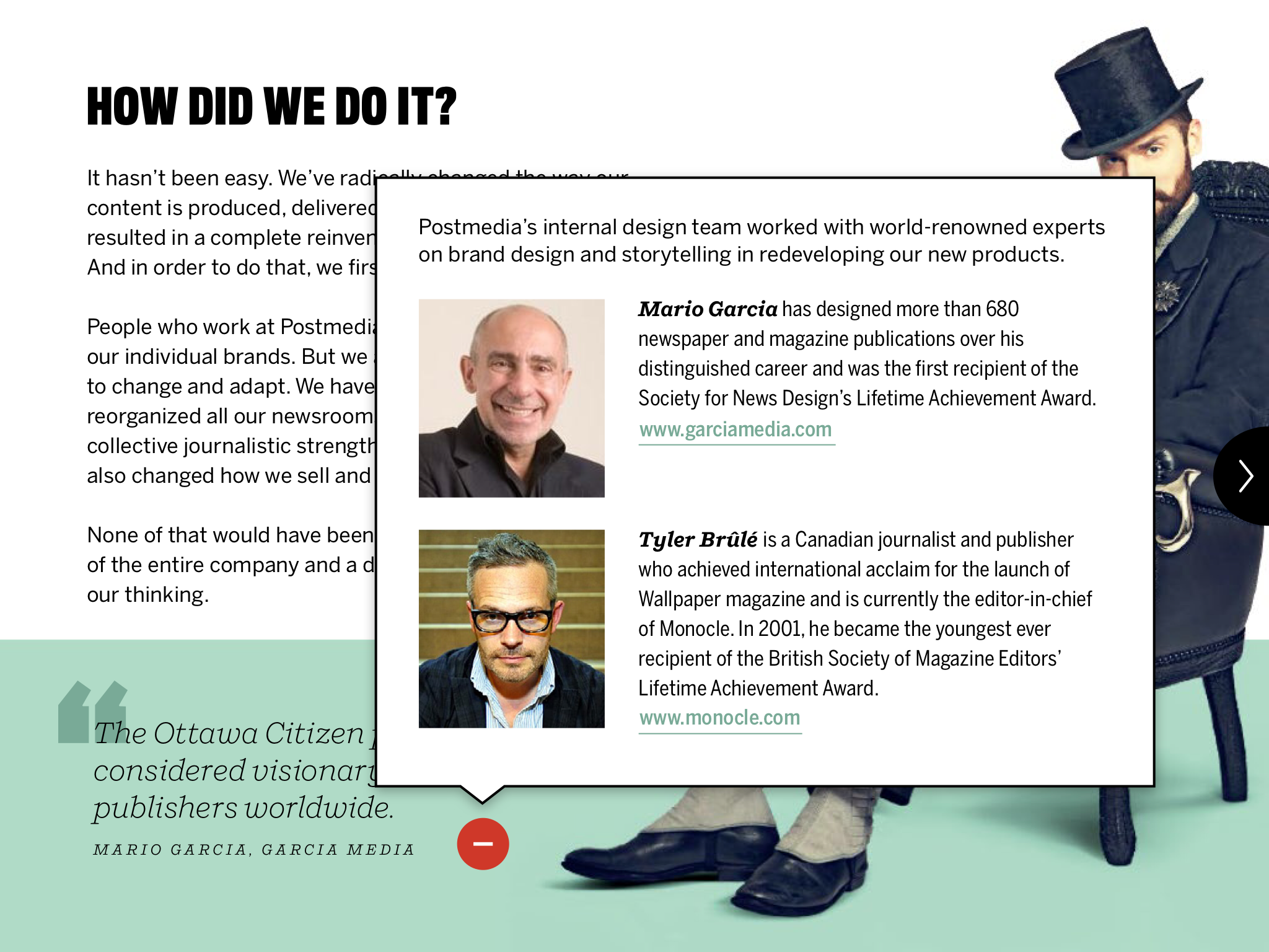
Our partner in this project was the project's creative director, the talented Gayle Grin, design director for the award-winning National Post.
The concepts Reed and I presented at the first meeting for tablet, print and mobile
Our first workshop emphasized mobile platforms, so we began by showing how a tablet edition might appear, for example. But a key element of the entire process was that all four platforms were always present in all our discussions.
A goal of that first workshop was to emerge with a clear concept of where the Postmedia of 2018 would be positioned.
From the workshop, we emerged with these three key goals:
1. Develop an overall editorial philosophy for a deep digital presence across all the newspapers.
2. Create a unified look so that visually there would be common elements running throughout them all.
3. Find ways to adapt stories to the platform in which they appear.
After the workshop, Reed and I worked closely with Gayle and several other Postmedia designers and editors to explore options for all the platforms. Particular areas of concentration were storytelling strategies, content flow and sectioning, the role of each platform and considering how a digital-first approach affects newsroom dynamics.

Prototypes for mobile, tablet, web and print by Andrew Spearin, Pegie Stark Adam, Matthew Warland, Gayle Grin and Carl Neustaedter. The Gothic-style logo and purple color scheme in prototypes were originated by Jacob Bryce, McMillan.
We worked with these designers and editors to bring the many smart ideas represented into a single set of “unified” media quartet prototypes. These would be the basis for the final print and digital products that appear today.
An early decision was made to introduce the new philosophy one newspaper at a time, starting with the Citizen, which had already begun a separate redesign project at the time and was eager to be a laboratory for the other papers.

The “unified prototype”
Developing an overall editorial philosophy
The new Postmedia editorial philosophy was based on concepts that are the foundation of what I call iWED (integrated Writing-Editing-Design):
1. With iWED, the formula is that 60% of the products must be based on templates to facilitate production, but 40% offer surprise and serendipity.
2. It is the job of the editor and designer to make sure that each platform is used to its full potential.
3. Gone are the days when an editor and designer planned for only one user experience. Instead, digital first means editing and designing across all platforms with all available and relevant tools, including video, audio and social media.
4. Designers need to get out of the mindset of designing a page or a screen. Instead, they must think of designing experiences, from the moment someone taps on the app icon or opens the paper.
5. Particularly for mobile, designers must learn how to accommodate constant interruptions, using clear navigation and hierarchy to guide users throughout the product.
Cohesive elements across platforms
To bring the platforms together, we emphasized key points of continuity across them all:
Information architecture: simplifying content
via @StuMillsCBC
A key point of our discussions was reviewing the content flow in a typical edition of the Citizen. What existing content needs to be enhanced? What content do we now have that should be eliminated as no longer relevant?
More importantly, how could we come up with a set of “buckets” that indicated content quickly in an easy to navigate manner.
The result? Three buckets–Ottawa, Context, You—across all platforms.
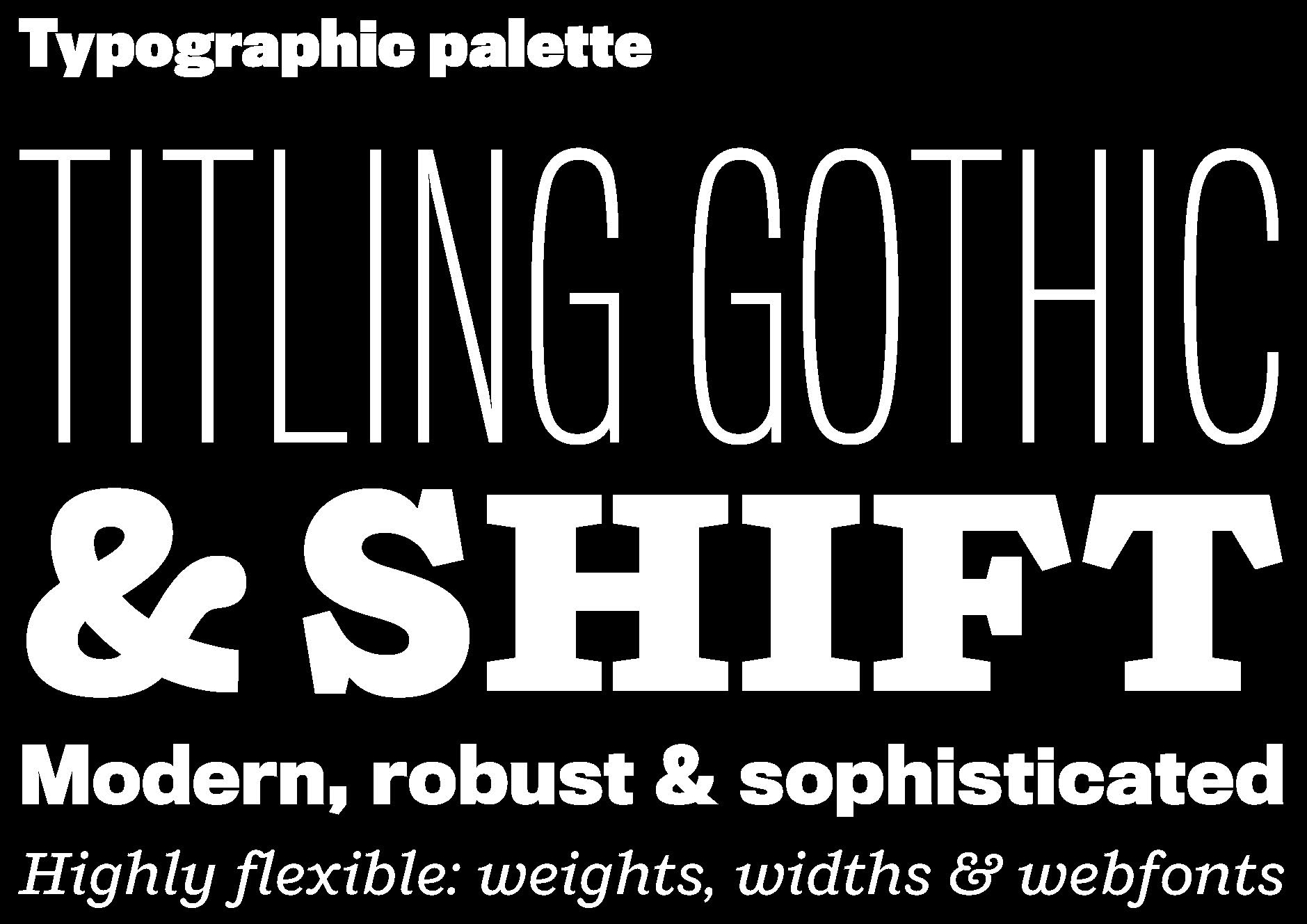
A flexible typographic palette
Working with Gayle, we recommended two main type families to lead the Postmedia visual identity in print and digital:
Titling Gothic FB from Font Bureau, an impactful sans-serif with many weights and widths to cover dramatic headlines and clear subheads alike;
Shift from MCKL, a warm slab-serif that acts as an approachable counterpoint to Titling Gothic.
Benton Sans, Chronicle Text, and Georgia are used for captions and body text across different platforms.
The color palette
The buckets are color-coded with a bright palette. Copper green is the Citizen's nameplate color, with a rich blue for “News,” a deeper green for “Context” and a vibrant orange for “You.”
A pillbox logo
The “pillbox” (square) logo was a crucial element of the new design, working equally well on the small canvas of a smartphone as in print. Squares are also used as a motif throughout the digital and print editions, notably to signal the three buckets and other sections.
The Citizen's pillbox logo was designed by Winkreative under the direction of Tyler Brûlé.
A closer look at the four platforms
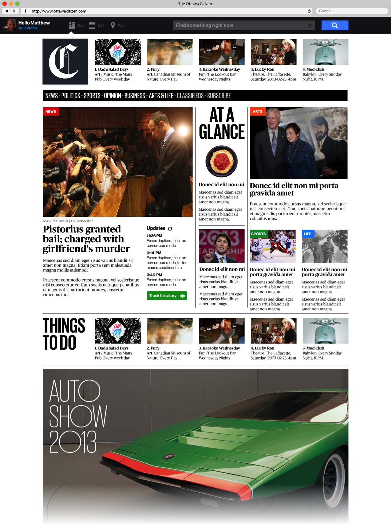
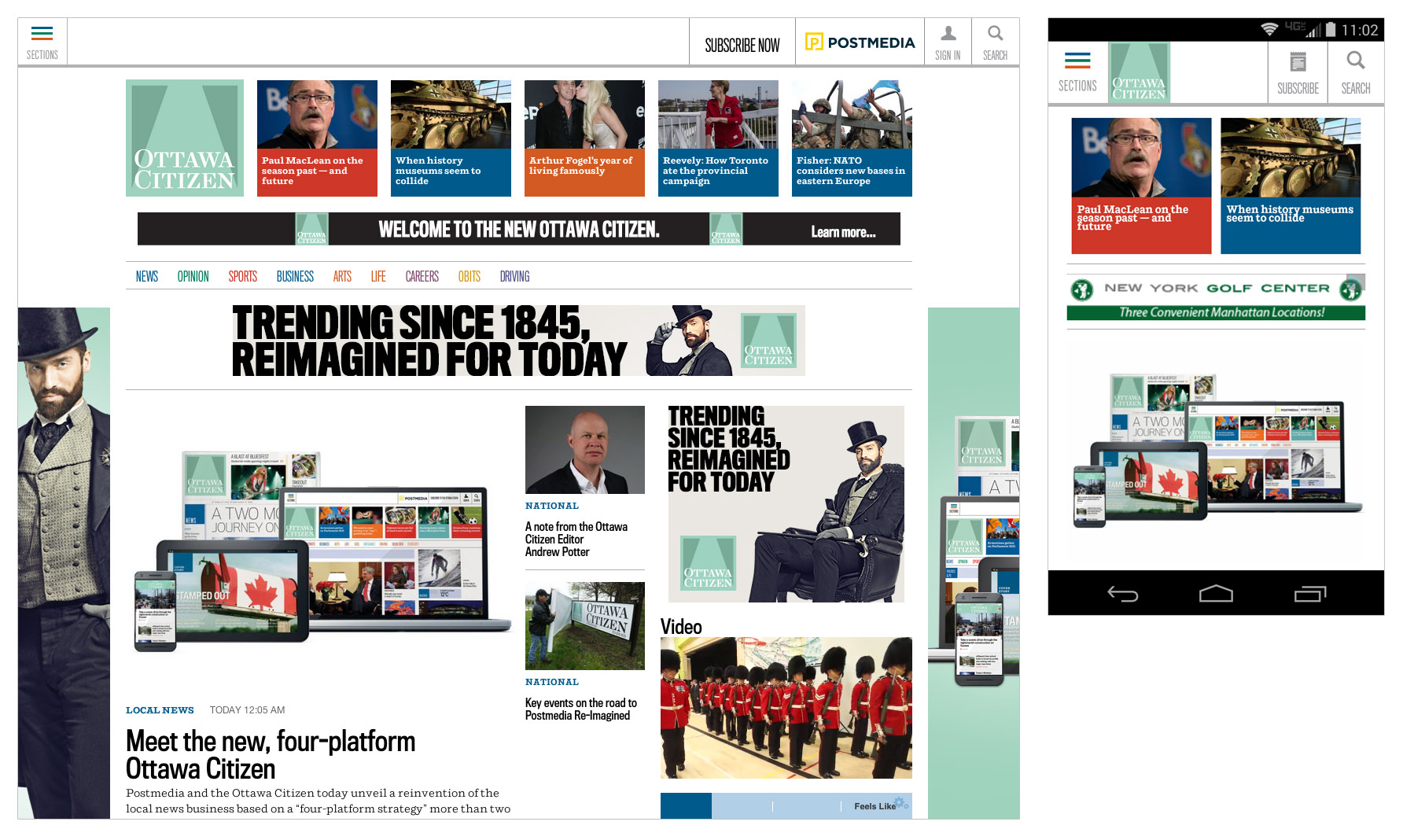
Responsive website
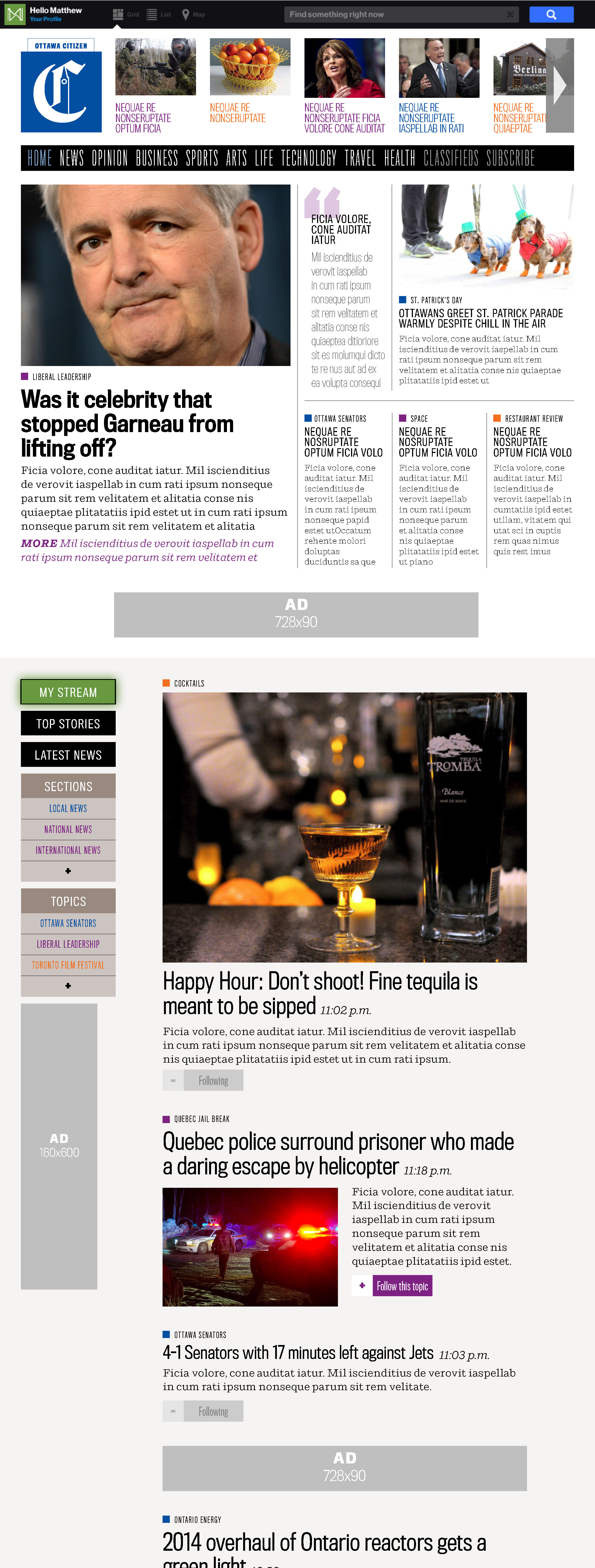
ottawacitizen.com is now responsive, working on every device from smartphone to desktop.
From Postmedia's announcement of the new Ottawa Citizen: “The responsive-designed websites comprise the 'digital hub,' always on and always up-to-date, designed for search-driven audiences with breaking news, features, columnists, opinion, video, audio, interactive media, archives, blogs, special sections and social media.”
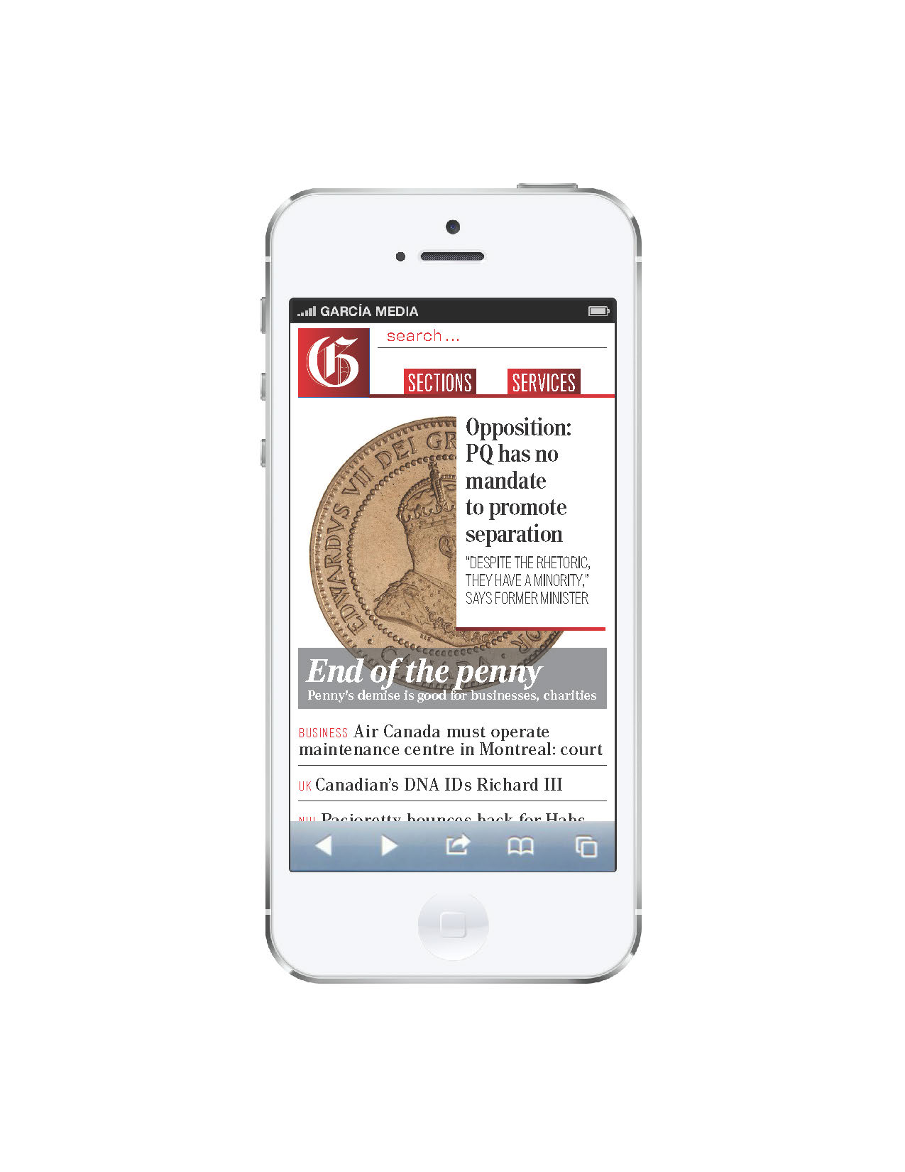
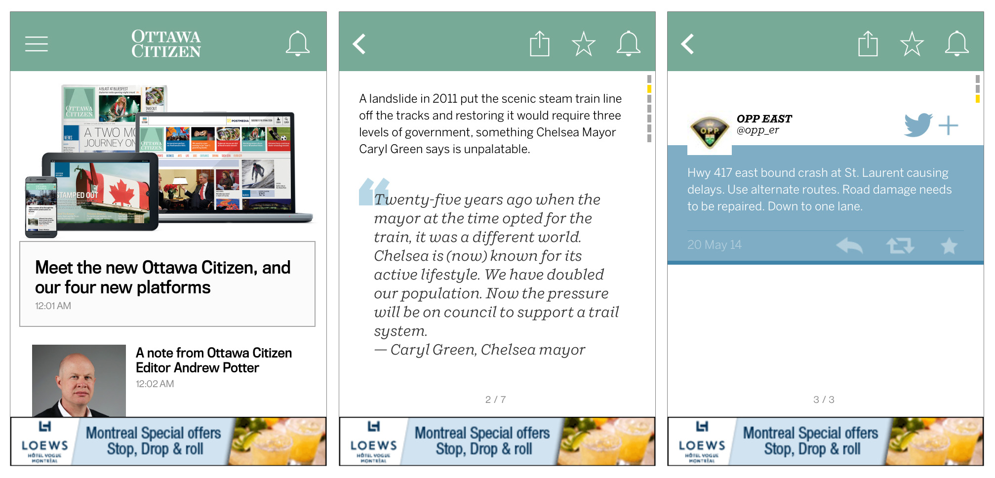
Smartphone edition
For iOS and Android mobile phones, the focus is fast and local, with short and snappy updates created by a dedicated editorial team.
“The smartphone app is the local, always-on product designed for the skimming, sharing, mobile audience, with links to the web for non-local news. It speaks in its own, distinct voice, and is created 18 hours a day for the small screen and audiences on the go. Think of it as micro- blogging meets talk radio.”
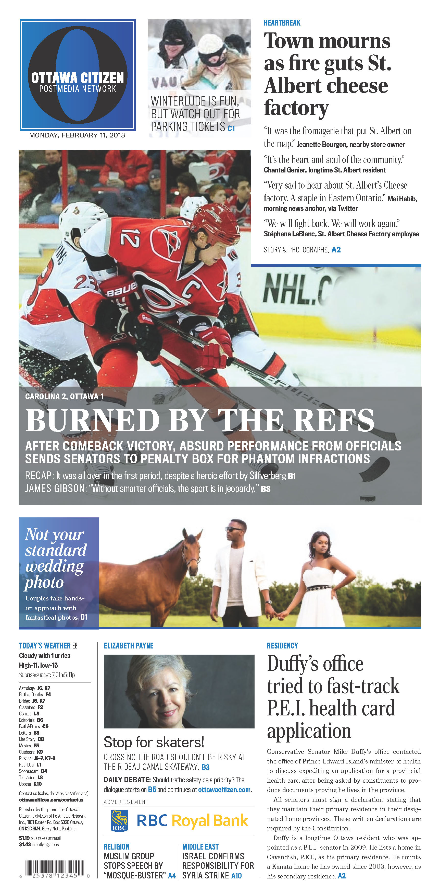
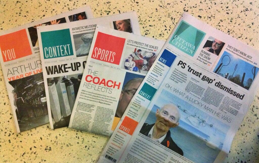
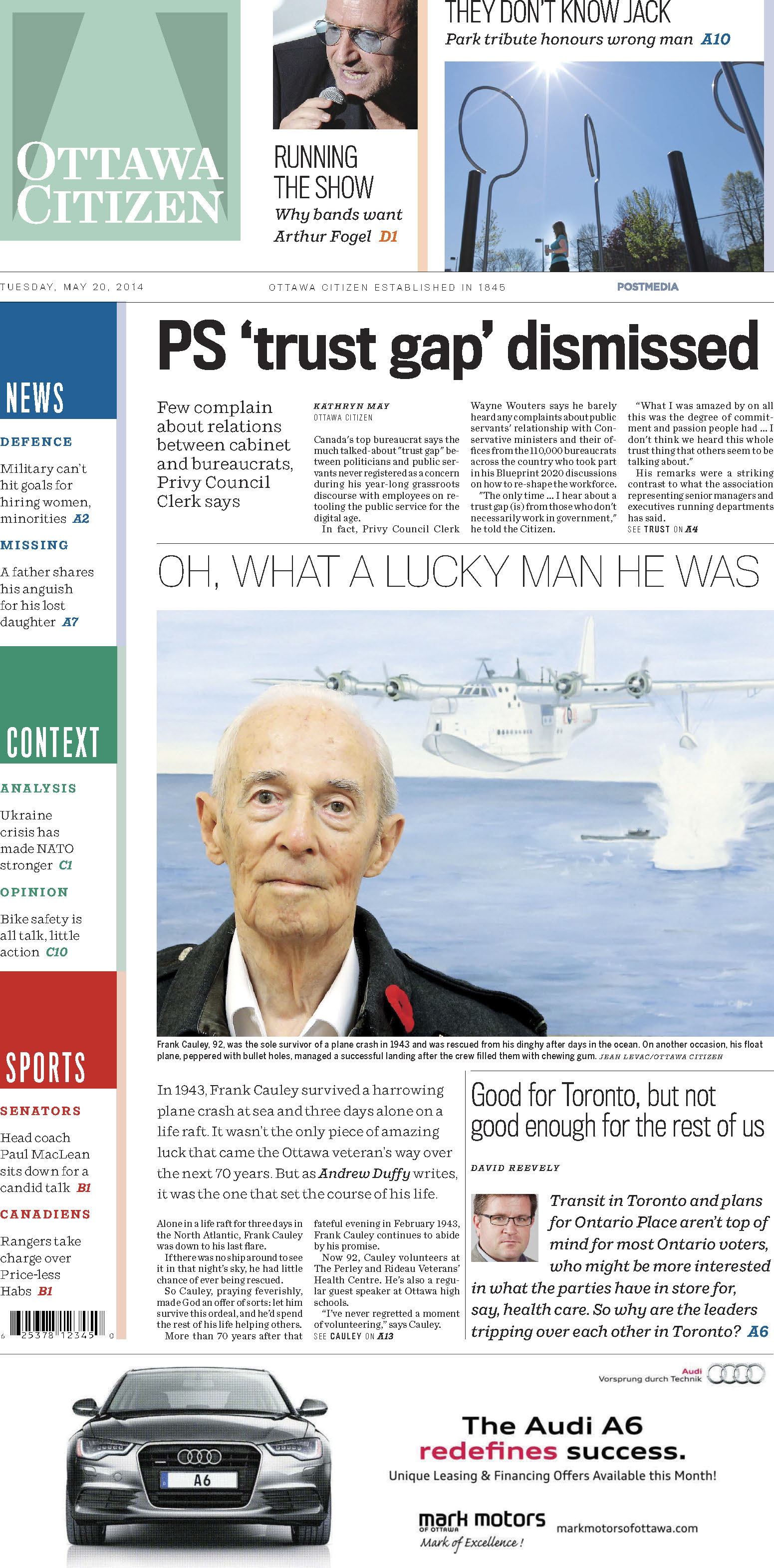
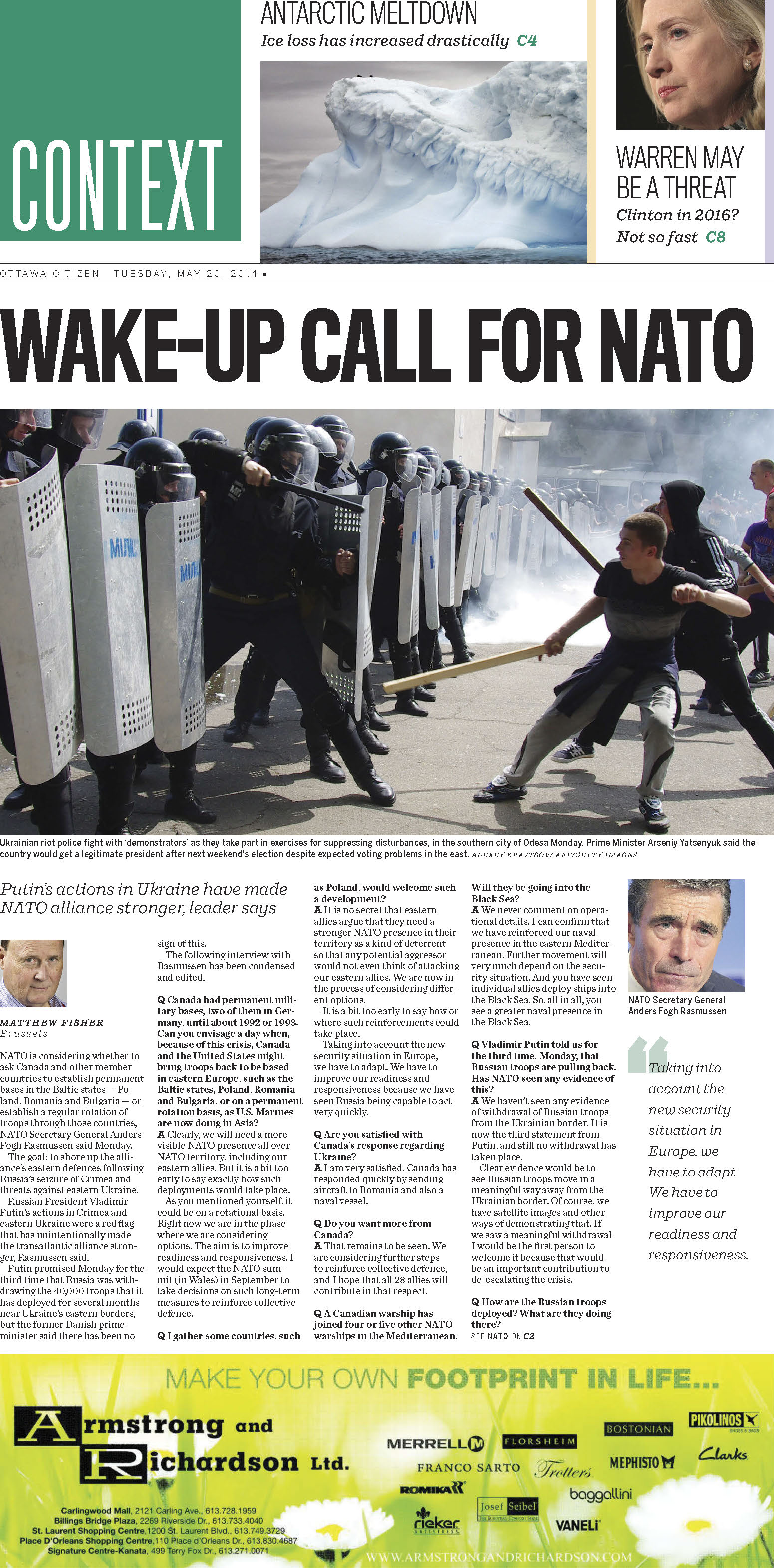
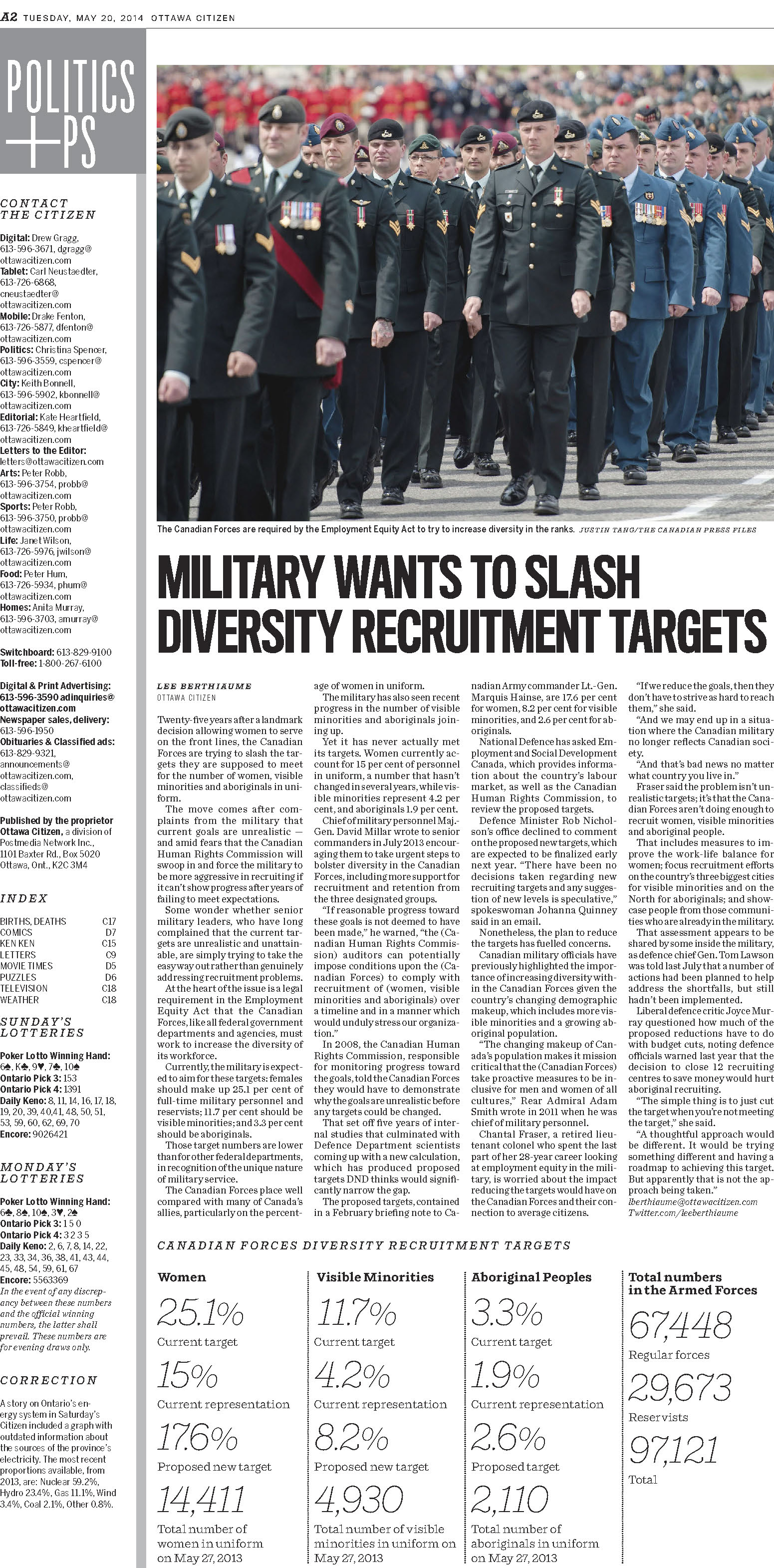
Print edition
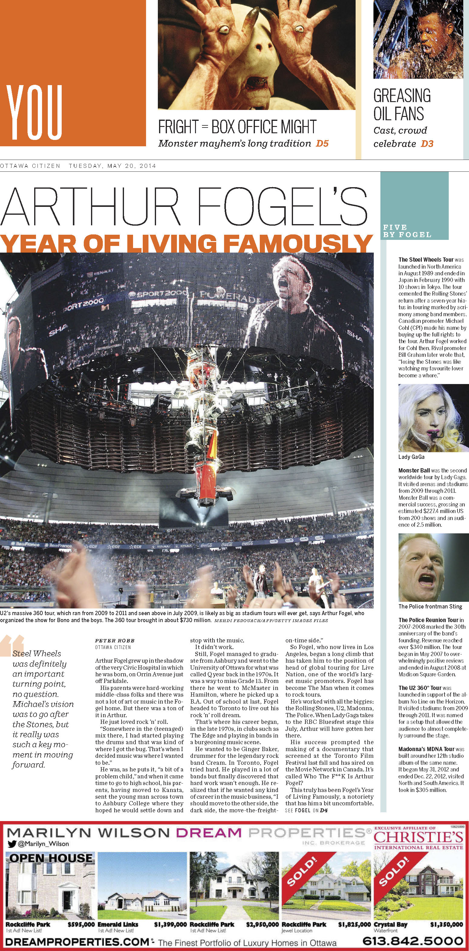
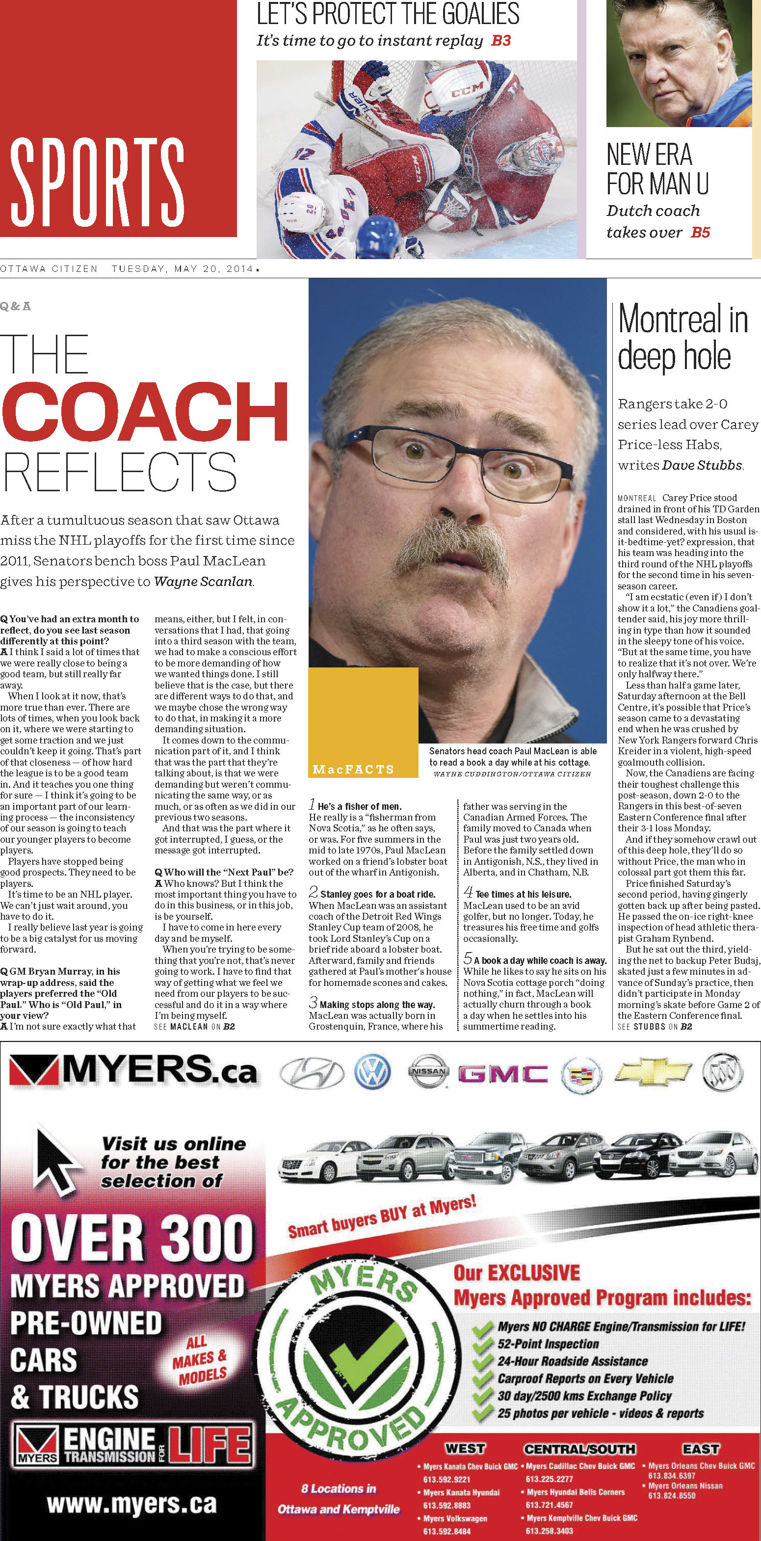
Today's print edition is far more dynamic than yesterday's, powered by an energetic new type and color palette. This is a newspaper that is “doing print happily,” using the broadsheet canvas to display large headlines and photos.
“The newspaper features insights and analysis for an informed and passionate morning audience. It offers deep engagement with Postmedia’s best journalism. New, color-coded sections provide easy navigation.”
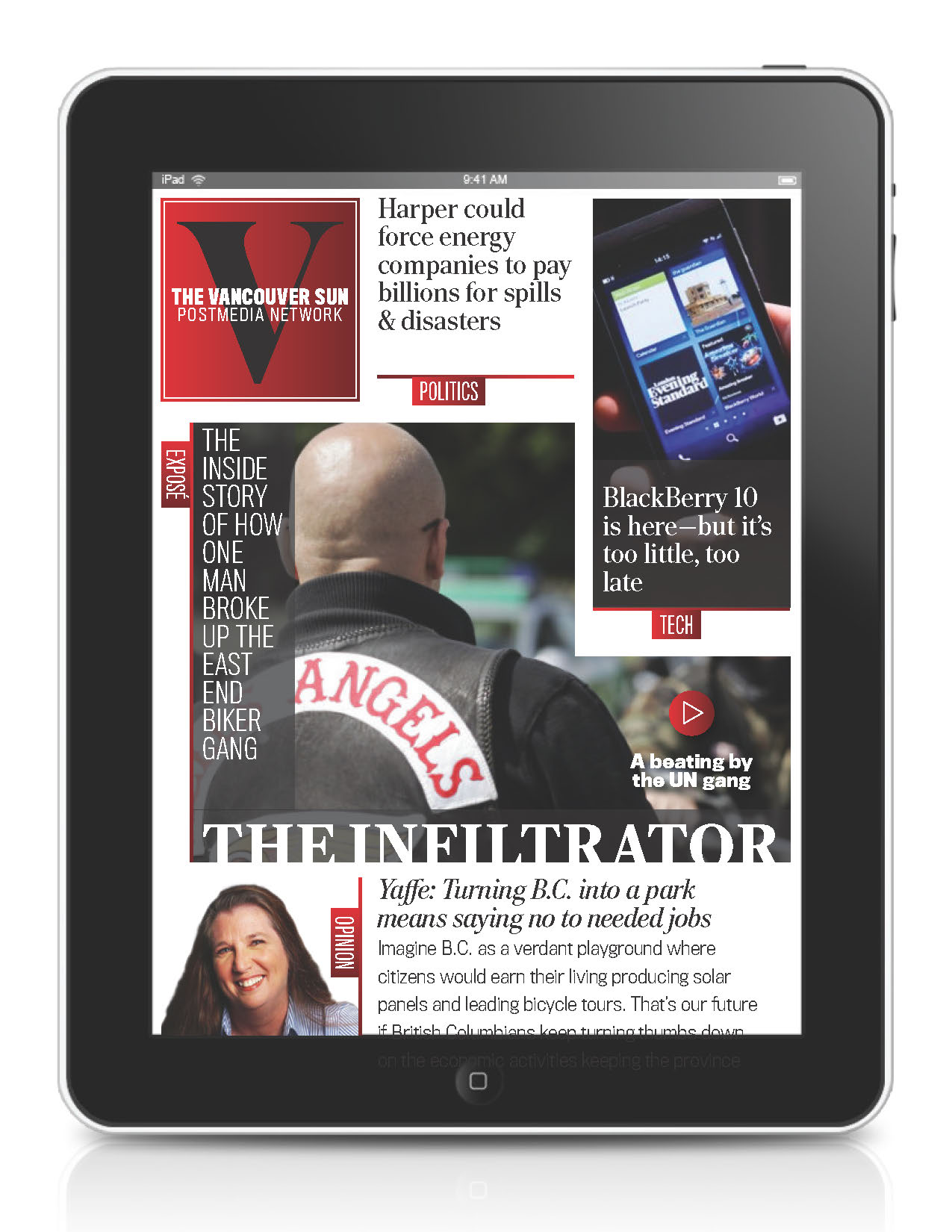
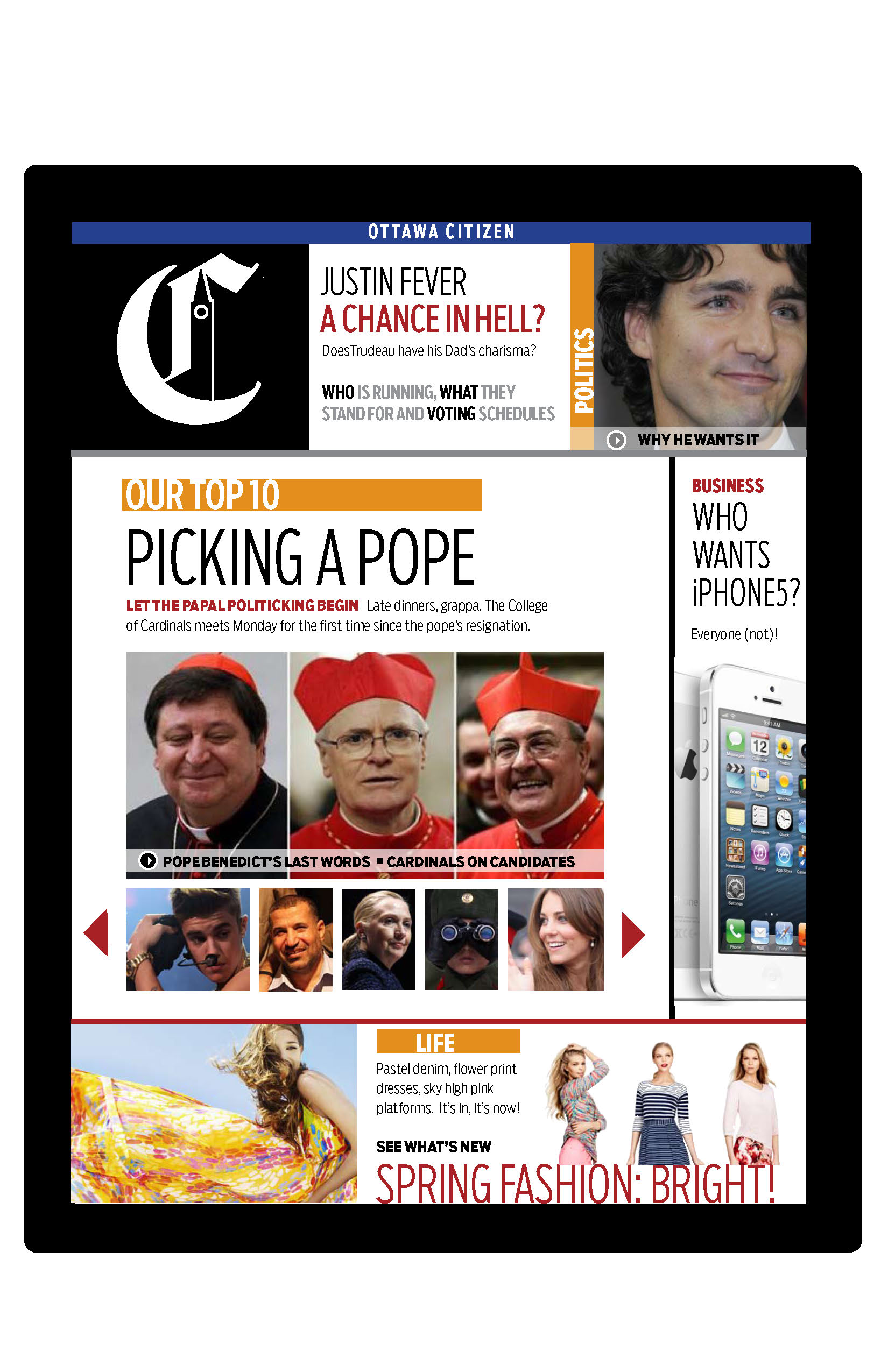
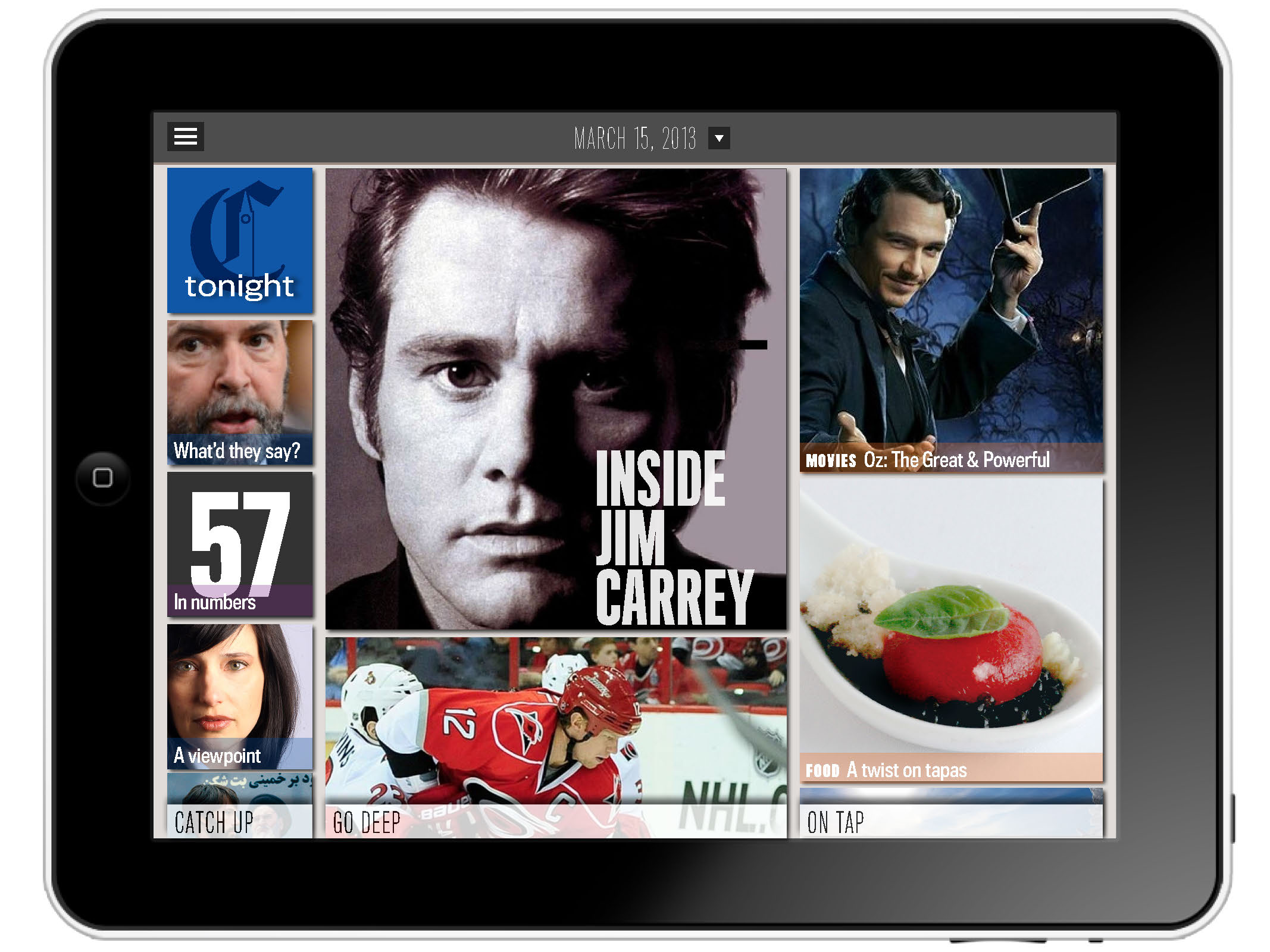
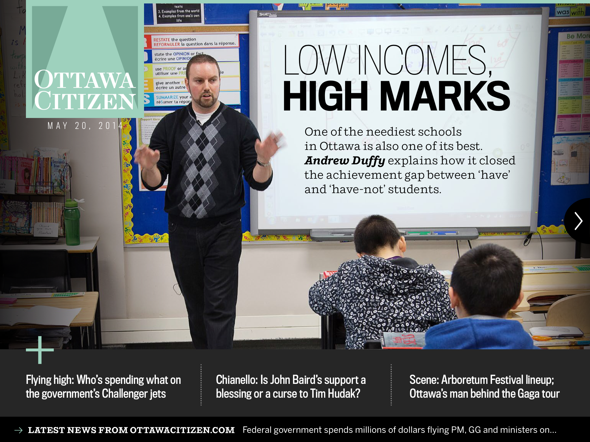
Evening tablet edition
The Citizen's new iPad app is wholly different from the website and print edition. At 6 p.m. each day, a dedicated team will release an edition edited and designed from the ground up to take advantage of the tablet. It will have interactive “pop-up” moments galore, along with video, photos, audio, and of course text.
“The new 6 p.m. news and current affairs tablet magazine is a feature-driven, animated, vibrant approach to storytelling. It illuminates, illustrates and expands on the news of the day through an interactive story format.”
Quotes from our colleagues at Postmedia
We asked some of our collaborators in the Postmedia “Project 2.0” team to give us their takes on this exciting launch.
Wayne Parrish, Chief Operating Officer, Postmedia
I remember Lou Clancy and I debriefing at the hotel bar just afterward (our first meeting with Mario), replaying two moments of the afternoon's conversation—one where Mario focused on the importance of putting story-telling at the heart of everything, the other where he began describing his “media quartet” and we realized it was our “four-platform” strategy put more lyrically—and me, channeling my inner Bogie, murmuring, “Louis, I think this is the beginning of a beautiful friendship.”
Lou Clancy, Senior Vice President for Content, Postmedia
It's been an extraordinary whirlwind of a ride since Wayne Parrish and I first met with Mario 16 months ago. Our newsrooms are transforming at an ever increasing rate. The people at our petri dish, The Ottawa Citizen, have not just embraced change, they are driving it.
The Citizen was a traditional newspaper, a good one, but one steeped in a print ethos. Today, it is a leader in a brave new world of telling stories in different and engaging ways on different platforms and to different audiences. It is a remarkable revolution that saw everything change — technology, workflows, newsroom structure, and most importantly, culture.
Mario has been a catalyst. His enthusiasm and belief in putting content and storytelling at the forefront helped give life to process. People across Postmedia now tell us they see a future.
For an industry that has invited Cassandra to the table for decades, it is a welcome change.
Gayle Grin, Creative Director, Postmedia Project 2.0, and Managing Editor of Design, National Post
The design is a pillar of our overall strategy, which is to connect with different audiences in different ways on four different platforms: print, web, smartphone and tablet. As creative director, I led a team of talented designers whose goal was to create a consistency of design across platforms while respecting the unique features of each platform.
We had a lot of fun working with reinvented nameplates, new typography, refreshed colour palettes, revamped page design and alternative story forms. It was an exciting process and it is a thrill to see it actually being implemented, the first of eight Postmedia sites to launch the new approach and design.
Wow! As it rolls out to the other metro papers it will reinforce the connectedness of the Postmedia brand and underscore our unity of vision across platforms for our advertisers. And readers will feel so respected!
Carl Neustaedter, Deputy Editor and Senior Tablet Producer, Ottawa Citizen
On the Citizen's tablet edition:
I’ve never been involved with a product that demands so much collaboration between editors and designers—and that draws on genres of print, web and broadcast, too. It’s what makes iPad editions so exciting. It’s challenging to produce, but as a visual journalist, it’s been a lot of fun for me.”
I’m thrilled that some of our reporters, photographers and producers have jumped into experimenting with different ways to tell stories. We’ve never made anything like this before, and it’s a tough process. But when it comes together, it’s pretty magical.
There are very few daily iPad news products. We had very few models to study. At first that was frustrating, but ultimately liberating. It forced us at every turn to examine for ourselves what was right for our audience and for our newsrooms. After we launch, that process will have to continue as we study analytics and make the calculation — as all media companies need to now — of the tradeoff between resources and the payoff in audience and advertising.
We can’t wait to see what the reaction to the iPad edition is. It’s a very different reading experience than what we’ve offered in the past. We hope our current readers will be intrigued and that people who don’t currently read us will find a new way to experience news.
Industry watchers constantly note that traditional media organizations like ours are far too conservative when it comes to innovation and change. They’re largely right, but I think what’s being tried at Postmedia is different. At the very least, the industry watchers will have more to discuss.
The response
On Twitter
The @OttawaCitizen new multi-platform relaunch is an excellent approach. Every news outlet needs to treat each platform as unique.
— Greg Donnelly (@gdon44) May 20, 2014
Mayor @JimWatsonOttawa enjoying his #NewOttawaCitizen! pic.twitter.com/JwPOLKNI8F
— Joanne Chianello (@jchianello) May 20, 2014
Seriously, I’ve never seen a better iPad app, anywhere. Completely reinvents the form.
— Andrew Coyne (@acoyne) May 20, 2014
Articles about the relaunch
Designedge Canada: Postmedia redesigns and reimagines Ottawa Citizen
Gigaom: The Postmedia chain is trying to rethink not just how people read its content but where and when
Charles Apple: A look at the “four-platform” redesign of the Ottawa Citizen
The Globe and Mail: Postmedia unveils Ottawa Citizen redesign
Financial Post: Postmedia rolls out reimagined Ottawa Citizen as part of new four-platform strategy
The Canadian Press: Postmedia unveils new app strategy in Ottawa aimed at bolstering digital future
The Canadian Journalism Project: Postmedia unveils new four-platform strategy for print, web, smartphone and tablet
Talking New Media: First look: Ottawa Citizen’s new afternoon iPad edition, with its magazine look and feel