This is the weekend edition of TheMarioBlog and will be updated as needed. The next blog post is Monday, September 12.
.We get some great news from our designer colleague Ole Munk, about his latest project, the Danish daily Kristeligt Dagblad
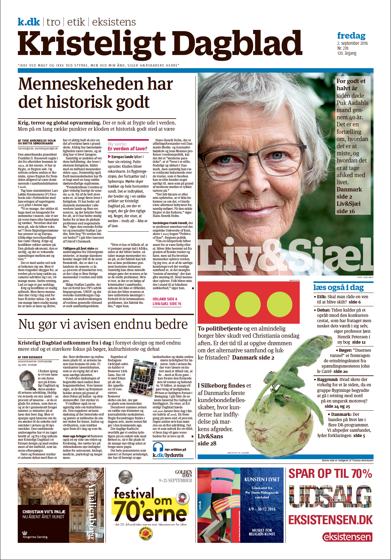
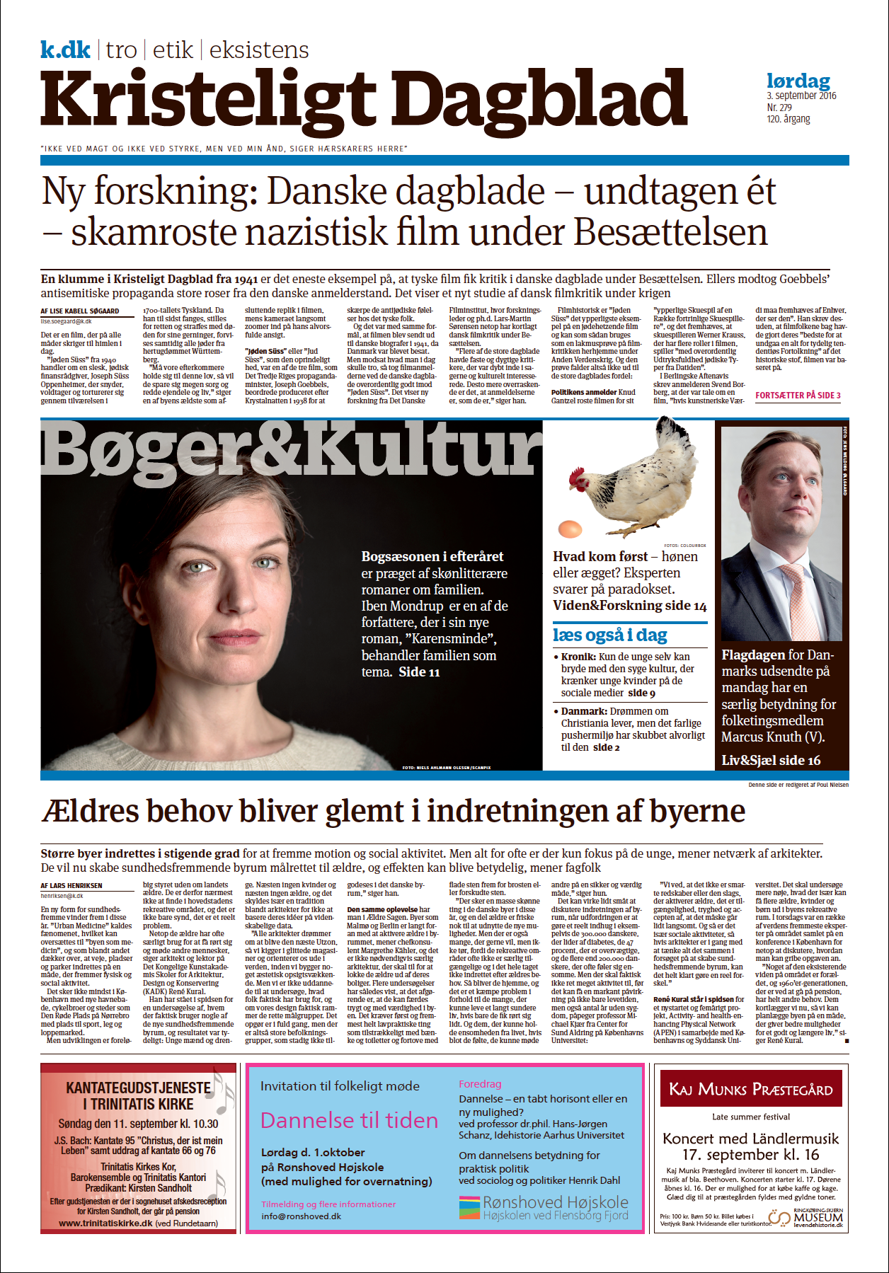
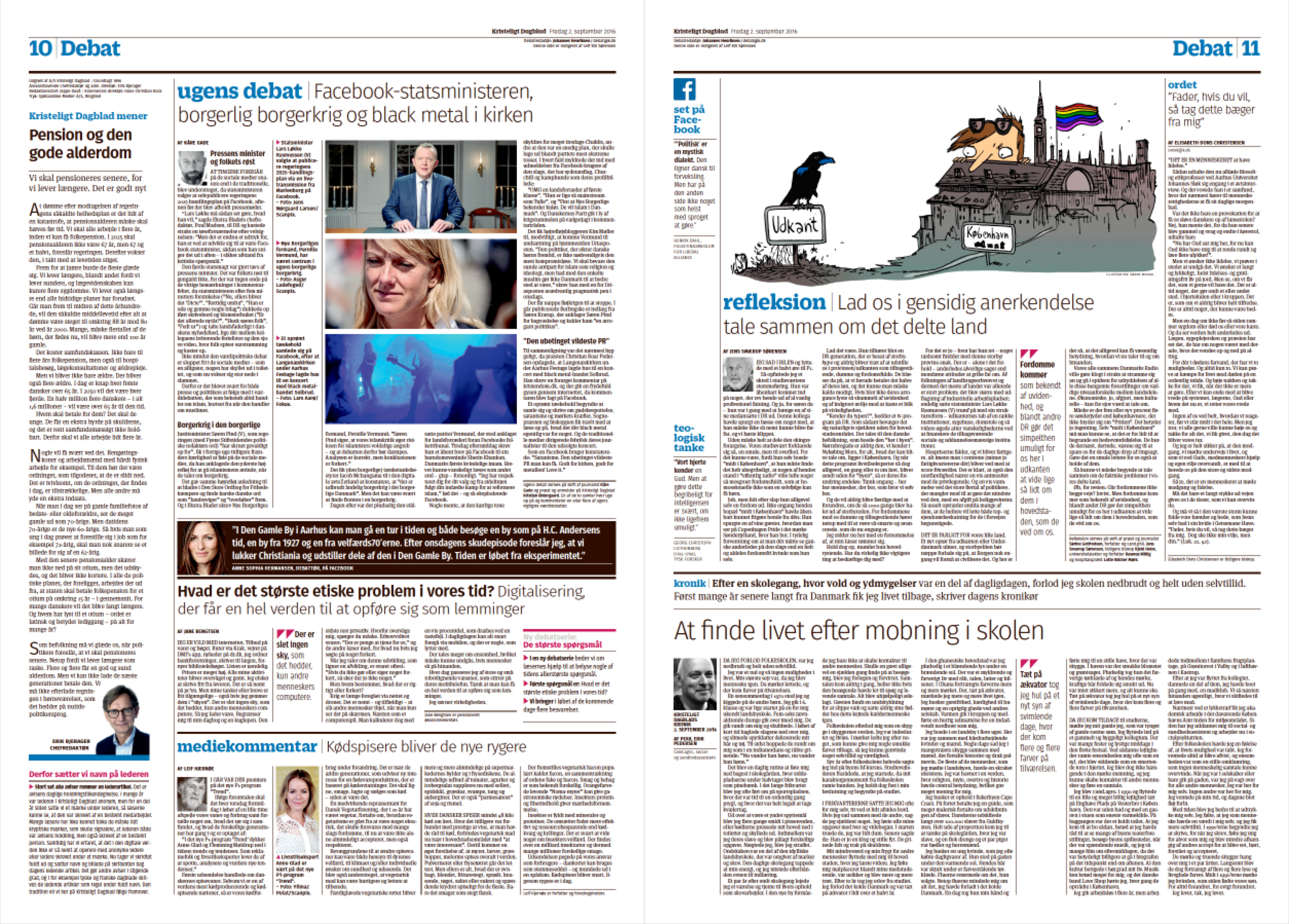
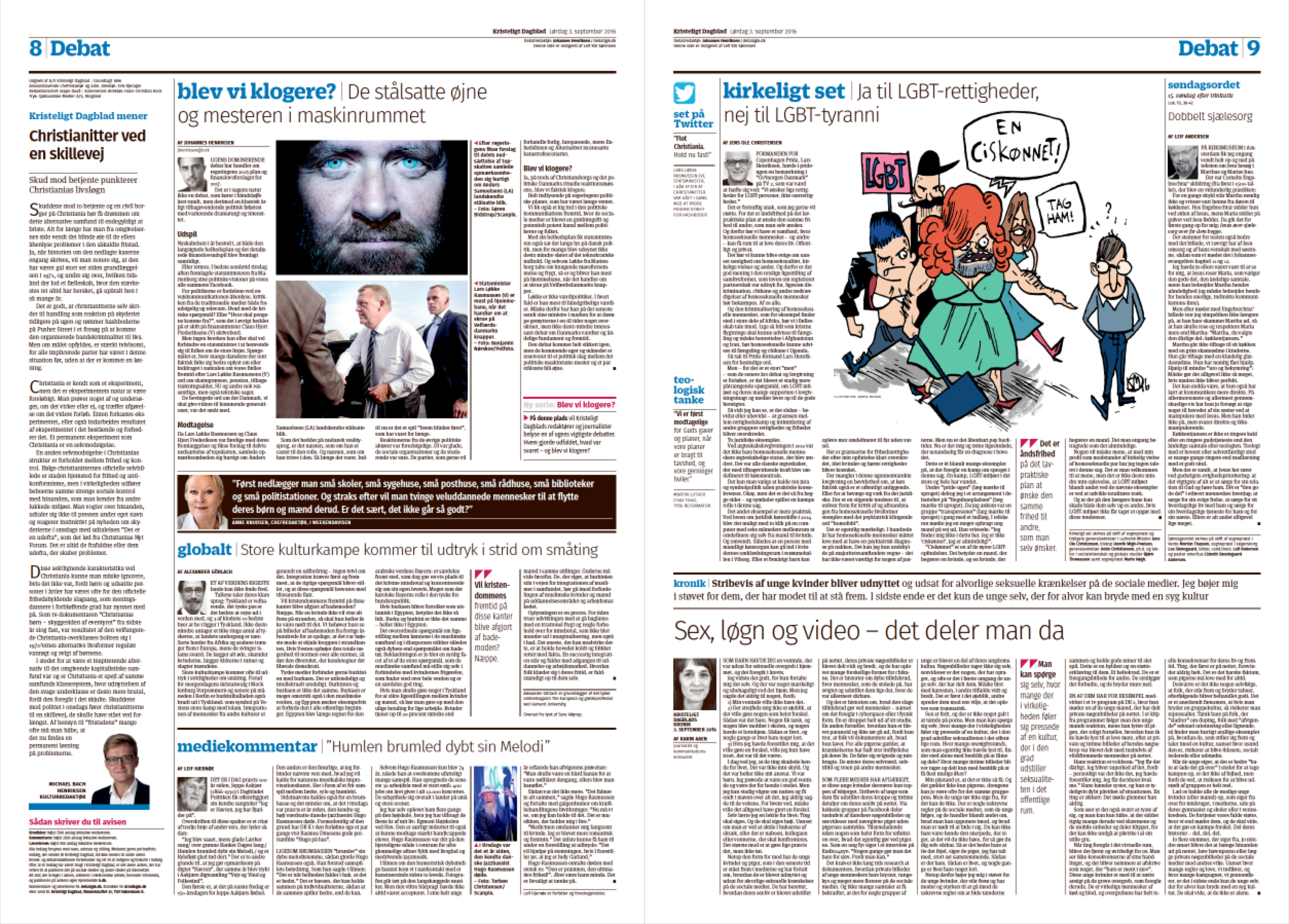
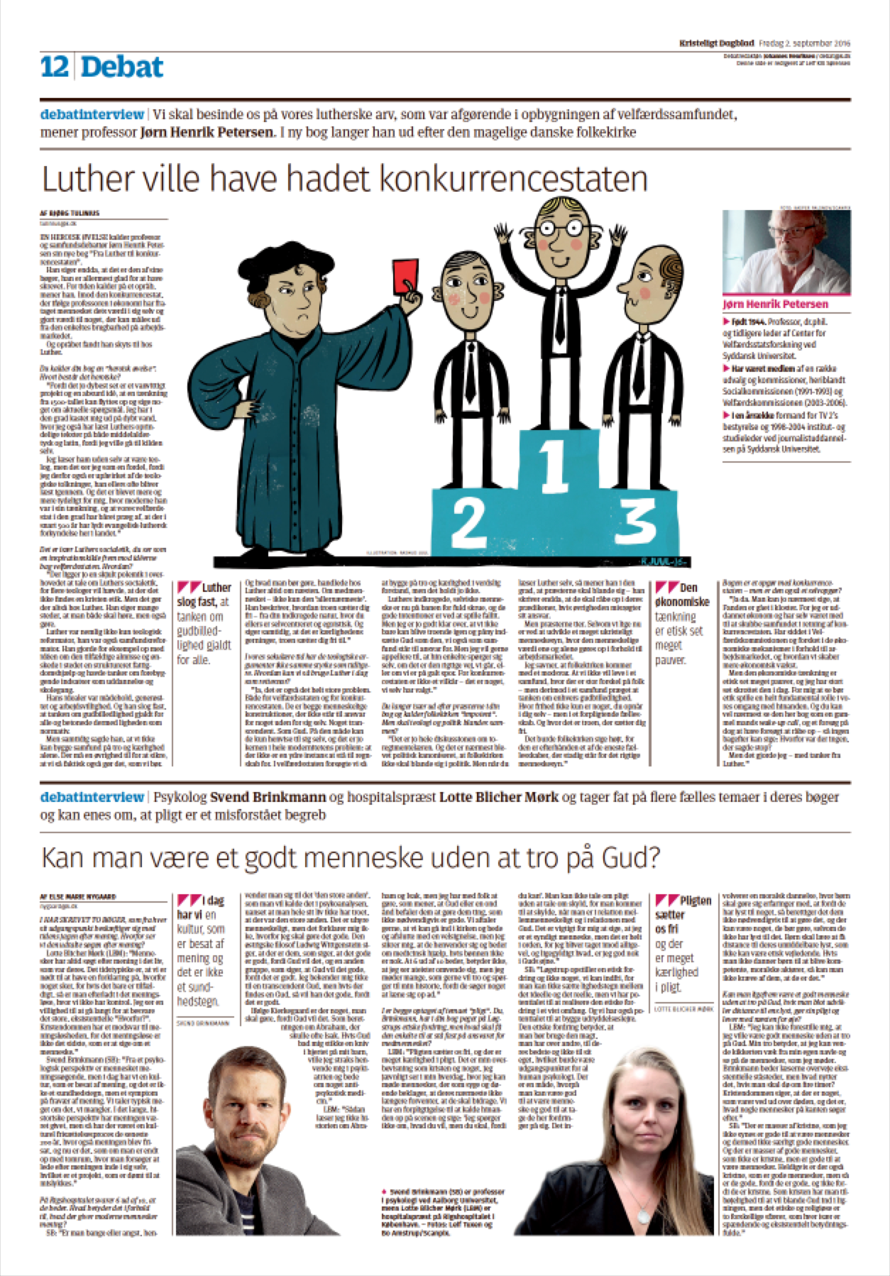
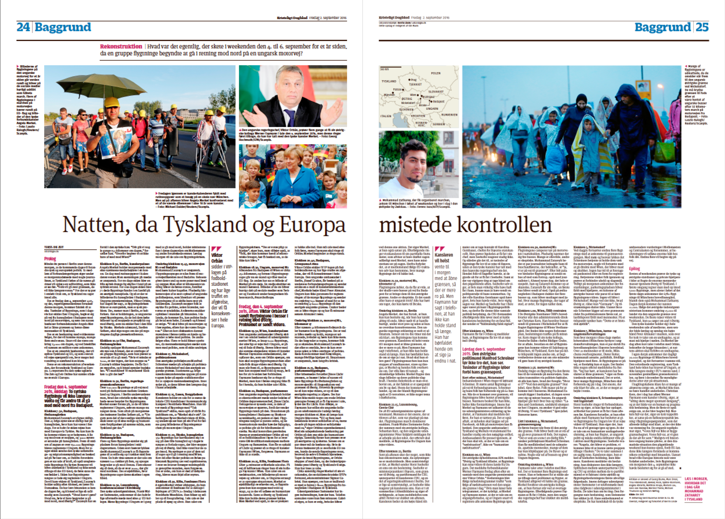
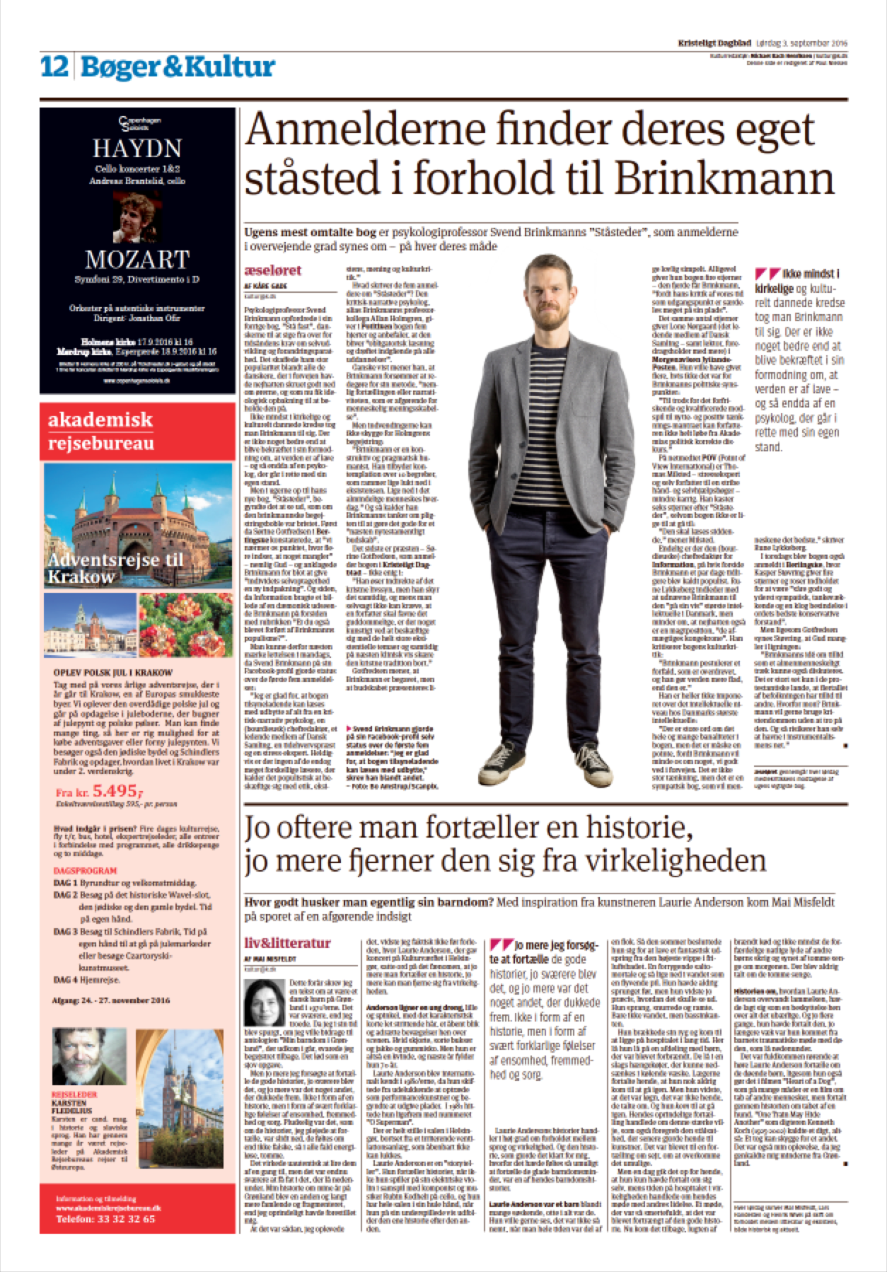
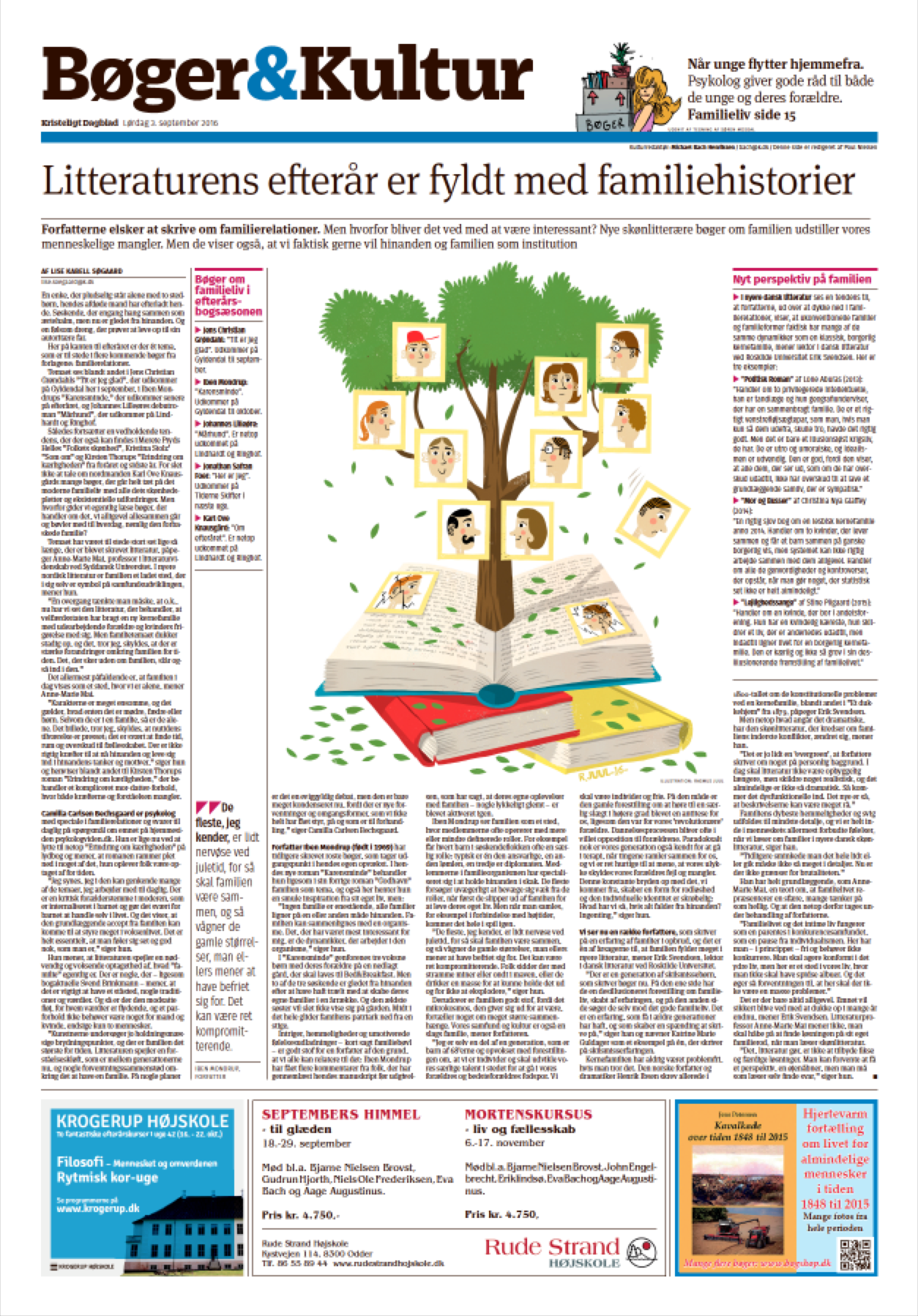
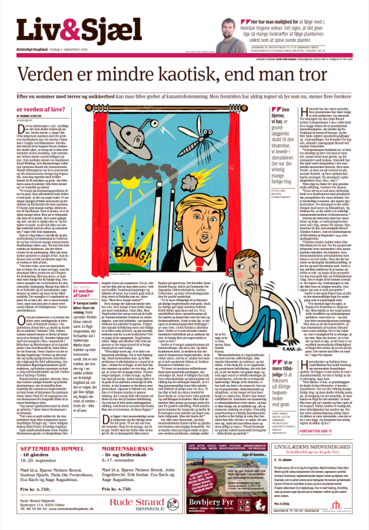
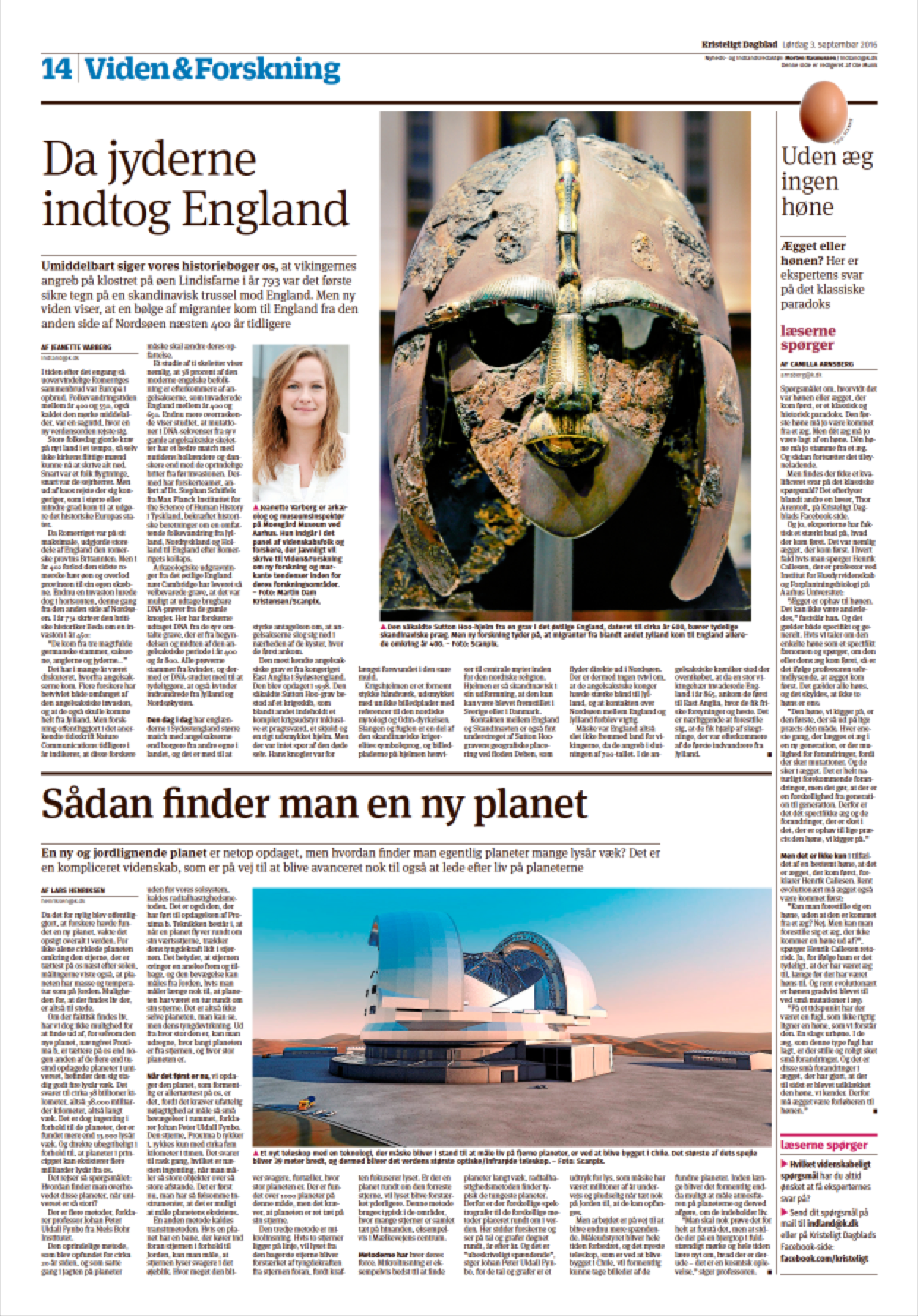
Kristeligt Dagblad, a 120-year-old newspaper, launched a new design and a content rethink September 2, adding new weekly pages about science and cultural history, while expanding its debate and book review sections.
Ole reminds me that this newspaper enjoys today its highest circulation ever at 27000+,
What to look for in the new KD?
In Ole's own words:
–The new has introduced a brand new nameplate, based on Duplicate Slab which has also become the main navigation typeface throughout the paper. Meta Serif continues to be Kristeligt Dagblad’s signature typeface, used for body text as well as headlines, while Fira Sans has replaced TheSans for secondary typography (captions, fact boxes, graphics, etc) and for the headlines of the distinctive and contrastful debate pages. The colour palette has been brightened and simplified and the use of graphic elements, such as dividers, has become more consistent.
Ole serves as Kristeligt Dagblad design director and is also a partner of the Danish design company Ribergård & Munk.
The newly designed Kristeligt Dagblad