_(dragged)_2_FRONT_JPEG.jpg)
_(dragged)_FLAP_ONE.jpg)
_(dragged)_1_FLAP_BACK.jpg)
_1_INTRO_jpeg.jpg)
_INTRO_2_jpeg.jpg)
_7OPINION_jpeg.jpg)
_9_JPEG.jpg)
_8_VIEWSjpeg.jpg)
_10_jpeg_bak.jpg)
_3_jpeg.jpg)
_5_jpeg.jpg)
_6_jpeg.jpg)
It was 2006 and a new financial daily was in the horizon for India. I remember getting a call from Raju Narisetti, Mint’s first editor with whom I had worked at The Wall Street Journal.
The minute he told me what his new project was, I was on board: the creation of a new financial daily for India, and the first in a Berliner format.
The work was intense. The camaraderie of the original team an inspiration. And so, on Feb. 1, 2007, Mint launched, as shiny as the coin icon that we placed over the “i” in its logo. A series of presentations, parties and galas hailed the newly arrived publication into the world.
It’s almost 10 years. Today, the Mint newsroom has won more journalism awards than any other newsroom in India. Mint’s pioneering use of data journalism, the integration of its newsroom to become more digital, and its investigative reporting, have provided an example for other news outlets to follow.
What’s new in the “new” Mint?
In the words of Sukumar, editor in chief:
“In 2007, when Mint launched, print was a dominant medium. It still is, but the digital medium is growing and fast. The new Mint is simply a contemporary newspaper for the coming digital era.
“Back in 2007, when the approach of most business papers was to give readers less of more (or sketchy stories, often no better than headlines, on a lot of topics), Mint’s response was to do more of less (in-depth analytical pieces on substantive issues). Circa 2016, readers are demanding more of more for two reasons: there has been an increase in the number of issues that matter to them; and they would prefer to get everything they need from a newsroom they have come to trust as an accurate and authoritative chronicler and analyst of the business and economy.”
Why switch from Berliner to broadsheet?
Many in the business who know that I have been helping Mint with its change to a larger format, have asked me why Mint is abandoning the highly desired Berliner size.
We all know that Berliner is a preferred format, and that has not changed. But newspaper formats are part of the culture of where newspapers are published. In India, a large majority of newspapers—especially the serious ones, including the Hindustan Times, published by Mint’s owner, HT Media Limited, are broadsheets.
For Mint and for its advertisers, the switch was necessary.
“Mint has had to transcend the limits of the Berliner format it popularized in India and become a broadsheet, albeit one with the navigational aids, wraps, long-form narratives, and data stories that in many ways define what a newspaper should be in the digital era.Mint and Mint’s digital platform Livemint.com will complement each other. In effect, this isn’t just a cosmetic change in design and size but a fundamental rethink of a print product – and in terms of content too,” Editor Sukumar said.
In fact, Rajan Bhalla, Group CMO HT Media Limited, which owns Mint, said the new Mint is going to be the most awesome read with high quality, superior and credible journalism on one side and great packaging & design on the other. In the new avatar its going to be wider, broader and deeper with an innovative backless design comprising two front pages. Our refreshed positioning on the back of the promise of ‘Mint being the most awesome daily’, will be ‘Mint or Nothing’.
How the new design developed
_MODEL_JPEG.jpg)
_1_MODEL_2_JPEG.jpg)
We always thought that the front page had to invite the reader to read, thus the text-driven visual approach
.jpg)
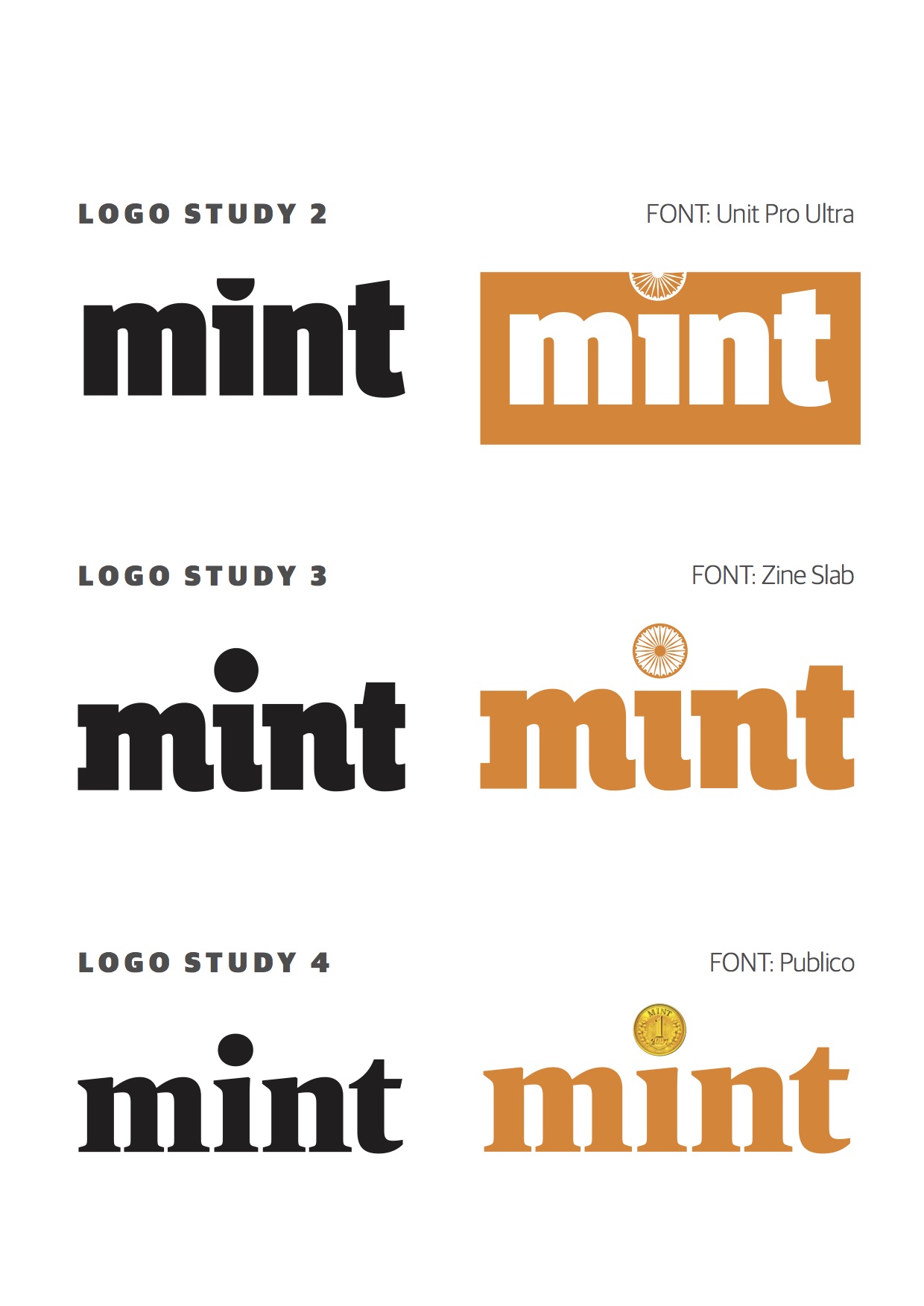
In the beginning we even considered new logo variations
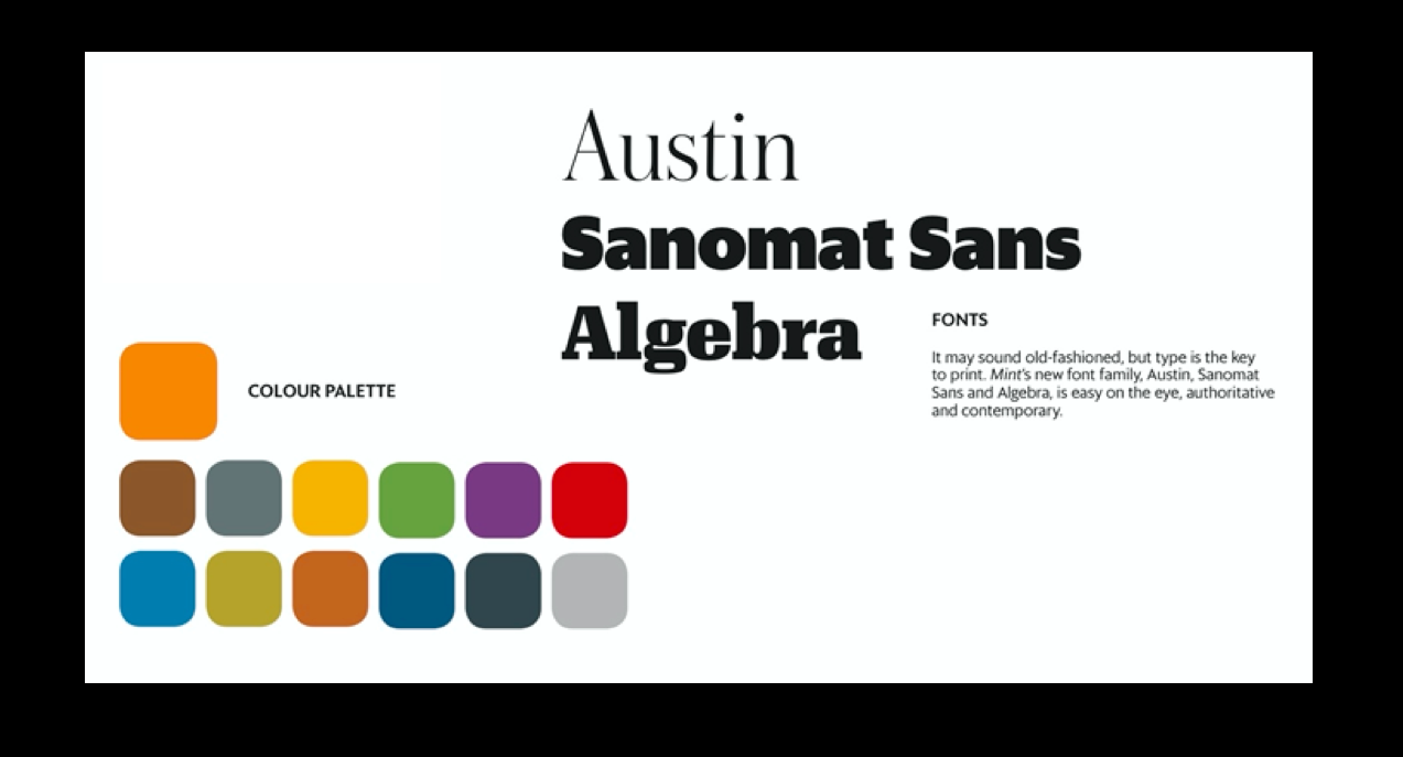
Type and color palettes: Mint’s new font family, Austin, Sanomat Sans and Algebra, —
In early 2016 I was invited again to participate with the Mint team and come up with a new look for the broadsheet that would pick up on the most functional and preferred elements of the Berliner format.
Working closely with Editor in Chief, Sukumar, and art director, Abel Robinson, we conducted a one week workshop to study every section of Mint and come up with solutions. Acting as Garcia Media art directors for the Mint project were Andy Rossback and Adonis Durado.
The result is a streamlined newspaper where readers will see the print edition as part of a media quintet. We have designed ways for relevant digital content unit referrals to be quite present in print. We also know that contemporary print is all about more depth, longer narratives, a true lean back platform.
From the start, I was aware that there was plenty of the original Mint design that had to be preserved. We wanted to maintain an elegant, classic look for a financial daily that is, ultimately, text driven. In fact, I believe that in the current digital transformation, the role of print is for a total lean back approach. Those who come to print are going to look for more in-depth and analytical pieces to help them understand the intricacies of the news.
I wanted to transmit that sense of “this is a serious newspaper and you come here to read” from Page One. I believe we achieved that.
I also wanted to make sure that we made print a companion to the digital offerings of Mint. By working with a multi column grid, we were able to isolate “digital alleys” to refer to content found on mobile platforms.
Here is how we refer readers to digital offerings related to a story in print
The facts about Mint
First edition of Mint: Feb. 1, 2007
First editor: Raju Narisetti
Publisher: HT Media Limited, Delhi, India
Page 1 Plus: These are “half page flaps” in the Delhi and Mumbai editions (production constraints prevent the Mint team from doing this in other markets). This will house the Quick Edit, Mint’s by-now-famous short take on weighty issues. It will also house insightful data, breaking news, and news you can use, including stock tips, commodity prices, and a quick exercise that desk-bound workers can do in the course of the day. Since newscycles are 24×7, it will also point readers to developing stories that broke while they were asleep, and to events and stories to watch out for later in the day.
The Second Page One—The back page of Mint now becomes the second Page 1 of the paper, replete with the masthead. Many people begin to read the paper from the back and the second Page 1 of Mint will highlight the most important politics and policy stories of the day. Easy access is one of the benefits of digital offerings and a second Page 1 on the back page is a recognition of both this and the reading habits of people.
Fonts— Mint’s new font family, Austin, Sanomat Sans and Algebra, —easy on the eye, authoritative and contemporary.

Congratulations to the Mint team
I wish the Mint team the very best as they embark on their second decade, complete with a new mandate to be the best contemporary newspaper of India. It is a distinct honor for me to have been involved again with Mint, a newspaper very dear to me. With this change of format, Mint makes big steps forward while maintaining the same levels of credibility and excellence in business journalism that its readers have come to expect. I know the readers will enjoy what is more than a redesign and a total rethink of how to present business news in a modern, easy to read way for the digital age.