As someone who considers Poynter as family, I am proud today to say that we at Garcia Media were involved in a collaboration with the Poynter team to take a look at http://www.poynter.org and find ways to improve it, not just visually, but also in terms of navigation, new content strategies and with better storytelling techniques.
For the thousands who visit this Poynter website daily, including publishers, editors, reporters and designers, along with college and university journalism professors and their students, the changes will be obvious and, we hope, will make them enjoy their Poynter website experience even more.
Among the changes:
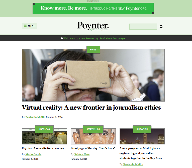
—New look: our aim is to make the site so appealing that those who come in search of one story will stay for two or maybe three. Notice new color palette. The first 10-second impression for users will be one that combines visual appeal with a sense of hierarchical importance for the fewer, but more important, items on that home screen.
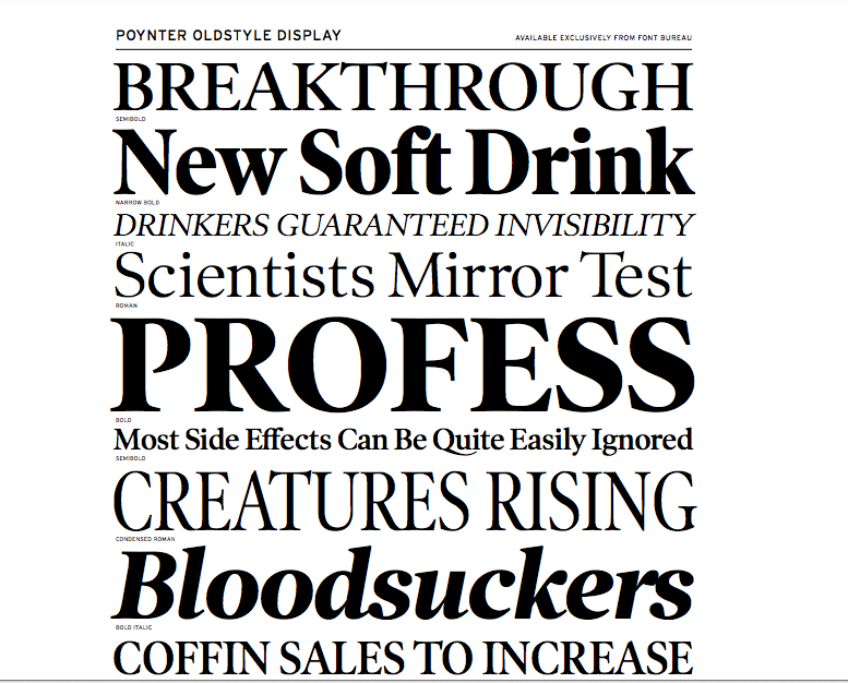
–New logo: a refreshed and more elegant version of the Poynter logo by Roger Black, who was involved with the Garcia Media design team in the creation of a type palette that centers on Font Bureau’s extensive Poynter Oldstyle family. Our goal was to update Poynter’s typographic legacy to work across a growing variety of screens and printed material.
—Better navigation: with improved labeling of topics. We have also included a “what to read next” feature which offers suggestions for additional stories of interest, placed at the end of the article page.
—Improved hierarchy for home page: our aim is to make the site so appealing that those who come in search of one story will stay for two or maybe three.
Instead of a listing of headlines that may overwhelm the ever so casual user, our new website relies on a few curated items at the top that truly represent the most important stories of the day.
We worked closely with Tim Franklin, Poynter President, as well as Seth Liss, website editor, in a collaborative effort that included several other members of the Poynter team.
Art director for Garcia Media was Reed Reibstein, who has since left for American City Business Journals.
![]()
New logo: a refreshed and more elegant version of the Poynter logo by Roger Black
Type palette: Font Bureau’s extensive Poynter Oldstyle family. Our goal was to update Poynter’s typographic legacy to work across a growing variety of screens and printed material.
Better navigation: with improved labeling of topics
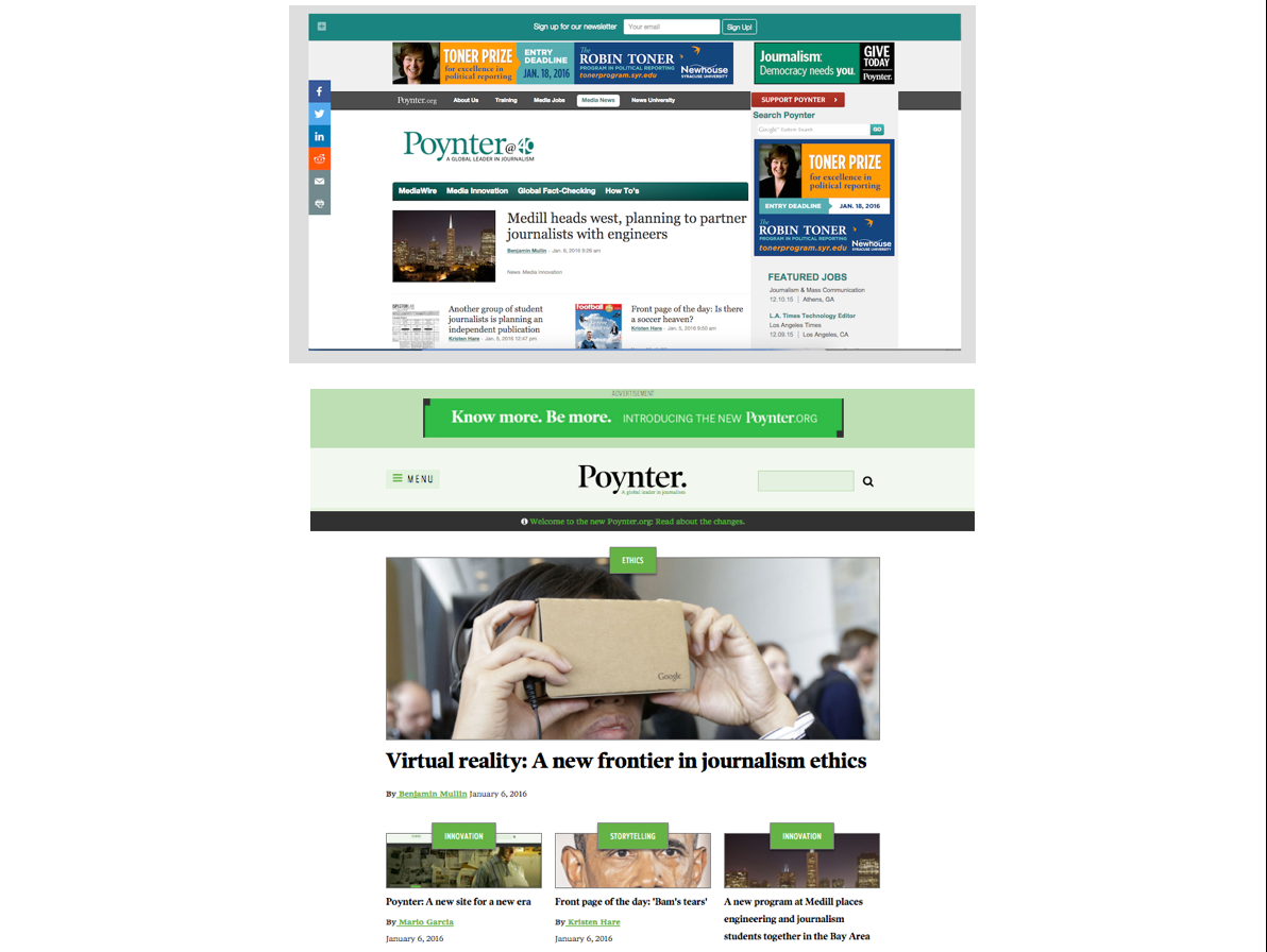
Before and after for the Poynter homepage
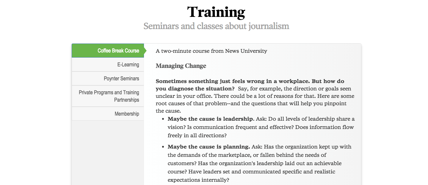
Coffee Break Course, a two-minute course from News University that will provide a quick, but robust, set of tips on specific topics.