![]()
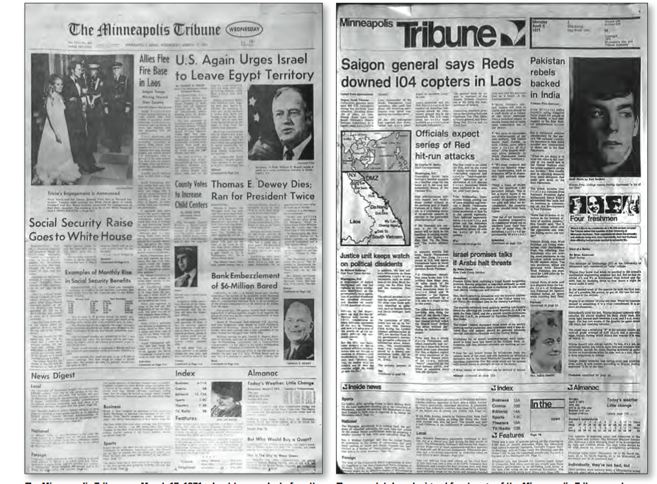
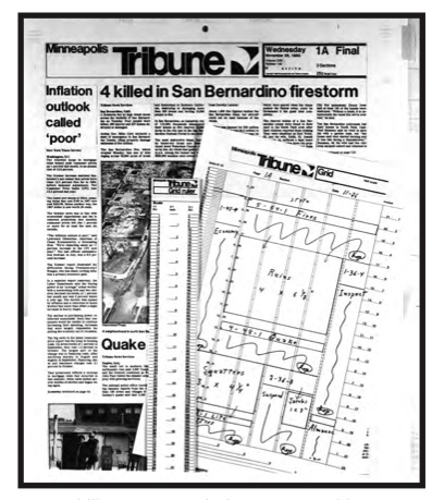
Frank Ariss’ redesign of The Minneapolis Tribune in 1967: dramatic, innovative and all Helvetica (including the logo). Images courtesy of Michael O’Donnell
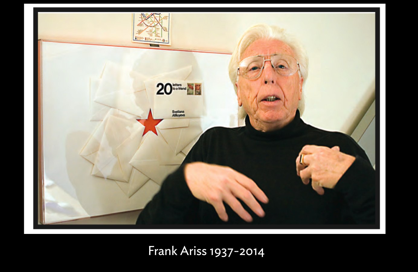
We are saddened by the death of that pioneer of newspaper design, Frank Ariss, who died Nov. 3 at Sacred Heart Hospital in Eau Claire, WI, of complications from an aortic aneurysm. Frank was 76.
In 1966 Frank was a visiting professor at what is now the Minneapolis College of Art and Design. He began working on prototypes for The Minneapolis Tribune and the editors liked it to much they hired him to redesign the old fashioned newspaper.
The Tribune went from being another American daily with non-distinct typography, a smallish logo and lack of hierarchy, to a modern version in which one of the highlights was the exclusive use of Helvetica throughout.
I remember first seeing Frank’s creation for the Tribune while at my desk at Syracuse University. I was then a young professor who had just taken over the post left vacant by that other great pioneer of newspaper design, Edmund Arnold. I remember the impression that this design had on me, and how I immediately made slides of it to show my newspaper design class. More importantly, it became a key case study in my first book, Contemporary Newspaper Design.
Michael O’Donnell, a journalism professor at the University of St. Thomas, said that Ariss’ redesign was considered “revolutionary” when he was in graduate school in the 1970s. I thank Michael for letting me know about Ariss’ death and for the images I have used to go with this blog post.
As we pay tribute to the talented Frank Ariss, we can also imagine how difficult it must have been to convince editors in an American newsroom of the 60s about the creating and executing of a grid, the dramatic change of a logo, the unique utilization of the elegant Helvetica throughout.
There is no question that Frank Ariss paved the way for the rest of us.
When I interviewed him for this blog in 2008, Frank described the then current state of US newspapers as “deplorable”.
Referring to his inspiring work for The Minneapolis Tribune, Frank said:
Tribune inspiration? Inspiration had nothing to do with it. Just some bloody good old fashion deep thoughtful thinking, a lot of hard work, and then making the right decisions.
That statement sums up Frank Ariss and it’s a great statement for the rest of us to live by.
For additional information about Frank Ariss
I interviewed him in 2008 for TheMarioBlog.
https://www.garciamedia.com/blog/309
The StarTribune obit:
http://www.startribune.com/local/282040121.html
This link goes to the PDF file for a Michael O'Donnell report, written for SND Magazine:
http://courseweb.stthomas.edu/mjodonnell/ariss/design_2009.pdf
This link goes to an HTML version of the O'Donnell piece that includes an audio slide show and a link to the PDF:
http://courseweb.stthomas.edu/mjodonnell/cojo350/reading/ariss/design_2009.html
Mario Garcia: Teaching Master Class at Poynter November 20
Innovation and Storytelling: Master Class with Mario Garcia
Here is where you can register to either attend the class in person, or via the archived replay shortly after the live session November 20.
Go here to register and more information:
https://www.newsu.org/masterclass-garcia
Pages We Like
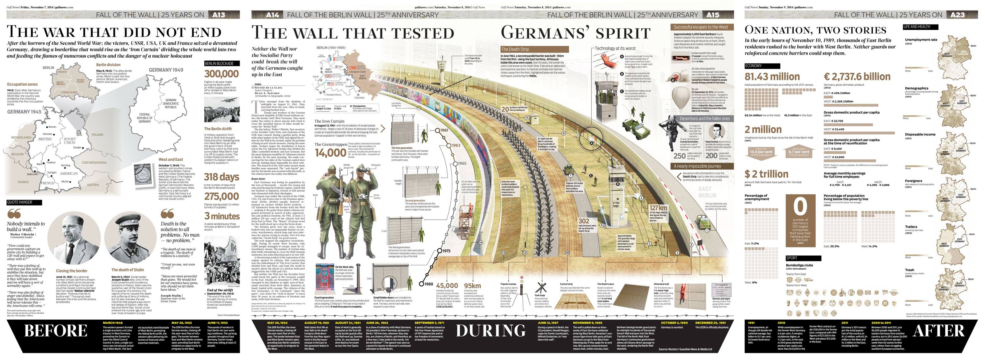
It is another marvelous example of visual storytelling from Dubai's Gulf News. This time a visual explanation as Germany celebrated the 25th anniversary of the fall of the Berln Wall.
Here is the work of Hugo Sanchez and the graphics/design team of Gulf News, under the direction of design director Miguel Gomez, and editor in chief Abdul Hamid Ahmad.
Meanwhile at De Telegraaf…..
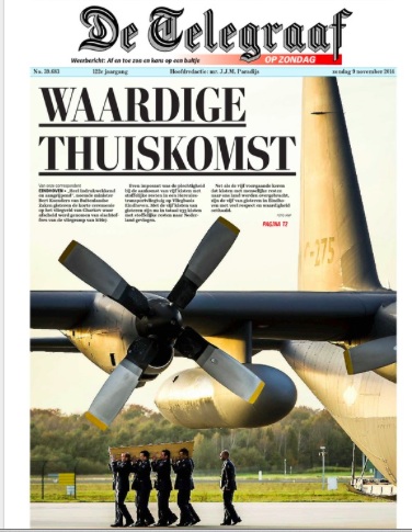
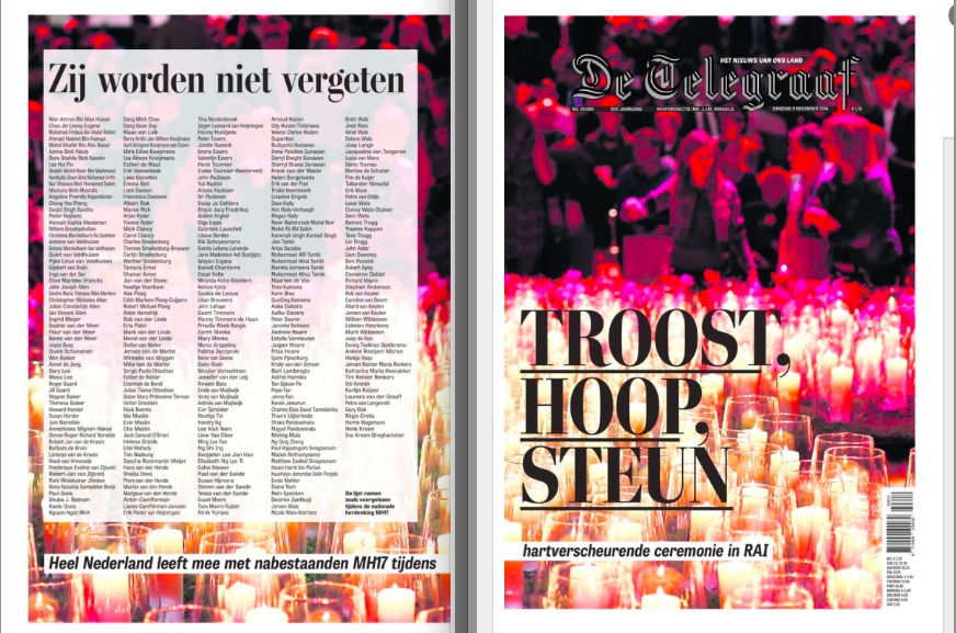
We continue to be proud of the way De Telegraaf's new tabloid design is evolving, as shown in these pages.
Previously in TheMarioBlog about De Telegraaf:
https://www.garciamedia.com/blog/categories/de_telegraaf
https://garciamedia.com/blog/de_telegraaf_the_road_to_tabloid_part_3 .