Updated Wednesday, Jan. 26, 08:42, Hong Kong
TAKEAWAY: When we first put several lines of Retina on a page of The Wall Street Journal, we knew that reading those stock listings would never be hard work again for the eyes. Now Retina is in the permanent collection of the Museum of Modern Art. Celebrating one of typography’s most beautiful and useful fonts. ALSO: The Martha Stewart Living app——life is an iPad full of chocolates AND: This is TheMarioBlog’s 700th post. PLUS: Visual changes at USA Today

Celebrating Retina’s accolade
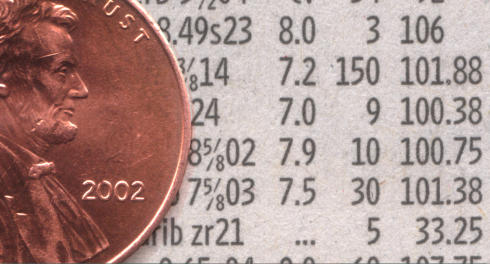
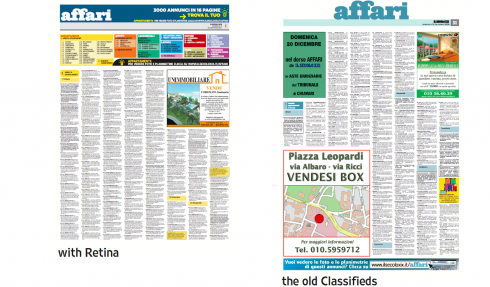
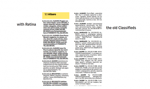
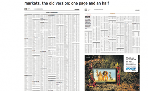
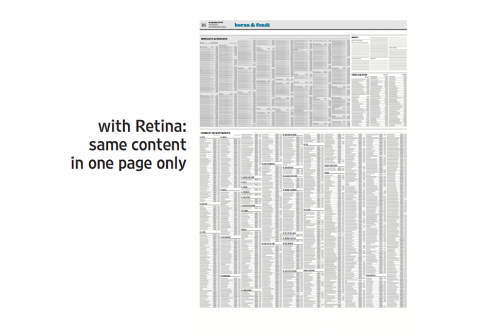
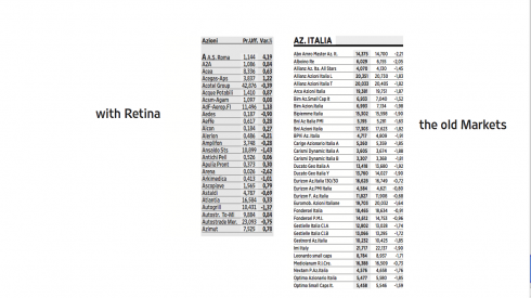
Legible and economical Retina: six plus lines of Retina agate could fit along side a penny (Graphic courtesy of Hoefler & Frere Jones)
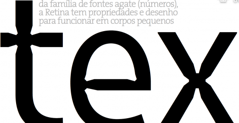
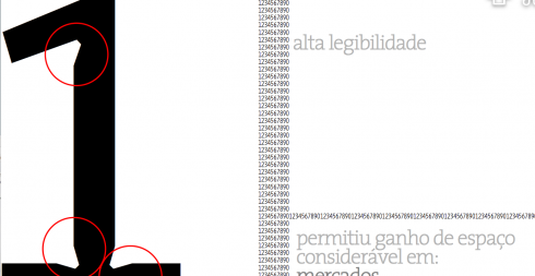
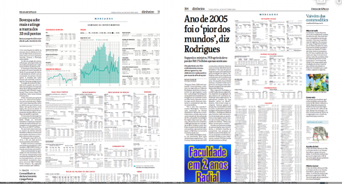
We utilized Retina during the redesign of Brazil’s Folha de Sao Paulo; here are pages from the styleguide prepared by then design director Massimo Gentile
The morning email brings us this great news. It is a note from Jonathan Hoefler, of
Of related interest:
Of interest about Jonathan and Tobias:
http://www.eyemagazine.com/feature.php?id=119&fid=532
About Retina:
http://www.theatlantic.com/magazine/toc/2008/01/
MoMA page for Retina
http://www.moma.org/collection/object.php?object_id=139302
Here is a general description of their acquisition:
http://www.moma.org/explore/inside_out/2011/01/24/digital-fonts-23-new-faces-in-moma-s-collection.
The Queen of Domesticity goes iPad
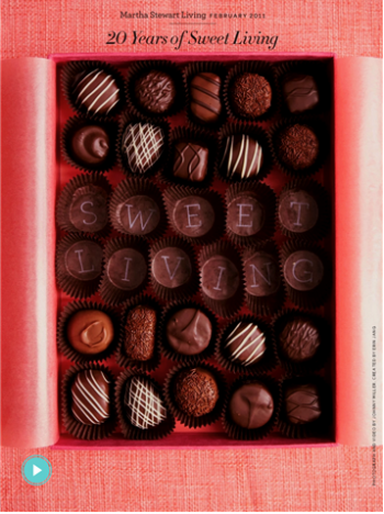
She taught us how to bake Brownies and Blondies, or to make picture perfect photo frames, so it was a matter of time before Martha Stewart got cozy with an iPad. It has happened.
The Martha Stewart Living iPad app is here now and it could make folding sheets or fluffling pillows fun.
And if that lovable movie character, Forest Gump, sees the Martha Stewart Living iPad, he would probably say: Life is like an iPad full of chocolates……..
See the video of the Martha Stewart iPad app. I admit that the screen with that box of chocolates makes your mouth water and your fingers reach out to the screen to sample the one that looks dark and rich, real and ready for the taking.
700 blog entries later: we are still here
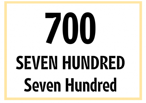
Our 700th blog post poster is set in Retina, courtesy of Jonathan Hoefler, of Hoefler & Frere Jones, who set the type for me,and added this comment: “I’m attaching a few 700s for you: sadly none of Retina’s qualities are evident in the number zero, so I thought the words might help instead.”
It is blog entry #700 today.
Thanks for keeping me company here as I make an attempt to relate daily experiences, thoughts and ideas that I think may be of interest to all of you who honor me with your visits.
As always, I welcome your input and comments. As I get ready for the next 700, I will continue to strive for bringing you something of interest that we could share each day. This blog is all about exchanging ideas, reflecting on our daily happenings and taking the pulse of our industry, especially as it applies to those projects that we are closed to. I see this forum as a teaching tool first and foremost. We all learn together, and I am aware of the value of your time and appreciate it enormously that you stop by on your way to work, or during lunch, or before you retire for the day.
TheMarioBlog is, in my view, a behind the scenes daily reportage of things that are in my mind that I consider to be of interest to others in our professional community.
Looking at the statistics we know that thousands of you stop by often, if not daily, and that you are a true global audience, with many of you come from Russia, India, China and North America, although Europe, Australia and New Zealand figure prominently as well. Although your main interest seems to be the design of printed newspapers, more are beginning to follow my entries related to iPad and tablets generally.
We live in the Oprah era, so I am not surprised that the most heavily trafficked posts are those with a more personal touch, as in the 40 Years/40 Lessons series of my sort of professional memoir. There is more to come of that, as in 30 more segments!
However, your favorite posts are definitely those that cover the behind the scenes of a project, and I hope to cover more of that, too.
With nine projects now running simultaneously worldwide, it is busy behind the scenes, as you can imagine, but we stop to catch our breath and jot down the teachable lessons of each. Stay tuned. Thanks for the visit.
And to Ron Reason, who pushed me to write a daily blog while we sat waiting for a flight out of Lagos: muchas gracias!
Visual changes at USA Today
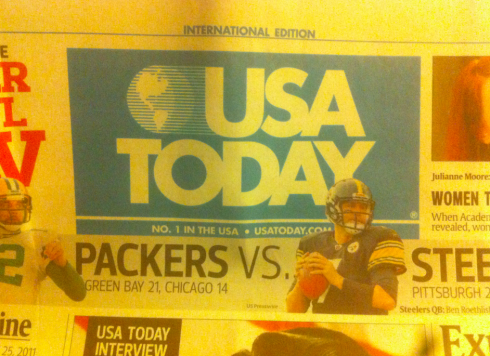
The newly introduced USA Today logo: larger
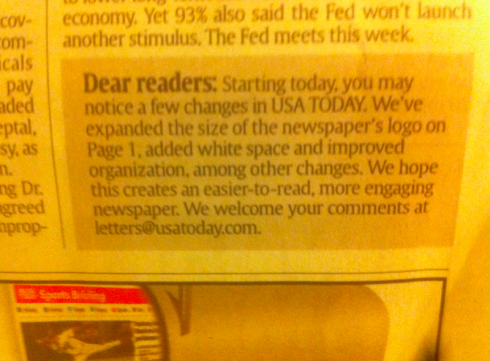
Here is note to readers as it appeared in Tuesday’s USA Today international edition
Surprise to see USA Today’s International Edition here in Hong Kong yesterday. Although I did not notice the changes at first glance, a note to readers at the bottom of the front page announced them:
it states that the logo is bigger, white space has been added and that organization was improved. We will take a closer look.
TheMarioBlog post #700
TAKEAWAY: Within 24 hours I have heard two uses of the word “modern” attached to my work. One client sees prototype and says: This may be too modern for our readers. Another client sees prototype and says: This is not modern enough, could you spicy it up a bit? What is the designer to do? First, define “modern” in terms of a newspaper’s design. We give it a try here.
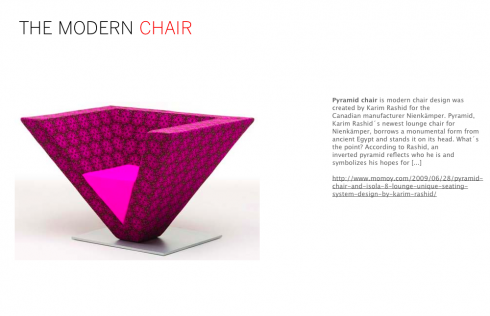
Perhaps not the most comfortable, but, indeed, modern
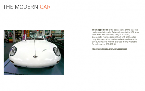
….cute and modern, but will it get you there?
Modernly with a sort of retro look: would the girls of Sex and the City wear it?
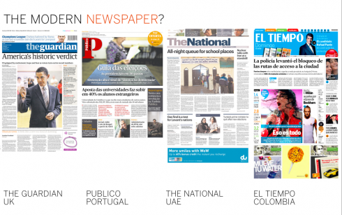
These four newspapers were cited recently by sources whom I asked: what, in your view, is a modernly designed newspaper?
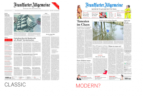
Ask many publishers about Germany’s Frankfurter Allgemeine’s look and they will tell you that it is classic daily, but “very modern” on Sundays
.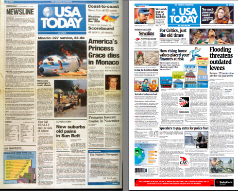
When USAToday appeared in 1982 (see first edition, left) it defined “modern” for newspaper design; almost 30 years later, publishers and readers worldwide still see it as the icon of the modern newspaper
When is a newspaper’s design too modern?
I am sure that every designer reading this blog has heard the “it’s too modern” label applied to her prototype. So have I, more times than I care to hear.
Right now, I sit in the midst of several projects and two, particularly, call to mind the “modern” adjective, but in different situations.
Within the last 24 hours, I have heard from the execs of a classic newspaper project asking me if our prototype may not be ” too modern” for their more traditional readers. Then in another project, the publisher is asking: couldn’t the look be less classic and more modern?
Time to pause and to try to define “modern” as it applies to newspapers, not furniture, telephones or living rooms.
First, my experience with readers and modern: having presented prototypes of possible newspaper looks across six continents over four decades i know that the definition of modern can be as basic as the inclusion of color on the page. Right after USA Today launched its first issue, September 15, 1982, anything with a color logo would be “modern like USA Today”. And, by the way, we still hear that comparison made, even though it is worth mentioning that USA Today itself is NOT so modern anymore. But that is another blog post for another day.
Modern, however, could be the addition of a photo on page one for a newspaper that never had one—-as in Germany’s Die Zeit when we redesigned it in the early 90s; Die Zeit always carried only caricatures and cartoons on its front page. So, when we proposed photography on page one, there were gasps followed by “too modern for our readers”.
Modern can also be a different grid for the page: I remember the old days when those American broadsheets were eight narrow columns; changing the page to a six column format would immediately get the chorus going: too modern and magazinish, a newsy newspaper should be 8 columns. Of course, nobody mentions that anymore. Good thing.
Modern can be a tabloid format as opposed to a broadsheet. I will never forget the letter from an angry reader of The Wall Street Journal Europe when we converted it from broadsheet to tabloid: “If I wanted a modern newspaper looking like USA Today I would move back to Cleveland,” he wrote. (Of course, USA Today is NOT a tabloid, but that was not important to this irate loyal reader. He simply saw modern.)
When modern offends
The discussion of too much or too little modern usually comes as a result of focus groups. It never fails: marketing directors will compile focus groups results and raise the “too modern” or “not too modern” flag.
Which brings to mind Apple’s genius Steve Jobs (we wish him a speedy recovery and return to his laboratory!). Here is Jobs’ take on the testing of products: “It’s really hard to design products by focus groups. A lot of times, people don’t know what they want until you show it to them.”
Modern, according to some who know…..
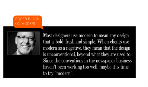
Roger Black
Designer and media consultant extraordinaire
Historically modern refers to the movement that came out of constructivism and the Bauhaus—-grids, geometric sans serif type faces, asymmetric design and so on.Most designers use modern to mean any design that that is bold, fresh, and simple. When clients use modern as a negative, they mean that the design is unconventional, beyond what they are used to. Since the conventions in the newspaper business haven’t been working too well, maybe it is time to try “modern”.
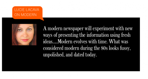
Lucie Lacava
Lacava Design Inc.
“
Modern” is all about perception, and visual sensibilities……A modern newspaper is defined by the sum of its parts, from content to design aesthetics.
A modern newspaper will experiment with new ways of presenting the information using fresh ideas.
With the influence of the web, television, mobile devices, social media, movies, and especially global advertising, we are moving towards a universal design style. However perception of what is modern, is still defined by culture, and demographics.Modern evolves with time. What was considered modern during the 80’s, looks fussy, unpolished and dated today.
A modern design is one that does not call so much attention to itself but rather to its content, less is more.
A modern newspaper is not only available in print, like a chameleon it redefines itself for other mediums.
Gabriela Lendo
Online Designer
Vostok ,a design strategy studio based in Madrid
Lendo writes us a definition of modern for online newspapers:
One can safely say that the difference between a modern newspaper design and one that is not modern enough lies in:Information layout and hierarchy is based on time (what’s new since the last time I was here). Image is king while text is context.One stream of constant information.Short and scannable articles.Read later icon. Information is displayed following a time based hierarchy, impeding other elements to compete for attention.
Marshall Matlock
SND Contest Director;
Professor, Syracuse University’s S.I. School of Public Communications
Modern newspaper design is a print design that is reader friendly. The publication should help the reader to determine what the day’s news is as well as the importance of that news. When it comes as the latter the reader would normally find the lead story the most important of the day’s news. The front page of many publications will display the most important news for that edition but unlike the early days may also include a quality feature story or an in-depth piece that may run in several editions.
And if you really want to be the most modern newspaper designer, perhaps you can study this website, where the authors make modern their mantra:
We are the most modernistic modern modernists on planet modern with a keen modern design eye for modern things, modernist goodies, modern architecture, mod model fashion and mostly modern moments in modern history. We eat, breath, sleep, and think modern. Perhaps we are modern overloaded but we love modern never the less. Go modern you modernists and believe in a modest modern Jetsons world where cars fly and saucer communes rule.
Classic, modern, traditional and ugly
We are only discussing “modern” in this blog today. But designers everywhere know that many terms are used to describe on’e work at the end of a prototype presentation. One must be able to read between the lines.
Classic, for example, could mean elegant. Classic, in the lips of a diplomatic editor or publisher could mean “boring”. Watch the body language, please, and you get the message.
Traditional is another word used loosely to describe a prototype. Of course, it could mean a design that truly adheres to firm, solid foundations or traditions. Traditional can also be used to tell you: this has been done before, saw it elsewhere (which newspaper was that with the blue reverse logo?), and you better start thinking of versions 2, 3 and 4, because once “traditional” is spelled across the mind of the editor or publisher, there is no going back.
And then there is ugly.
Which, in terms of our discussion, can be a beautiful word. The editor who tells you “I find that ugly” is a rare find.
Honesty at the end of a design discussion can be the quickest ticket to the next wonderful solution.
Not classic, traditional or not sure (the phrase of those who don’t wish to offend too quickly), just plain ugly.
Oh, the sound of ugly can even turn your next try at that design into something deliciously modern.
TheMarioBlog post #699

Third update, Sunday, Jan. 23, 13:06 Hong Kong time
TAKEAWAY: This Sunday readers of The Washington Post will see a revamped edition of their newspaper, including the introduction of a new, slick Sunday Style section in tabloid format, rethought Arts section, Kids Post and newly redesigned navigation units on A1. We describe our involvement in the process.
A new Sunday Post starting January 23
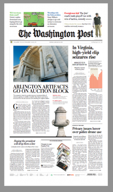
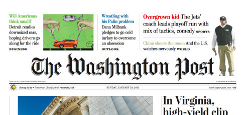
Here is the front page of Sunday’s The Washington Post, with new A1 promos at top; page designed by Jon A. Wile, Senior News Designer
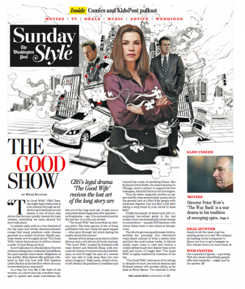
First cover of the new Sunday Style section as it will appear Sunday
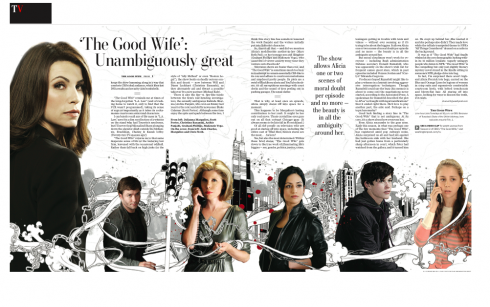
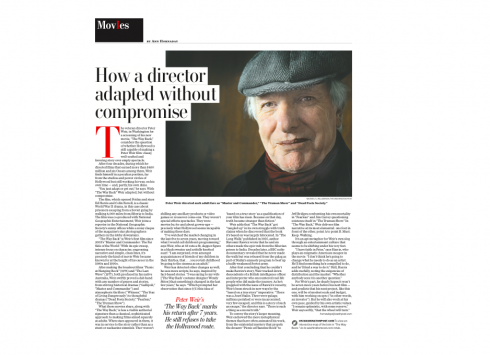
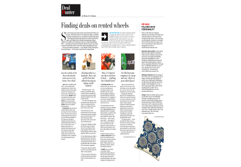
Inside pages of the new Sunday Style section
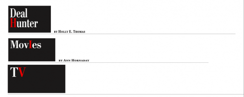
Our concept for headers for inside pagers borrows the “pill box” rectangle used on the front page logo for the section. The one letter of the logo in red erupts from the black background of the box.
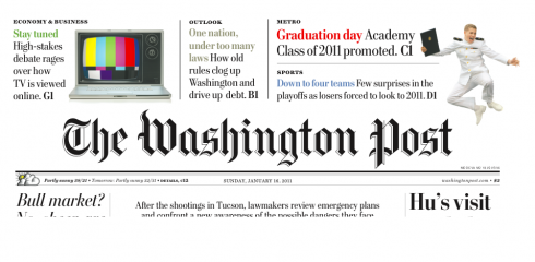
Here’s prototype of how the new front page promos for Page One will appear at The Washington Post starting Sunday: a combination of free form units with soft pastel colors
Here is a “mosaic” approach to the navigation, as it appears on the The Washington Post Saturday, calling attention to all the special content coming in the Sunday Post; many of the new offerings will already be inserted in the Saturday editions, allowing readers more time to go through them leisurely
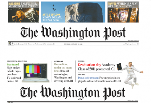
This image shows how Sunday Post front page promos looked until last Sunday (top), and the new approach, more open, less boxy and with softer use of colors.
Don’t know why, but everytime I am working on a project anywhere in the planet, I always imagine a couple of people who would be consuming that product: newspaper, magazine, app, or whatever platform. It helps me with a sense of “localness” and allows me to focus on making the product suitable to a specific audience. We all know that the product that is for everyone ends up being for no one.
And so, when Marcus Brauchli, executive editor of The Washington Post, and Raju Narisetti, managing editor, invited me to come to DC and work with them and their team on the creation of a new Sunday Style section for the Post, my immediate reaction was one that included a cozy Sunday morning somewhere in a corner of the living quarters of the White House, with The Obamas enjoying their Sunday Post, including the new Style section.
Who knows? Maybe this will really happen and we will hear their reactions. There is something in the new Sunday Post for every member of the Obama family, including their young daughters as well as their in-residence maternal grandmother!
What will they see?
First, the Sunday Style, in tabloid format, is part of a major series of great changes
and offerings coming to readers of The Washington Post Sunday, January 23.
Among the changes coming to the Post this Sunday:
*Expanded coverage of arts and popular culture creating separate Arts and Sunday Style sections, adding new features and columns and delivering feature sections on Saturday to give busy readers more time to enjoy their Sunday paper.
*Sunday Style will be a new tabloid-size section focused on popular culture, featuring coverage of movie, television and music by Hank Stuever, Ann Hornaday and other award-winning Post journalists. The new section will also have stories on fashion, shopping deals, the latest trends on the Internet and the week’s most interesting photos from the Washington-area social scene. The popular Style Invitational and Celebritology will move from Saturday to Sunday Style, where they will appear with pop-culture book reviews, weddings coverage in On Love and well-read advice columns by Carolyn Hax and Amy Dickinson.
*The expanded Arts section will showcase The Post’s world-class coverage of theater, opera, art, dance, classical music, architecture and museums with stories by renowned critics Sarah Kaufman, Philip Kennicott, Anne Midgette and Peter Marks. The Arts section will range from internationally significant openings and exhibits to the latest goings-on in Washington-area institutions, creating an expanded community for art-lovers in a city that treasures the arts.
*Sunday will also include a brand-new KidsPost tabloid, extending a popular feature of the daily paper to the Sunday Post as well. The new section will offer stories, games, puzzles and jokes for children and give young readers a separate, pull-out section of their own. KidsPost will come wrapped around the Sunday color comics.
The visual concept for Sunday Style
As soon as I arrived at The Washington Post, my task was to work closely with the talented design director, Janet Michaud, testing various ideas for Sunday Style.
First stop: the creation of a logo. It should say Sunday Style, but it must also carry Post somewhere in there. From the start, we decided that the logo should follow a “pill box” format, as to make it more economical. After all, this is a tabloid format, so the size of every element on that precious cover counts.
Second stop, secure the services of Jim Parkinson to help us with the final logo concept for Sunday Style. Parkinson did his usual magic and the logo for Sunday Style is crisp, attractive, elegant and, although new, has the familiarity that makes it a first cousin of everything else that is already in the Post.
Third: Janet and I spent hours conceptualizing the cover. We knew that we had to have text on the cover, and not just a headline and a summary, but a big chunk of the story there. The task here was to make text, photos, logos and navigational units come together as ONE. To that effect, no column rules, no boxes. My recent work in Europe has showed me that a free form style of design brings cohesiveness to a page, especially the small canvas of a tabloid, while incorporating areas of white space. Readers do not require boxes and rules to create separations. The storytelling process flows more naturally in an open environment.
In addition, we tried the use of columns of text touching or protruding into photos sometimes, a way of creating associations.
Fourth, we tackled the inside pages, creating a simple square “pill box” unit for the top of the page headers. Simple and small, allowing for air at the top of every page.
The rest was in the hands of Kevin Sullivan, Post’s features editor, and his team, creating stories to populate the canvas Janet and I had created.
“At a time when there is a lot more talk of apps and there are many more digital versions of newspapers, the Sunday changes are also a strong signal to our readers that the Post will continue to invest in its print offerings, which have a large, loyal readership,” says Post Managing Editor Narisetti. “For this investment—in new pages, new content—to pay off, we really needed a fresh design that engages our busy readers within the overall Post look and feel that they have come to love. And that is where your ideas and work was invaluable, Mario.”
New navigation at the top of Page One
Working with news designer Greg Manifold, we designed a new set of Page One navigations, incorporating subtle pastel colors, getting rid of boxes and opening the area at the top of the page, above The Washington Post logo, the same way that we had done for the cover of Style.
A similar style of navigation, but more in mosaic style, appears on the Saturday edition of the Post to promote the Sunday content.
Part of our work has been to standardize navigation throughout the Post.
It should all make the readers’ journey through their Sunday Post all the more enjoyable. Now, will we ever know what those first citizens of Washington, The Obamas, think about these great Post offerings on Sunday?
TheMarioBlog post #697