Ethan Marcotte
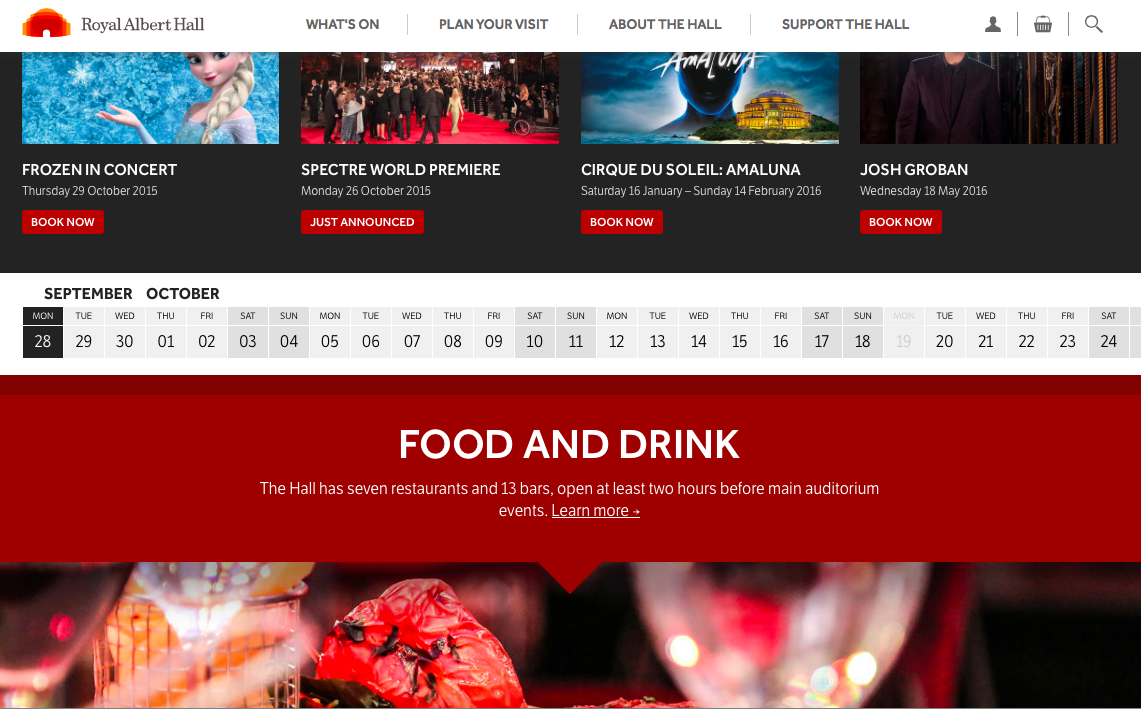
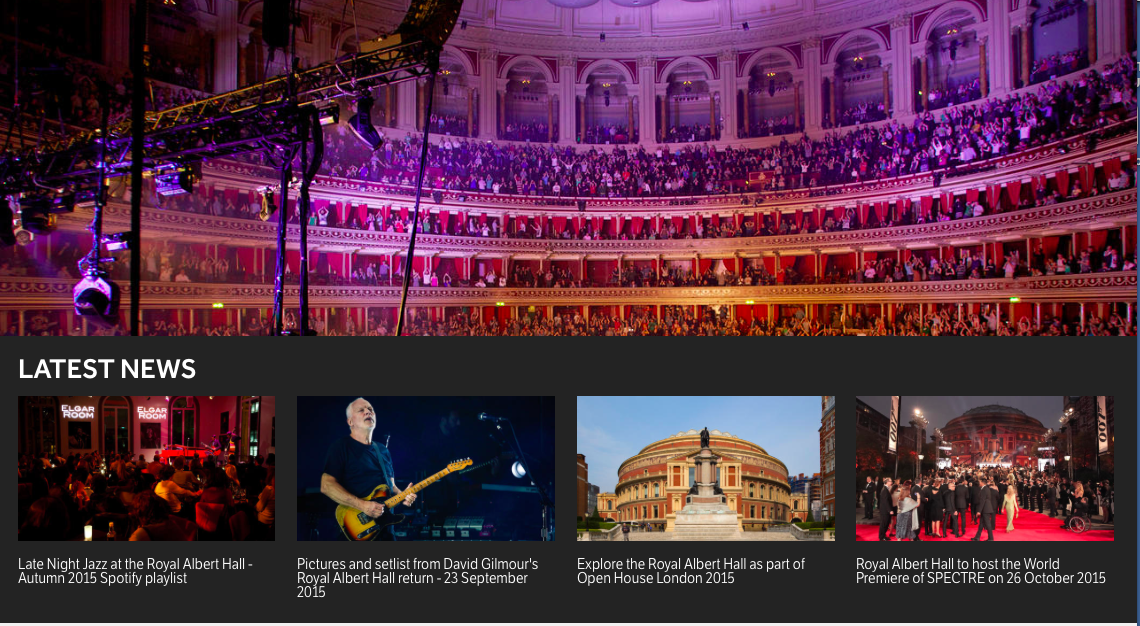
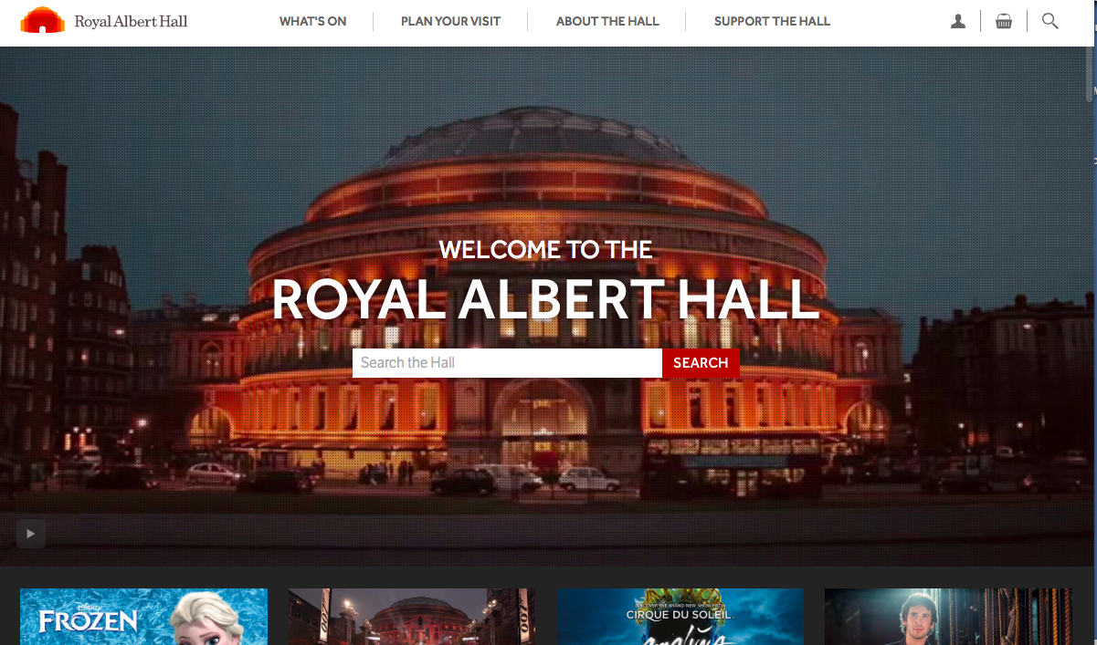
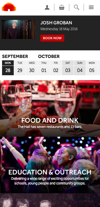
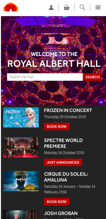
There is plenty to admire and tons of inspiration for storytellers and designers in this new concept from the Royal Albert Hall website. While its aim is to making the selling of tickets for its events easier, especially on mobile, we can all learn by looking at content is organized, images presented and navigation introduced.
And it is all responsive. Yet, what caught my interest during the course of this Podcast was actually how the principals involved in its development mentioned the moment they decided to approach the conceptualization of this website as a mobile first experience. The design for the website evolved from there.
The small platforms were considered first. Makes perfect sense.
In this Podcast, moderated by Ethan Marcotte, he chats with Louise Halliday and Jake Grimley who report that designing mobile-first means a website that works better for everyone.
Some highlights from the Podcast:
— A mobile-first approach to design: What we did, effectively, was that we started out with wireframes that presumed everybody was on mobile.
–…… one of the questions ….. was, “How are you going to make sure our website works on all different kinds of devices?” but I don’t think there was any serious expectation that we were going to come back and say, “We’re going to build an app for each different device” or something like that. I think it was pretty clear in the context that the correct answer was going to be that they were looking for a responsive website.
–…..mobile is probably just the most accessible web browser that people have these days, so perhaps we shouldn’t be presuming that just because someone’s got a mobile phone they’re actually sitting in the Hall using the mobile phone.
–All we did was to say to everyone, “We have this new beautiful website. Please don’t ruin it by giving us rubbish pictures.”
Why some things stay the same
Something really early on, something that Steph, the designer, said to us which really resonated with us was that you don’t want something which is too fundamentally different for the user. There’s a reason why websites are prototypical, why they kind of conform to a specific layout, and that’s because it’s what people expect and it’s because it’s probably the best way that people can navigate your website. So, we kind of really took that onboard because we were thinking about doing really crazy creative things, like because the Royal Albert Hall is round we thought, “Well, maybe we should have some kind of circular navigation system and do something a bit different.”
Pages we Like
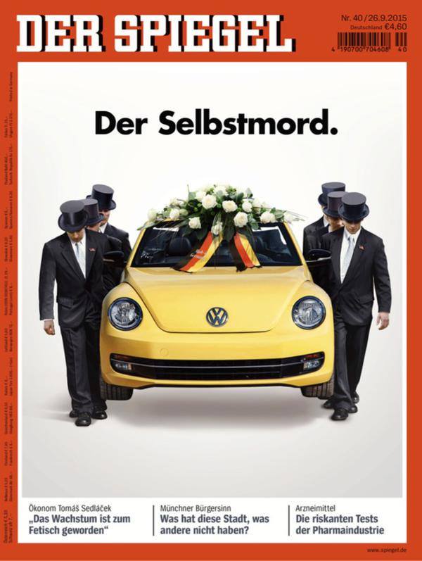
Fantastic visual storytelling for the story of Volkswagon and what some call Dieselgate.
As published in Germany's Der Spiegel magazine.
Headline reads: Self Murder