The avocado page in 2016: an SND winner for the National Post of Canada
Disclaimer: I love avocados, guacamole and anything having to do with that green vegetable that is perfect to eat with just a touch of olive oil and a pinch of salt. Yum.
Disclaimer #2: During the 1980s, when DESIGN was spelled in all caps at newsrooms all over the world, when art directors strut their stuff and won awards with those glorious poster pages of whatever the subject—-from eggs to mangos to lace hankies—-, I began to notice that sometimes the poster was visually magnificent, but there was no story there to accompany the aesthetic masterpiece. The result? WED (Writing-Editing-Design), an effort to make sure that there was a marriage of visuals and content.
Disclaimer #3: I think we all indulged in a little bit of “avocado pages” at one point or another.
And, then, the avocado pages—the poster look—disappeared, the victim of the economic crisis that hit newspapers and the shrinking of space that followed.
From time to time one would see a poster page in newspapers in South America or Asia. They had been eradicated from most North American and European newspapers.
WED and the avocado page
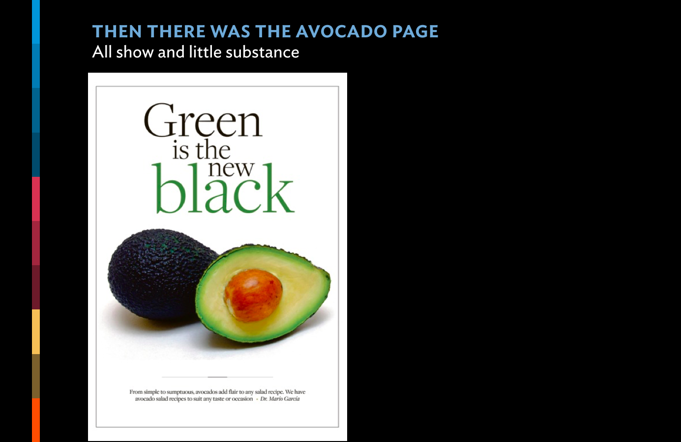
In my lectures I show this “exaggerated” version of the typical avocado page of the 1980s
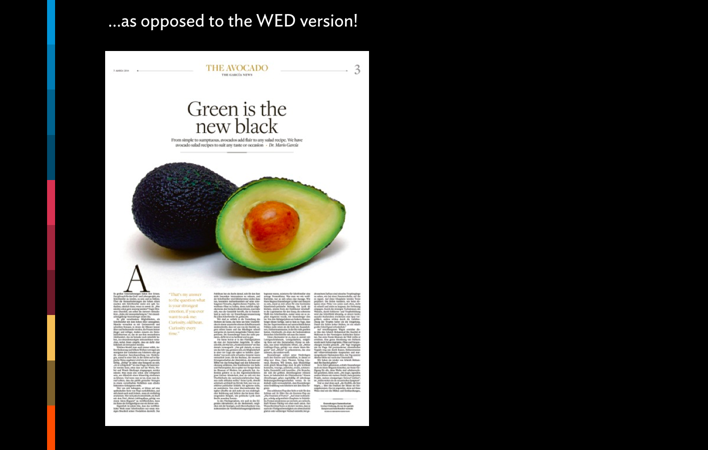
And here is the more acceptable WED-proof avocado page: at least include a story so that readers sink their teeth into more than just a delicious avocado
Ironically, it was precisely in last week's lecture that I introduced my students to the WED concept—one of the few discussions of the past that has tremendous relevance to the present and future. It is not difficult to convince a group of Columbia graduate journalism students that content is king and that we, as designers, must cater to the content. Anything that is used to decorate, is an excess, and if one does not assign a meaning to it, the reader will.
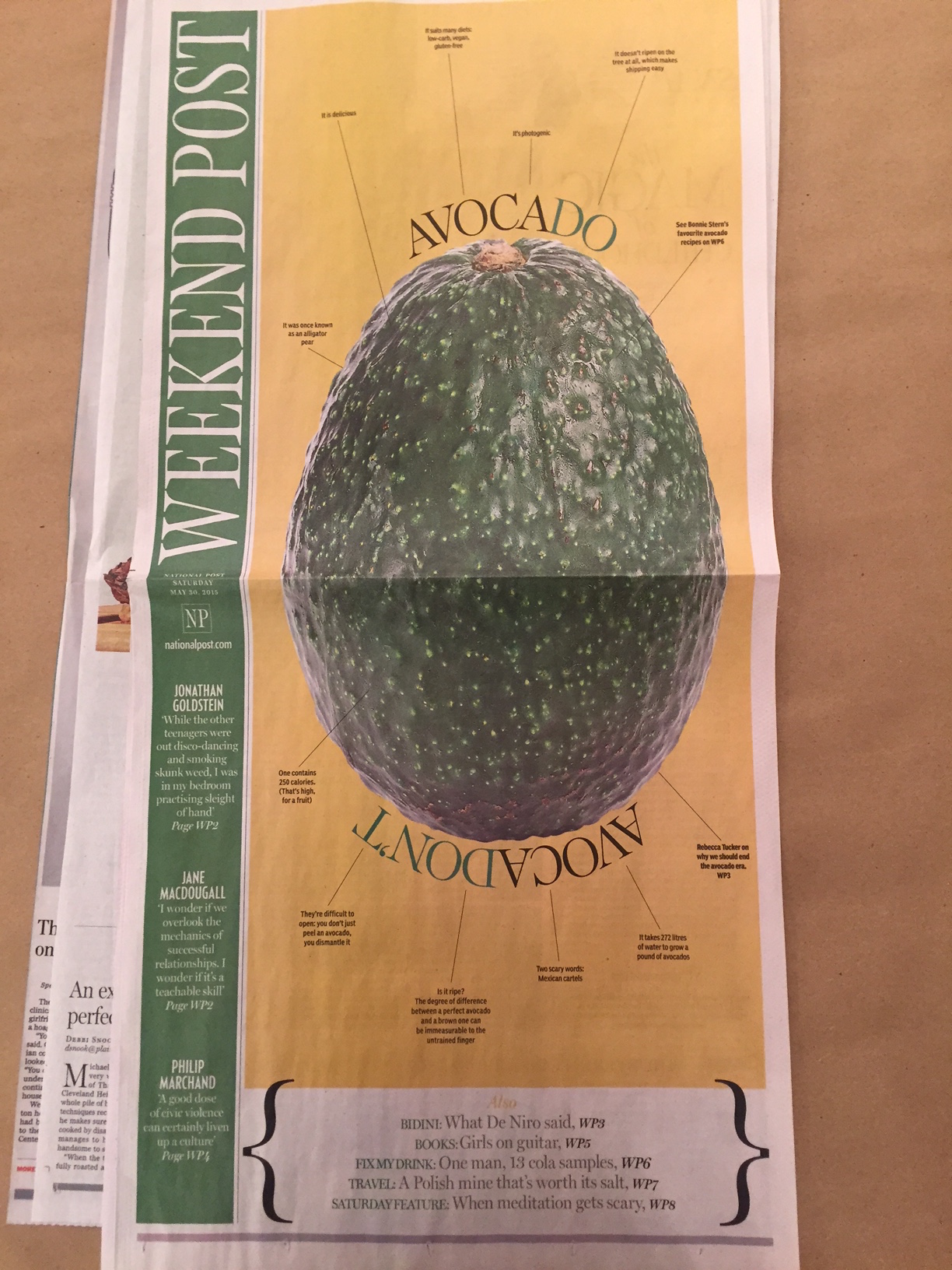
That is why I smiled when I saw this avocado page from Canada's National Post, one of the best designed newspapers in the world. I admit that this avocado page is not just decoration, as it has content that turns the illustration into an informational graphic.
Still, at first sight, it is an avocado page. Irrisistible. Poster like. A salute to the excess of the 1980s. And, if the Post can afford all that space, more power to them. I will definitely show the page to my class.
Congratulations to the Post for winning with this avocado page!
Ironically, a top rated head of design at an American newspaper, who prefers to remain anonymous, told me this:
“I am getting more requests to do this type of poster pages. IT is because we have a shortage of people, so the one story front makes sense. I never thought we would return to the poster page era, but here we are.”
Indeed, in the 1980s, it was an excess of space.
In 2016, perhaps a shortage of people.
We will never have a shortage of avocados—and that, as Martha Stewart would say—is a good thing.