![]()
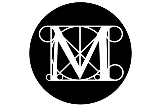
This is the existing Met logo, introduced in 1971, a classic that is revered by many and which does convey a feeling of art and architecture. The current logo — which features the letter ‘M’ and was based on a woodcut by Fra Luca Pacioli, who taught mathematics to Leonardo da Vinci.
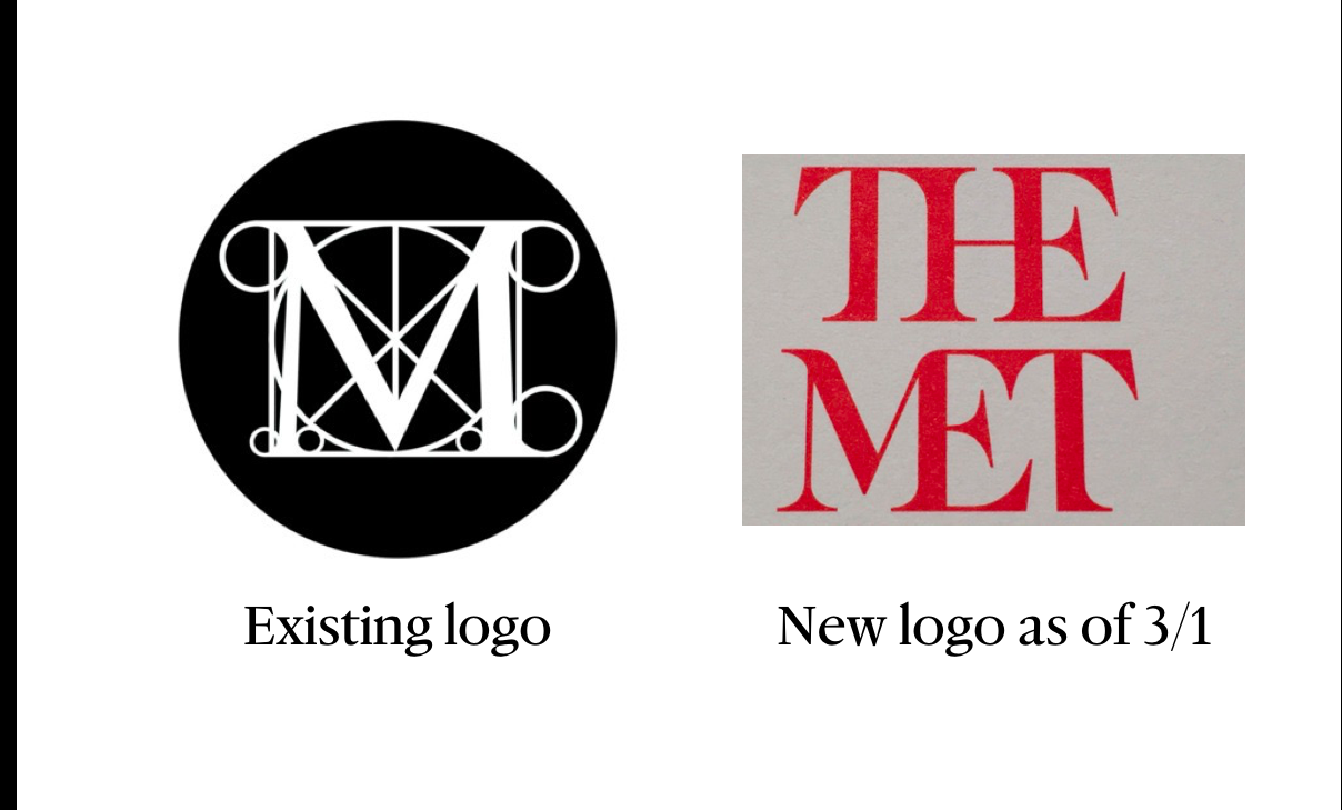

What's in a logo? Well, plenty of intertwined serifs if you are discussing the about-to-be-unveiled logo for the Metropolitan Museum of Art.
The discussions are many and varied, but, when it comes to the type and design community, this logo may not be ready for the exhibit!
The new logo was designed by the firm Wolff Olins, part of a two-year project with the Met to rethink the museum’s approach to the public.
Just to give you an idea of how this new logo has been described:
“It is a typographically Frankenstein-esque affront to all who love the Met.”
“It (the logo ) is the double decker bus crash!”
I took one first quick look and found it to be strange, a celebration of serifs in love that embraced each other, and, overall, not a logo that improved on the existing MET logo in any way.
In a statement, the Museum said that the logo is part of a new graphic language that’s intended to make the Met “feel more available and accessible to first-time as well as frequent visitors.”
But, it is what it is, and come March 1, this logo will be the one you will see on that MET Museum bag or on the coffee cup, you get at the gift shop, So I decided to ask several of my friends, all respected designers and type experts, what they thought.
Here you go.
What the experts say about the new MET logo
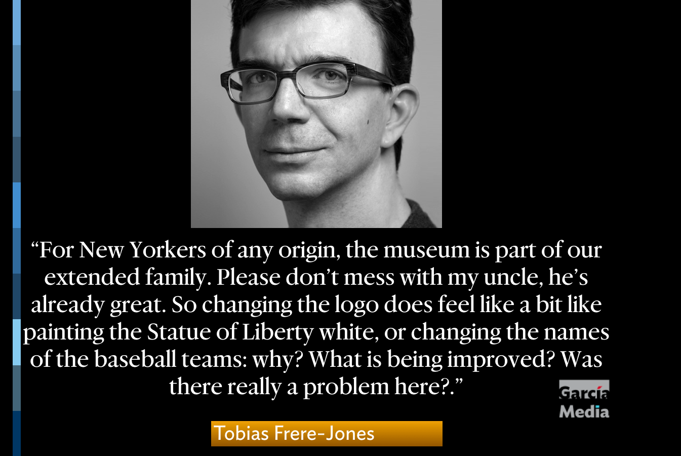
Tobias Frere-Jones, Founder, Frere-Jones Type (http://frerejones.com)
I grew up in New York City, and I have deep, foundation-level memories of The Metropolitan Museum of Art. My understanding of history and culture began with those suits of armor and Ming Dynasty vases, and the massive chunks of Egyptian history brought to the edge of Central Park.
For New Yorkers of any origin, the museum is part of our extended family. Please don’t mess with my uncle, he’s already great. So changing the logo does feel like a bit like painting the Statue of Liberty white, or changing the names of the baseball teams: why? What is being improved? Was there really a problem here?
Especially from this perspective, nostalgia can be overwhelming. But that’s not a valid (or at least not complete) way to judge an identity. Memories aside, it still seems unnecessary because the old logo was really good. It packed classicism and scholarship and wonder all into one mark. And if you’re left guessing at what decade the logo came from, you have something very rare. So before anything else, I question the motive for making this new identity, for fixing something that ain’t broke. Experimental Jetset have pointed out that we’ve only seen one isolated piece of what is necessarily a complex system, so any judgment is likely premature. That’s true, but still: what is being improved? Apart from this one being new and the other one being old, what else can we say? Arbitrary change is such a frustrating thing to watch. It’s disappointing for the audience, devaluing for the designer. Leaving something alone can be a valid decision, but so few seem believe to it.
Some have torn into the logo itself, but I don’t think it’s really fair. The mark may not be much of a solution but it isn’t the problem either. Justin Davidson, architecture critic for New York Magazine, recently derided its merged-capital structure. Problem is, the museum’s own collection includes ancient Roman inscriptions that behave exactly like this. It’s the one aspect of the logo that successfully nods to the mass of history in the collection. Asking a typographer or type designer would have cleared that up. A more urgent problem appears in the text itself, in the decision to work with “The Met”, a nickname already claimed by The Metropolitan Opera. That potential confusion has existed for decades, and the old “M” logo stepped around it deftly.
I can pick at this one mark, but superficially. There are some distracting moments, like the rounded corners on the M top, which detract from the overall sharpness and seem like an afterthought. The half-serifs on the initial and final T recall the nineties before anything else, and that’s a very odd note to strike. The full implementation may reveal a stronger and richer identity, but the weak premise has not made for a promising start.
Roger Black, Roger Black Design
It looks like they proposed “Met” by itself, which is not such a bad slam-ligature. But the Met people said, “What about the ‘The’?”
As Paula would say, this is the moment to resign the account.
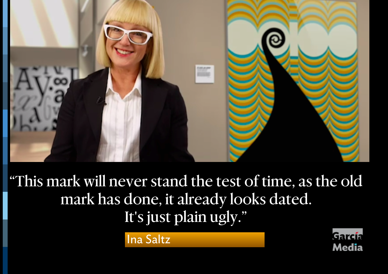
Ina Saltz, CCNY professor and http://Lynda.com typography expert
Also my parentheses (re Matthew Carter's MoMA logo) is missing its second part…
First of all, why throw the baby out with the bathwater in some (misguided) attempt to appear more “relevant” and “engaging”? The Museum’s logo has been beloved and world renowned for many decades. Why not simply tweak/update/revise it as Matthew Carter did with MoMA’s logo some years ago? (This was covered at length by the NY Times, and the changes were subtle but an improvement, not a complete identity switch, which can be a big mistake. And this is a mistake that the Met is making right now. There is already a firestorm of outrage among designers and people who care about typography).
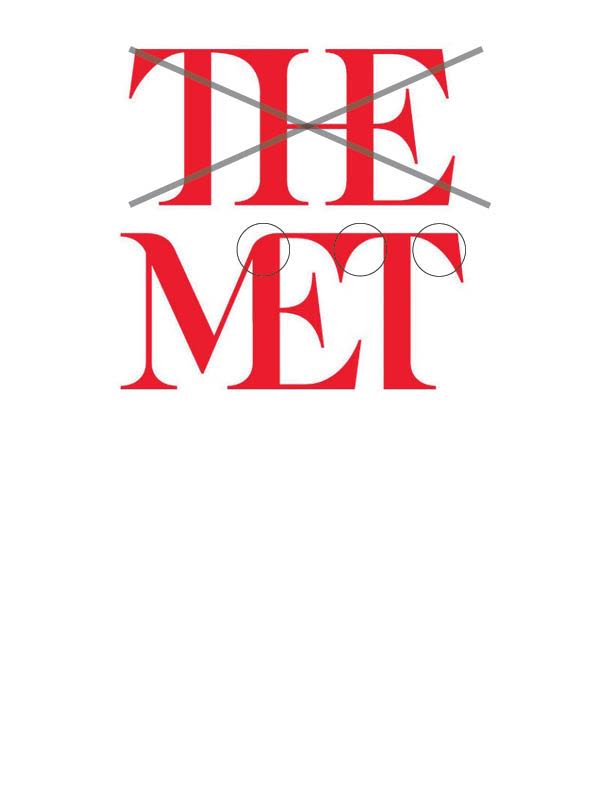
Specifically, the new “mark” is an ungainly, off-center mashup of eighties-style heavy bracketed serifs, with the crossbars of the “E”s tilting at weird angles. A mark that gives equal importance to THE and MET is an insult to the Met’s history and august stature in the museum world. This mark will never stand the test of time, as the old mark has done, it already looks dated. It’s just plain ugly.
What’s more, Wolff Olins was most likely paid a pretty penny to sell the new mark to the Met’s muckety-mucks. Whatever rationale was employed, the end result is cringeworthy.
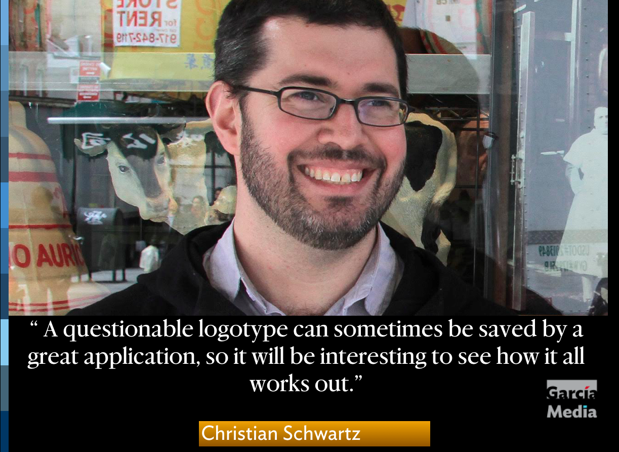
Christian Schwartz, Type Designer, Commercial Type
I can say that my initial reaction to the logotype is negative, like most people who have written about it, for two primary reasons. First, I think it puts far too much emphasis on THE, which seems like an odd choice. Second, this logo doesn't seem to solve a real problem that the rebrand was intended to address (according to the WIRED article I read): how to deal with the fact that the Met has multiple locations, including The Cloisters, which many New Yorkers don't know is part of the museum.
I will reserve judgment until I see the whole identity in action. A questionable logotype can sometimes be saved by a great application, so it will be interesting to see how it all works out. The handful of print applications that have been circulating in the press have been a mixed bag. That said, it's hard to imagine this logo on exterior signage, and I am curious to see how it works on the stickers visitors get on entry, which are such an important part of how people interact with the identity.
Why is it that logos only get discussed by the general public when the torches and pitchforks come out!?
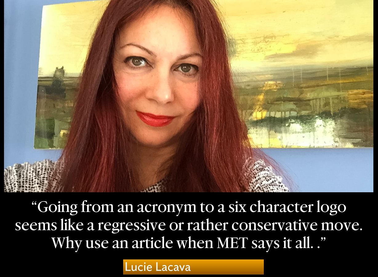
Lucie Lacava, Lucie Lacava Design
Going from an acronym to a six character logo seems like a regressive or rather conservative move. Why use an article when MET says it all. This brings to mind a quote from the movie THE GOOD SHEPHERD; ““does “GOD” need “THE?””.
The “THE” sits awkwardly above “MET”; it looks like it’s not quite visually centered due to negative space. It reads as TIE at first glance. The E and the T look amputated, the E received a lobotomy while the T has mismatched arms (brackets).
Isolating “MET” would go a long way in promoting a stronger brand—just thinking of marketing slogans such as “JUST MET” or “We MET at the MET”.
Lucie Lacava’s sketch to highlight her comments above
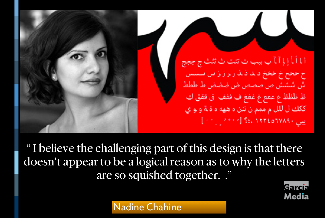
Nadine Chahine, UK Type Director and Legibility Expert, Monotype, London
Every letterform has an integral skeletal shape and if part of it is chopped off , the letter can start to look strange. Sometimes, you can remove parts of a letter and the result still works because there is something to suggest the continuity of that shape. But if you mesh two characters together and remove some of the elements that give the letters their identity, the result can look confusing or poorly designed.
In the case of The Met logo, the squashing together of the T, H, and E removes the breathing space between the forms, and hence the mentioned squished bus metaphor (as in Vulture article). The loss of the top E serif makes it feel almost headless and is disconcerting. I believe the challenging part of this design is that there doesn’t appear to be a logical reason as to why the letters are so squished together.
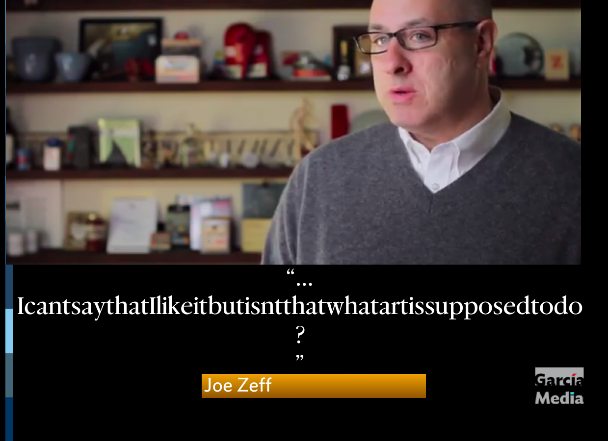
Joe Zeff, Vice President / Creative Director, Scrollmotion
IcantsaythatIlikeitbutisntthatwhatartissupposedtodo?
Of related interest
https://news.artnet.com/art-world/metropolitan-museum-of-art-new-logo-429641
The New York Times and the Met new logo
http://www.nytimes.com/2016/02/19/arts/the-met-and-a-new-logo.html?ref=arts&_r=0
Highlight
Justin Davidson, the architecture critic at New York magazine, called it a “graphic misfire” in an online column posted Wednesday.
Mr. Davidson, who saw the design on a Met mailing, wrote that “the whole ensemble looks like a red double-decker bus that has stopped short, shoving the passengers into each other’s backs. Worse, the entire top half of the new logo consists of the word the.”