Take a look at the front page of the US edition of The New York Times and compare it to its international counterpart. First thing you notice is the quality of the paper, which I think is a superior grade for the international edition when compared to that used in the US.
In terms of design, there is more white space and a more contemporary look, including promo boxes over the logo.
However, it is obvious that perhaps the Times is more playful and experimental with its edition outside the US borders.
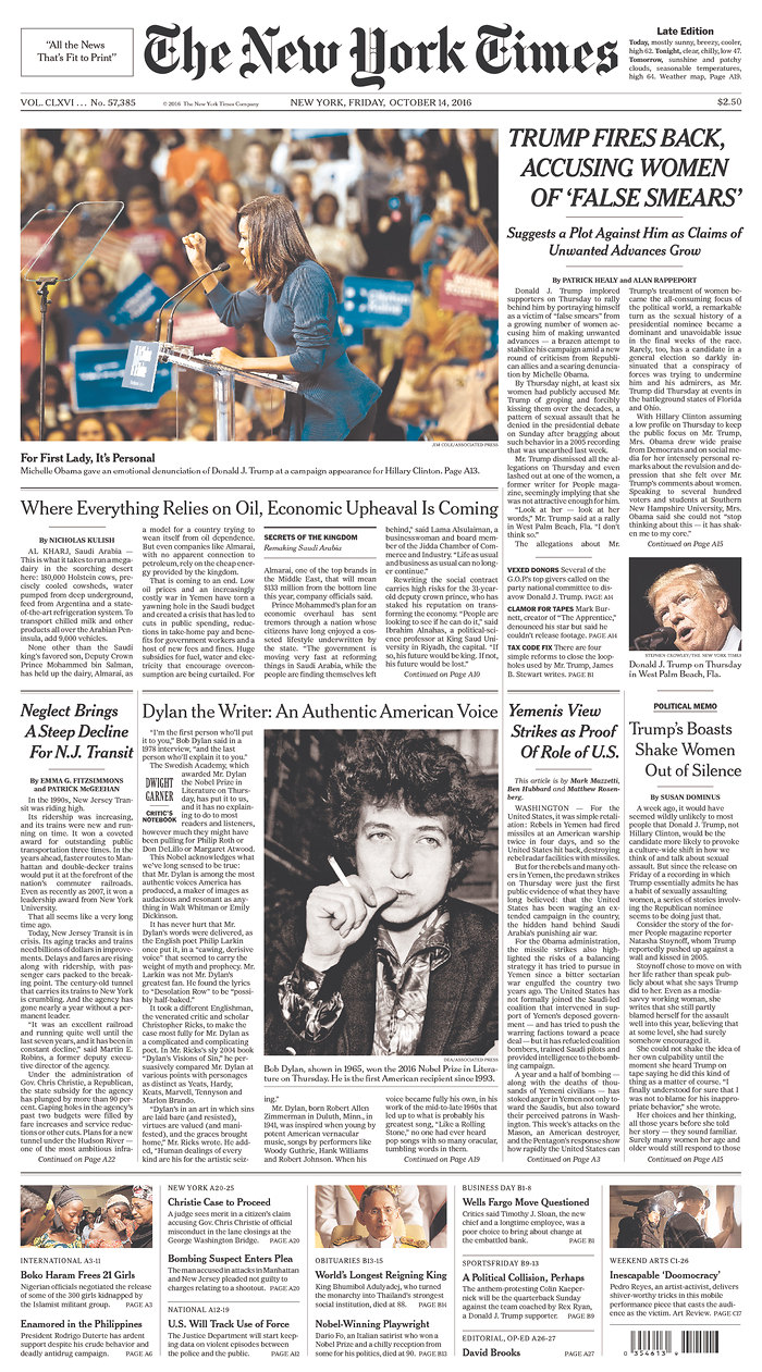
The international edition (left) and the US edition: a lot of variety from the quality of paper used, to selection of stories.
An Op-Ed Columnist on Page One
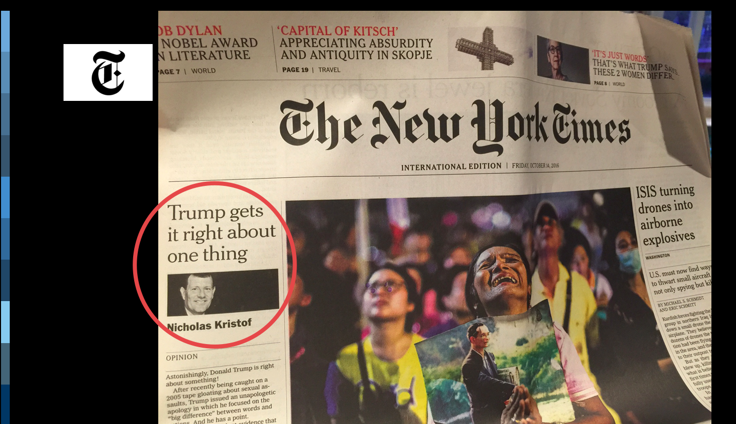
I like that a columnist is profiled right at the top of Page One sometimes, a practice which I applaud and encourage my clients to use. Especially for print editions in the midst of digital platforms,
Celebrity News on Page One
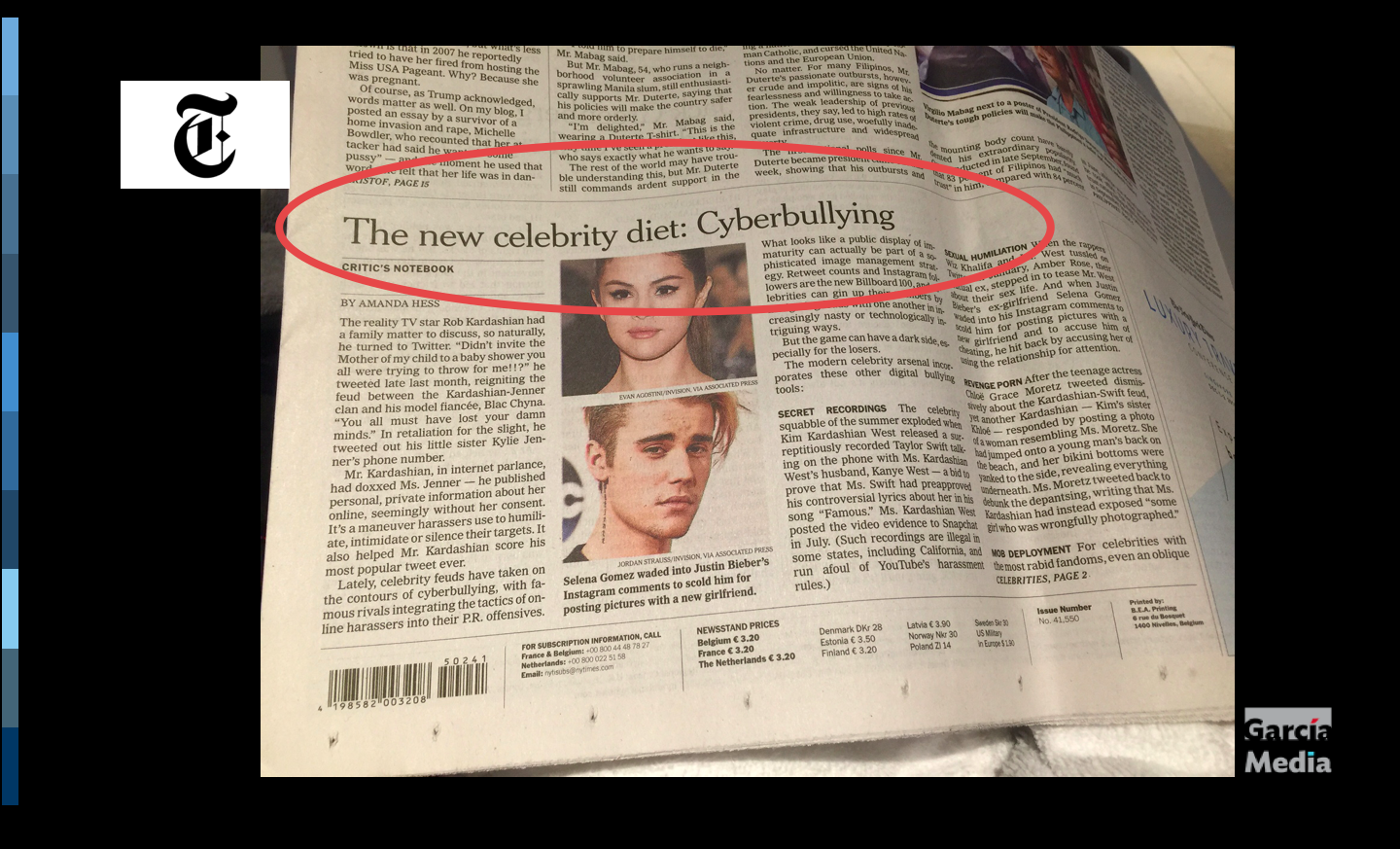
This one has a newsy angle, but, nonetheless seeing the faces of two stars on Page One of the Times was a bit startling, but welcome.
Ad placement
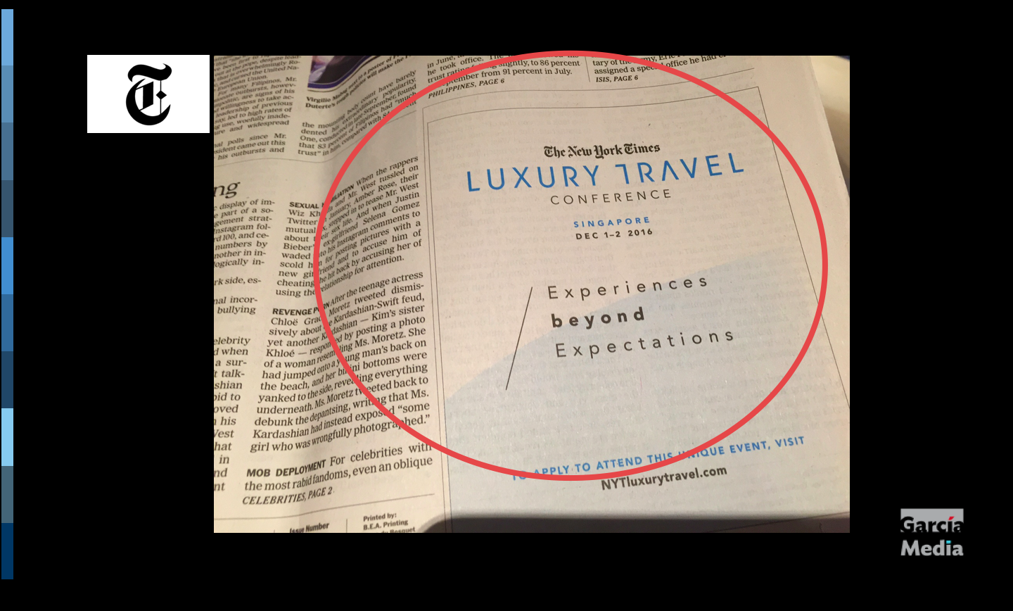
A square ad dominating the bottom corner of Page One.
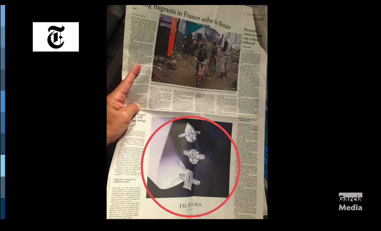
It is a large ad placed between two columns of text
TheMarioBlog post #2510
The Mario Blog
05.25.2026—9am
The Pope and I Agree: The Human Is the Muse
05.22.2026—10am
Thomas Stays on the Track. Humans Don’t. That’s the Whole Point.
05.08.2026—1am
The Super Crane is Coming. Are You Ready to Conduct?
02.27.2026—1am
Looking back 50 years, some things stay the same
02.10.2026—2am
When Rothko Meets the Robot: Why Your AI Needs a ‘Human Scent’ to Truly See.
02.09.2026—2am
The Artist’s New Scenographer: Why the Next Great Life Drawing Isn’t Born on the Canvas, but in the ‘Scent’ of the Prompt
Sign up and we will keep you updated