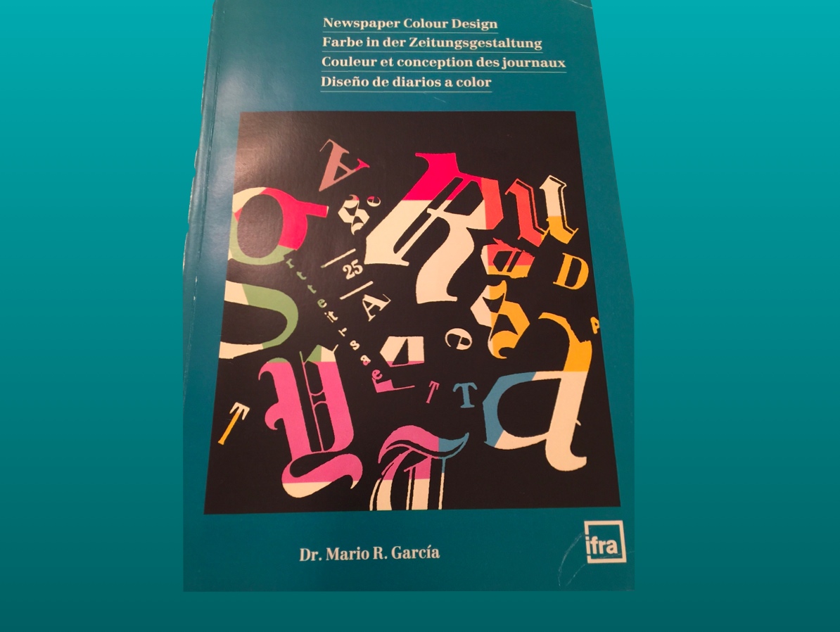
Newspaper Colour Design was published in 1988 by IFRA (now WAN IFRA) of Germany.
Newspaper Colour Design appeared in four languages simultaneously had come out at a time when newspapers were becoming experimental with their approach to color, having invested in expensive color presses that could reproduce color better.
In 2015, and as I flipped thru this now ancient text, I was wondering if my forecast for pastels had come through.
The headline: pastels have become the color palette of choice for many websites, phone and tablet editions, while in print we tend to see bright colors even in the most conservative of newspapers.
It is fun to take a look. Join me!
Some items of interest (and irony)!
Canada: The Ottawa Citizen
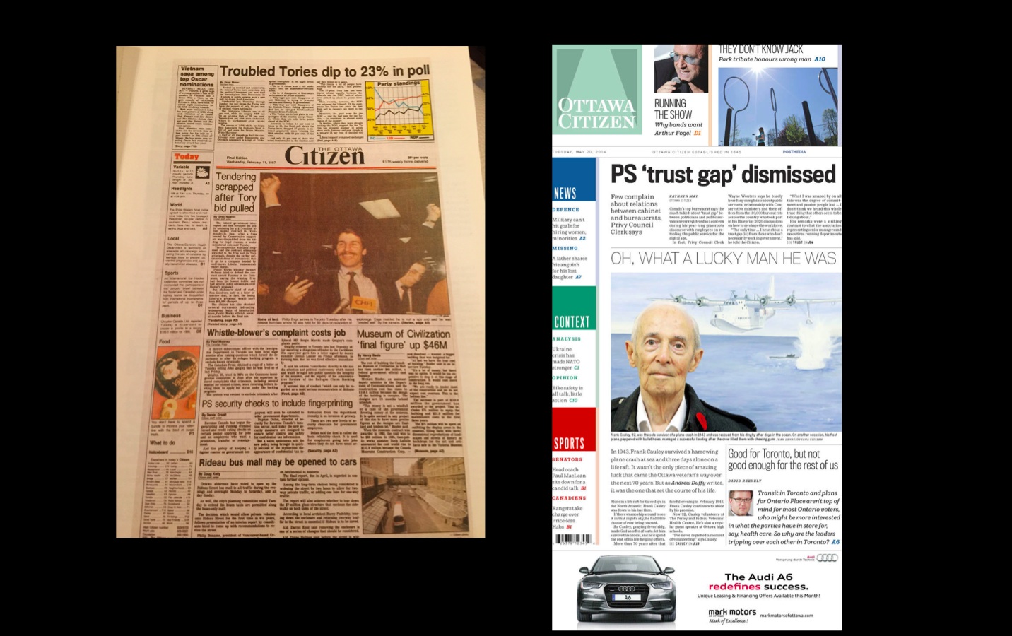
The 1988 front page of the Citizen and in its most recent redesign 2014
The Ottawa Citizen of 1988 was the first illustration in the book, and I made a reference to its poor use of color:
“…the presence of such a bright yellow as part of the informational graphic tends to create too much light for the top of the page…”
We at Garcia Media have now worked with The Ottawa Citizen. It is a very different front page and more disciplined use of color.
Norway: Aftenposten
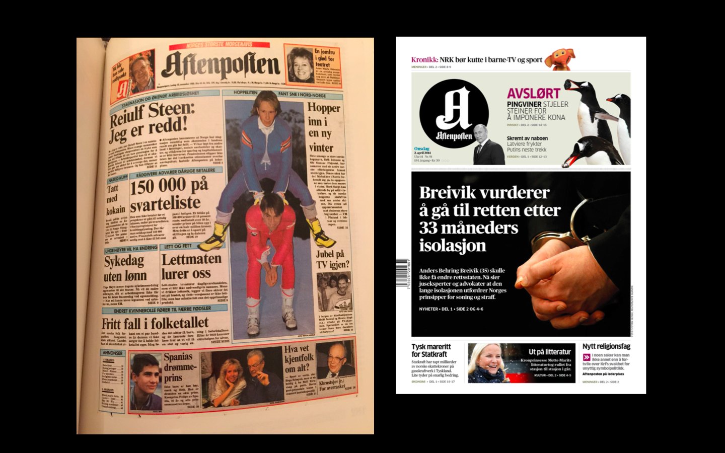
Norway’s Aftenposten: used to be a broadsheet and much more colorful in 1988; now a tabloid with a more muted color palette
Aftenposten of 1988 was praised in my book for its use of color:
“Color is well used in this front page from Aftenposten. A soft blue serves as a continuity device, as seen through the rules that are introduced directly under nameplate and carried through the rest of the page.”
We at Garcia Media continue to work with Aftenposten’s team. It is now in a tabloid format, and gone is the use of blue, in is greater use of white space, black, gray and muted colors throughout.
`
Sweden: Goteborgs Posten
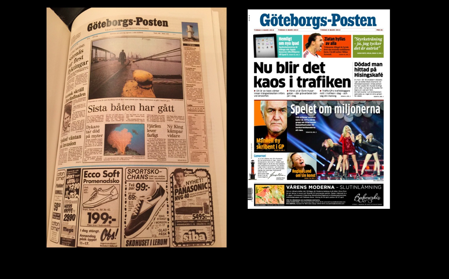
Goteborgs Posten of Sweden: then and now.
The GP of 1988 was also a broadsheet, with muted colors and emphasis on blue. I had worked with the GP team to implement a new color palette in 1987. For the next few years I continued my work with the GP team, helped them with their conversion to tabloid and with their transition to fewer sections and more of a digital presence. Today’s GP uses brighter colors.
Current use of color tends to emphasize white
Websites, particularly, seem quite conservative and restrictive in their use of color. We see blue as a dominant, and the occasional orange and red, but, for the most, the canvas of these websites are in white—a good thing.