
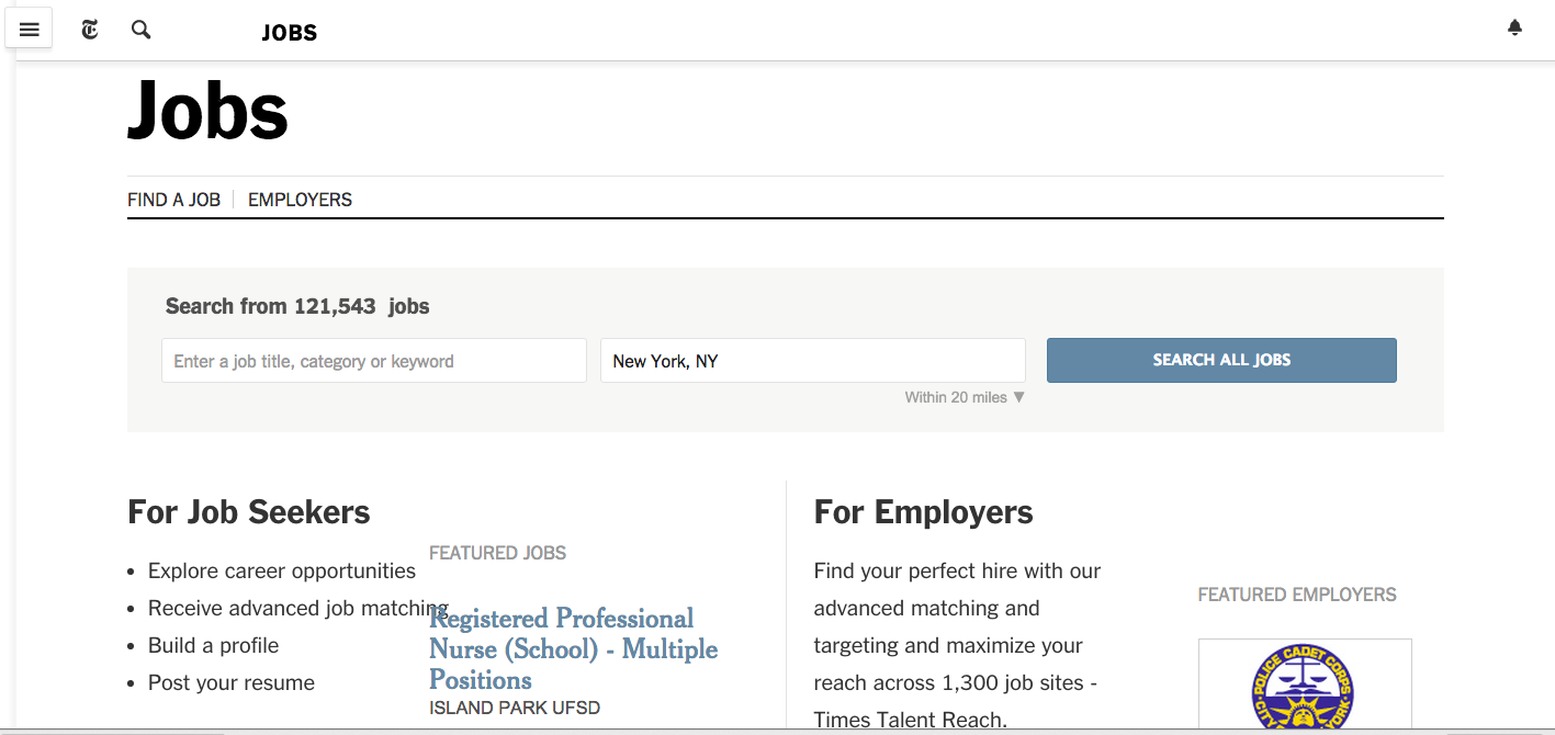
Finding that job on www.nytimes.c/jobs is definitely a more pleasant experience than on those printed pages
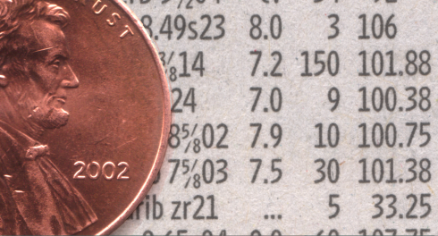
Legible and economical Retina: six plus lines of Retina agate could fit along side a penny (Graphic courtesy of Hoefler & Frere Jones)

The question took me by surprise. A former student of long ago sent me an email inquiring if anyone used agate type anymore.
I had not given agate much thought lately, I admit, or perhaps not at all since my days with the rethink of The Wall Street Journal when the world of agate took center stage there with the creation of Retina, for stock listings. Retina became such a hit with readers and type designers that it is now in the permanent collection of the Museum of Modern Art. The WSJ commissioned Jonathan Hoefler and Tobias Frere Jones to design a font that would be economical but highly legible for all those long columns of stock listings. They did, and their mastepiece is still utlized by newspapers across the globe, now beyond the agate size.
My former student's email made me take a look, and, indeed, right there on the Sunday edition of my printed New York Times I found two full pages that resembled the convergence of about three oceans of agate, gray, hard to read, worse to navigate and I wondered why anyone would tackle these pages in print when it would be a much more pleasant experience to go to www.nytimes.com/jobs.
How I wish those two pages of the Times were set in the beautiful Retina.
So, back to my former student's question: agate is still very much an overwhelming and tough on the eyes presence on some classified pages.
It doesn't have to be!
More about Retina
About Retina:
http://www.theatlantic.com/magazine/toc/2008/01/
MoMA page for Retina
http://www.moma.org/collection/object.php?object_id=139302
Here is a general description of their acquisition:
http://www.moma.org/explore/inside_out/2011/01/24/digital-fonts-23-new-faces-in-moma-s-collection.