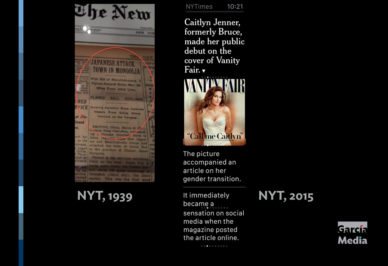
A 1939 New York Times front page story with headline and bullet decks and a 2015 NYT Smartwatch edition using same strategy
Newspaper front pages of the 1930s: stories were approached with various levels of headlines before a reader entered the text
We were enjoying a gala reception at the impressive Newseum iin Washington DC earlier this week, for the opening of the WAN IFRA World Media Congress. I had never visited the Newseum and must return to do a more leisure walk through this amazing place with its displays of everything related to news, providing wonderful lessons in American and world history, honoring our fellow journalists killed in the line of duty and providing one show stopping display after another, especially the moving 9/11 Memorial section of the museum, with all those front pages reminding us of that one darkest of days in our history.
As I strolled through the museum, I happened to stop at an exhibit that included actual newspaper pages from another era, including the 1930s. I had spent the afternoon conducting a smartwatch workshop and discussing the style of writing for at a glance journalism, where headlines flesh out the story and there is no text. We look at our watch, read two or three bites of the story and decide if that 's enough or if we wish to continue reading that story on another platform—most likely on the iPhone.
In front of me, front pages that were doing just that long before anyone, except Dick Tracy, ever imagined that a watch could do anything but tell time.
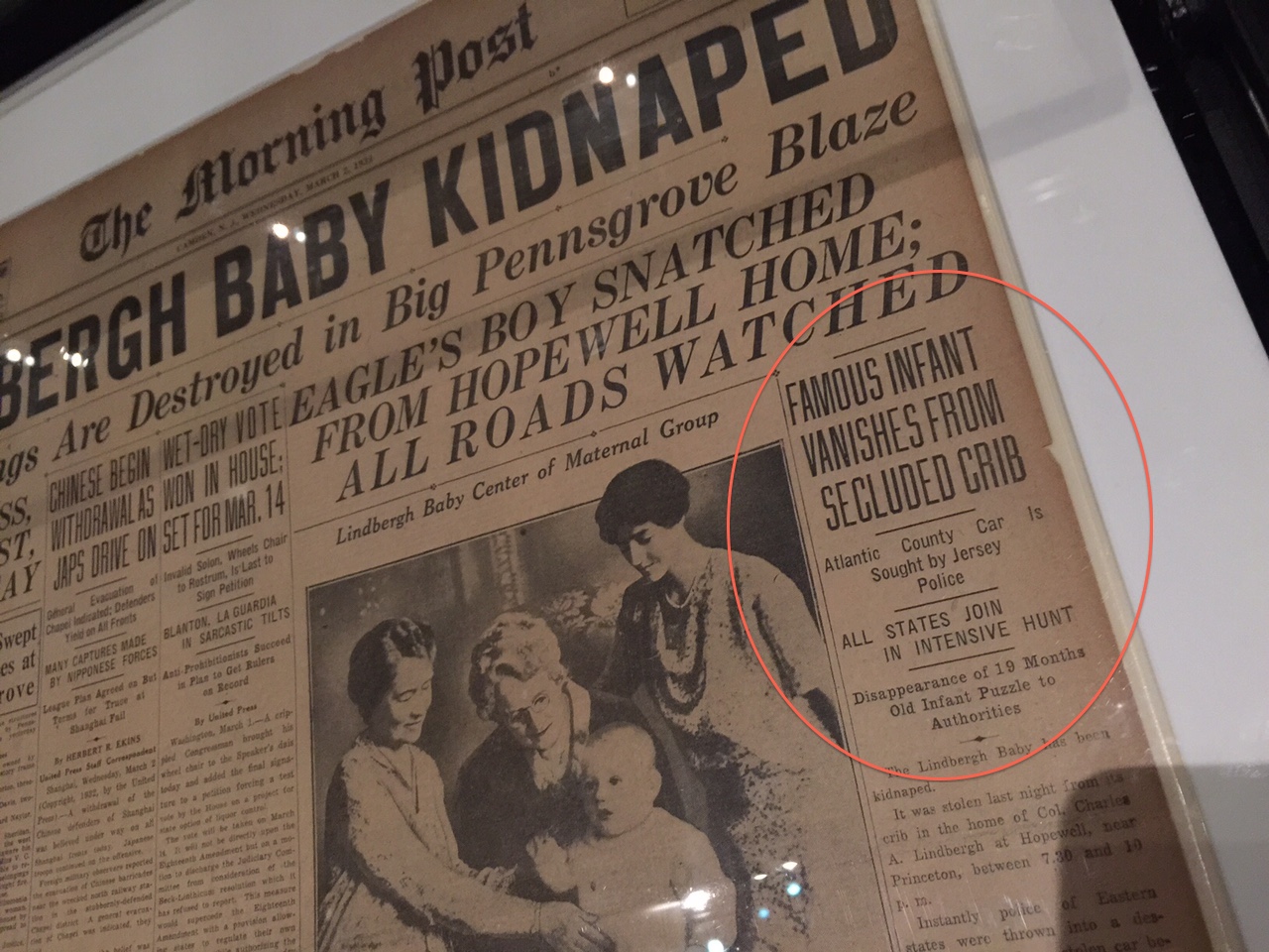
Indeed, The Morning Post of 1932, published in Camden, New Jersey at the time, carried the big story of the kidnapping of the Lindberg baby across its wide front page. Notice the detail in those decks or bullets following the main headline.
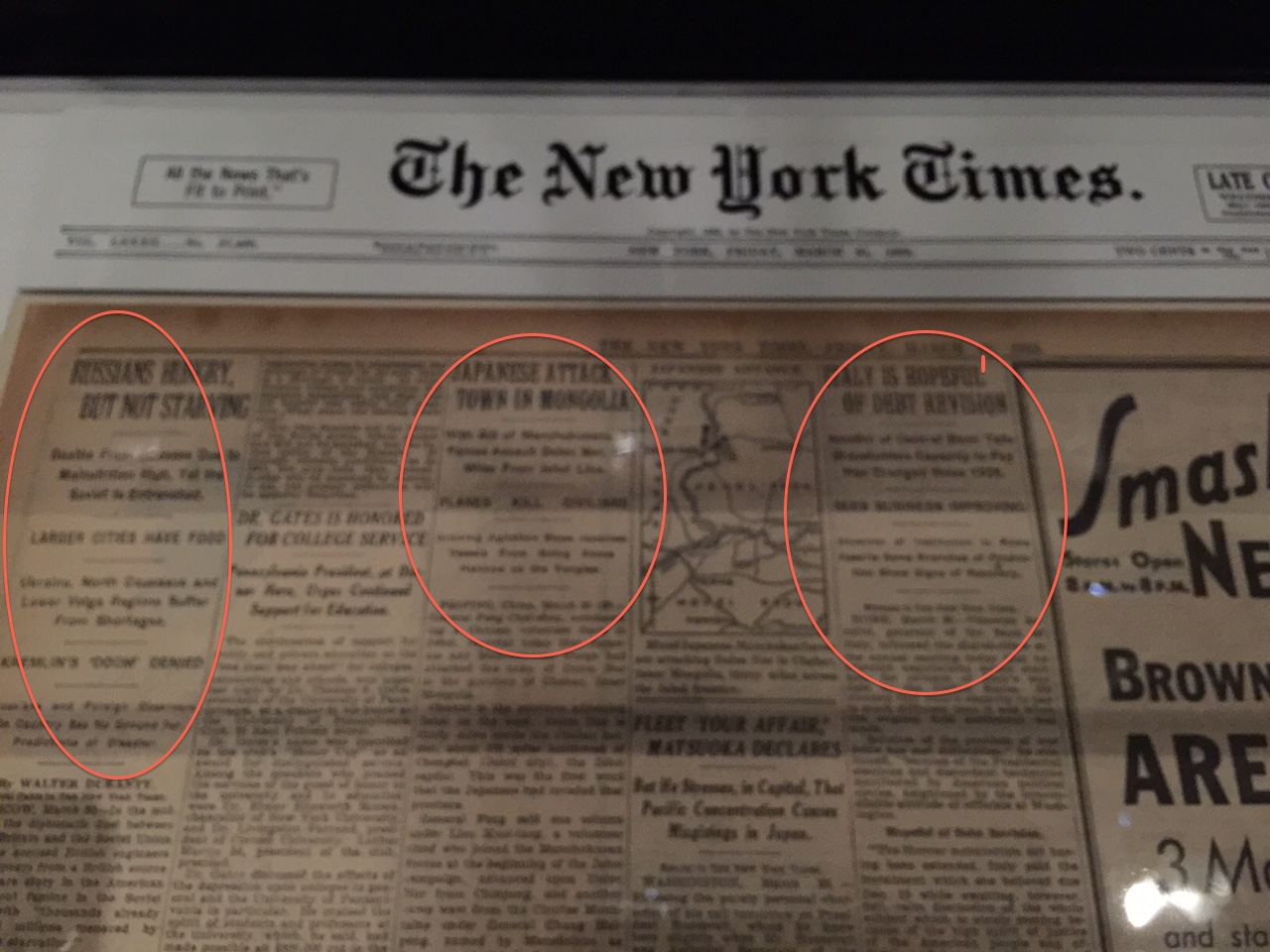
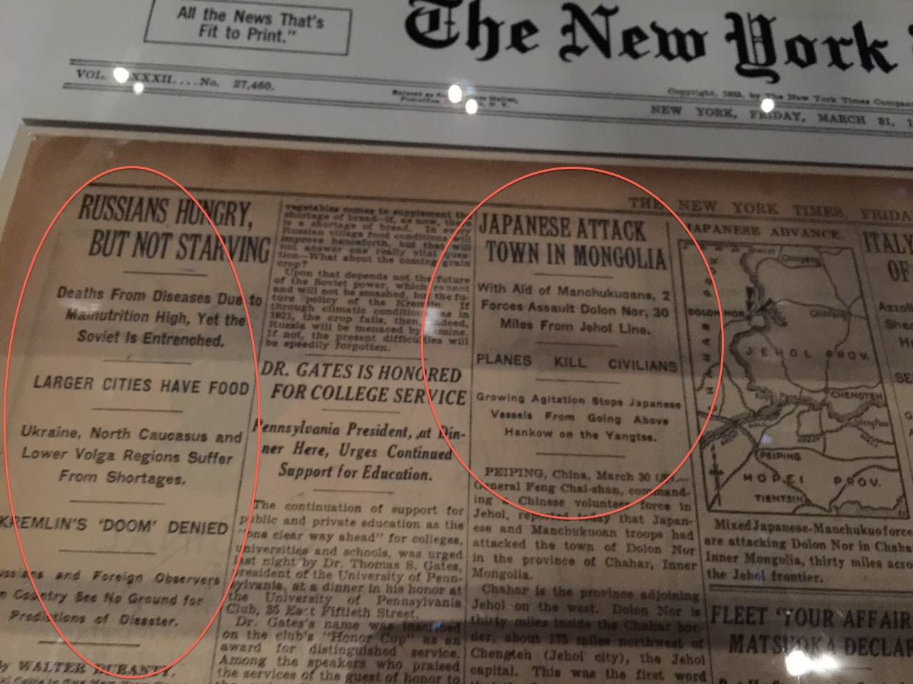
We see the same in The New York Times of 1939.
What we find is usually a lead headline in larger type, followed by various levels (and typographic treatments) for other decks or bullets that develop a story further. Of course, we have also seen this type of headline concept in The Wall Street Journal for decades.
It's probably a good idea to turn through the pages of those newspapers and get some inspiration for how we prepare stories for glanceable presentation on the smartwatch.
Mario interview in CNN En Español
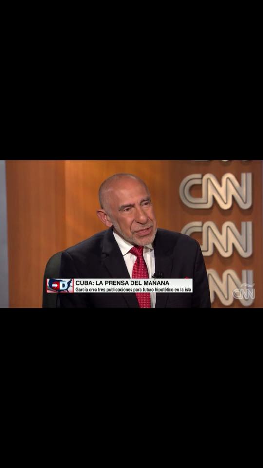
CNN interview: For those who can follow Spanish, here is my interview for CNN En Español with Juan Carlos Lopez. It is based on a discussion of how Cuban newspapers of the future might be (if freedom of the press ever comes). My partners in creative crime were the superbly talented and good friends Ana Lense Larrauri and Nuri J Ducassi.
The three titles are Cuba Hoy (a popular, down market tabloid), Havana 24/7 (English language daily), La Rampa (a contemporary newspaper of news and analysis for the middle class)
http://http://www.cnn.com/videos/spanish/2015/06/03/exp-cnne-directo-interview-mario-garcia.cnn
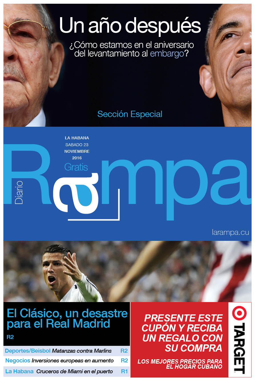
La Rampa, designed by Nuri Ducassi (consulting creative director, The Toronto Star)
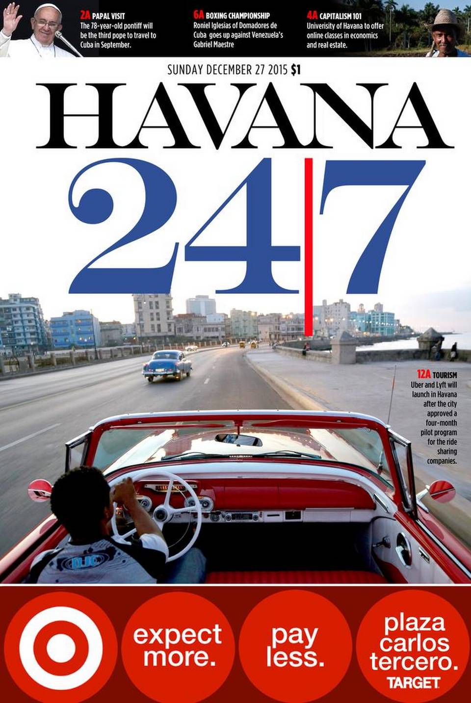
Havana 224/7, designedf by Ana Lense Larrauri (art director, The Miami Herald)
_2.jpg)
Cuba Hoy, designed by Mario Garcia (with Paula Ripoll, art director, Garcia Media Latinoamerica)
Related: In The Miami Herald today
http://www.miamiherald.com/news/nation-world/world/americas/cuba/article23005941.html